TL;DR

Get furniture and decor delivered free with Prime
- Fast, free delivery on millions of items
- Prime Video, Amazon Music and more included
- Member-only deals all year
House Beautiful reports that demand for plum and other jewel-toned home furnishings has risen, citing Havenly figures covering orders and designer sourcing through 2026. Designers recommend choosing complex, muted plum tones and using them in paint, furnishings or smaller accents; the trend’s future reach is a forecast, not a certainty.
Plum is gaining ground in home interiors, according to a House Beautiful report that cites rising furniture orders and designer sourcing figures from Havenly. The report frames the deep purple shade as part of a broader turn toward color and moodier rooms, while designers say it can work in a home through anything from a velvet pillow to painted walls.
Havenly Chief Commercial Officer Lee Anne Blake told House Beautiful that orders for purple and plum furniture at Interior Define grew in each consecutive quarter from Q3 2025 through Q3 2026, a 34 percent relative increase. Havenly designers, she said, sourced 53 percent more plum and jewel-toned decor items year over year. Those figures describe activity among the cited brands and designers; they do not establish that demand rose by the same amount across the wider home-design market.
Blake also said customers shopping Havenly’s brands were requesting white, cream and beige pieces less often. She linked the preference shift to increased interest in color and moody interiors, with Art Deco also in fashion. Plum’s brown and red undertones, Blake said, can make it feel more grounded than a bright purple and offer versatility comparable to navy or forest green.
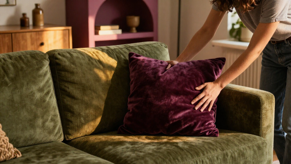
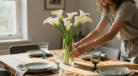
Designers quoted in the report favor plums with brown, red or gray undertones over bright, grape-like or blue-purple shades. Suggested ways to bring the color into a room include paint, wallpaper, a sectional, an accent chair, a rug, artwork or a pillow. For a temporary test, home expert Taniya Nayak recommends arranging plum or berry-colored dahlias in a vase to see how the color responds to existing decor and lighting.
Where Plum Fits in a Home
The reported figures give readers a concrete indication that plum is appearing more often in purchases and designer selections at the businesses Havenly cited. For people considering a color update, the advice offers options at different levels of commitment: a small accessory can test the palette, while wallpaper or painted walls make a stronger statement.
The design guidance also addresses a practical concern: a deep purple can look disconnected if it is added as a lone accent. Designers quoted by House Beautiful recommend giving plum relationships with other colors, materials and textures. Pairings mentioned include muddy olive, tobacco brown and dusty pink, as well as aged brass, stone, patterned textiles and rich wood. The aim is a coordinated room rather than a single bold object isolated in a neutral setting.
For renters or homeowners reluctant to commit, accessories and flowers can provide a lower-cost, reversible way to test the shade before choosing permanent finishes or large upholstered pieces. The report’s examples are design suggestions, not evidence that plum will suit every room or existing palette.
As an affiliate, we earn on qualifying purchases.
How Designers Recommend Using Plum
The House Beautiful report places plum within a wider movement toward more colorful and moody interiors. Blake connected that interest with the popularity of Art Deco, but the supplied material does not provide sales data for the overall design sector or quantify the influence of that style. Its market figures come from Havenly’s own business activity and sourcing.
Several designers distinguish plum from brighter purple shades. Kamber Mason cautioned against grape purples that may evoke children’s characters or products. Designer Isabel Clune recommended shades with brown, red or gray undertones and suggested grounding them with materials such as aged brass, stone and rich woods. These are expert preferences rather than formal standards for selecting paint or furnishings.
For stronger use, designers suggested color-drenching a smaller room, such as a powder room, library or primary bathroom. Amy Kartheiser said those intimate spaces can be places to be more adventurous, including painting both walls and ceiling. For a gentler approach, Lynn Berney of LTA Interiors suggested plum velvet pillows, an upholstered accent chair or artwork. Erika Johnston advised checking whether plum has enough presence in the room and considering a third color if the overall palette feels unbalanced.
““Because plum carries warm brown and red undertones, it reads more like an earthy, grounded neutral than an intimidating bright color.””
— Lee Anne Blake, Havenly’s chief commercial officer, as quoted by House Beautiful
What the Trend Data Cannot Show
The figures cited in the report do not show how much of the broader home-furnishings market has shifted toward plum. The 34 percent figure concerns relative growth in purple and plum furniture orders at Interior Define from Q3 2025 through Q3 2026; the report does not provide the underlying order totals or a market-wide comparison. The 53 percent year-over-year figure concerns plum and jewel-toned decor items sourced by Havenly designers, not consumer purchases across the industry.
It also remains uncertain whether plum will stay prominent through 2027. The report relays a forecast that it will continue to be a major force, but provides no independent forecast data or guarantee of future demand. No details are supplied on how preferences vary by region, price range, room type or customer group. The source material ends during a discussion of complementary colors, so it does not provide the complete set of designer recommendations from that section.
Watch Orders and Palette Choices
The next indication of whether the reported interest continues will be later purchasing and sourcing data. Readers can watch for updated figures from Havenly or Interior Define and for broader industry data that would show whether the pattern extends beyond those businesses. Until such information is available, the cited numbers should be treated as company-specific indicators, not proof of a universal shift.
For anyone trying the color now, the designers’ suggestions point to a gradual decision: test plum with flowers or a small accent, check how it looks in the room’s light, and then decide whether a larger piece or painted surface fits the existing palette. The report does not set a timetable for the trend or identify a next formal design milestone.
Key Questions
Why is plum appearing in home-design coverage?
House Beautiful reports increased Havenly furniture orders and designer sourcing for plum and jewel-toned decor. The figures indicate activity at the cited businesses, not the entire home-design market.
Which plum shades do the designers recommend?
The designers favor deep plum shades with brown, red or gray undertones and advise against especially bright grape or blue-purple tones.
How can I try plum without repainting a room?
Try a plum or berry-colored flower arrangement, a velvet pillow, artwork, a rug or an accent chair. These options let you compare the color with existing furnishings before making a larger change.
What colors and materials can work with plum?
Designers cited pairings such as muddy olive, tobacco brown and dusty pink, along with aged brass, stone, patterned textiles and rich wood. They recommend coordinating the palette so plum does not feel like an isolated accent.
Does the report prove plum will remain a major trend in 2027?
No. The report relays a forecast that plum will remain prominent, but the cited order and sourcing figures do not establish future demand across the industry.
Source: rss
Halloween Picks
halloween
As an affiliate, we earn on qualifying purchases.