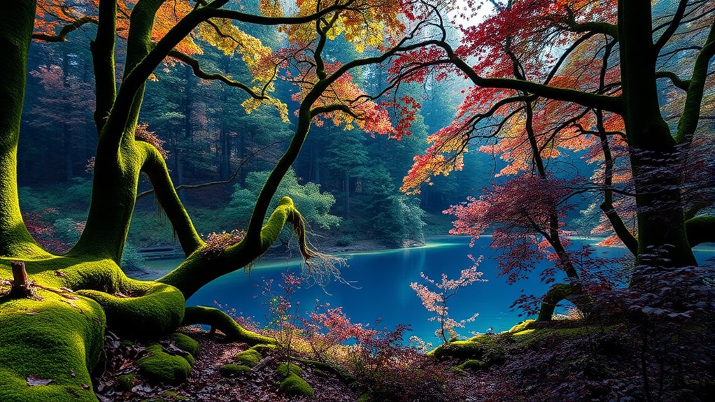
Rich color palettes featuring deep greens, blues, and plums can elevate your designs by adding vibrancy, sophistication, and emotional depth. These hues evoke feelings of growth, calmness, trust, luxury, and elegance. Combining them thoughtfully with complementary shades creates striking contrast and harmony, making your visuals more engaging. Balancing saturation and accents like gold or soft pinks brings refinement to your project. Keep exploring further to discover how to master these color schemes for stunning results.
Key Takeaways
- Combining deep greens, blues, and plums creates sophisticated, vibrant palettes that evoke growth, trust, and luxury.
- Use complementary color schemes—such as muted reds or warm oranges—to enhance contrast and visual interest.
- Incorporate touches of plum for mystery and elegance while balancing saturation for refinement.
- Draw inspiration from natural elements like plant cycles for organic, harmonious color combinations.
- Thoughtful application of these hues can craft emotional, impactful, and balanced visual narratives.

Rich color palettes bring vibrancy and depth to any design, instantly capturing attention and evoking emotion. When working with deep greens, blues, and plums, understanding color psychology becomes essential. Each color carries its own set of associations and feelings: green often symbolizes growth and harmony, blue conveys calm and trust, while plum suggests luxury and sophistication. By thoughtfully combining these hues, you can craft a palette that not only looks stunning but also communicates your intended message powerfully.
One effective way to enhance your design is to utilize complementary color schemes. Complementary colors sit opposite each other on the color wheel, creating a striking contrast that makes each hue stand out. For deep greens, pairing them with muted reds or soft pinks can generate a vibrant yet harmonious look. Blues can be complemented with warm oranges or corals, adding energy without overwhelming the viewer. For plums, accents of gold or soft yellows can bring a regal touch, balancing richness with warmth.
Using complementary color schemes with these deep hues allows you to create visual interest and balance. For example, a deep forest green paired with a subtle coral accent can evoke a sense of lushness and vitality, while a navy blue combined with a warm peach offers a soothing yet lively aesthetic. When you choose your colors, think about the emotions you want to evoke and how contrast can highlight key elements. High contrast can create a bold statement, drawing attention to focal points, whereas softer pairings can foster a sense of calm and refinement.
Incorporating these rich colors thoughtfully also involves considering their saturation and brightness. Deep greens and blues provide a grounded, sophisticated feel, but adding touches of plum can introduce a hint of mystery and elegance. Balance is key; don’t overwhelm your design with too many contrasting shades. Instead, use complementary schemes to emphasize specific areas or features, guiding the viewer’s eye naturally across the composition.
Additionally, understanding the growing and harvesting process of chia seeds can inspire natural and organic color palettes, emphasizing earthy tones and subtle hues that mirror the natural growth cycles. Ultimately, your goal with a rich color palette is to communicate emotion and intent through color harmony. By leveraging color psychology and complementary color schemes, you ensure your design resonates on a deeper level. Whether you’re aiming for a luxurious, tranquil, or energetic vibe, these deep hues offer endless possibilities. When you master the art of combining them thoughtfully, your projects will stand out with vibrancy, depth, and a compelling visual narrative that captures attention and leaves a lasting impression.

48 Colors Washable Watercolor Paint Set, with 3 Brushes Pen
- Vibrant Color Selection: 48 vivid, easily blendable colors
- Portable & Lightweight: Compact case for easy transport
- Dual-Function Case: Removable cover doubles as a palette
As an affiliate, we earn on qualifying purchases.
As an affiliate, we earn on qualifying purchases.
Frequently Asked Questions
How Do These Colors Influence Mood and Atmosphere?
These colors influence your mood by evoking calmness, stability, and sophistication. Deep greens can create a sense of balance and renewal, while blues foster tranquility and focus. Plums add a touch of luxury and mystery. Their psychological effects promote relaxation, and their cultural symbolism often connects to nature, wisdom, and spirituality. Using these colors intentionally helps set a serene, refined atmosphere that encourages reflection and emotional depth.
What Are the Best Combinations With Neutral Tones?
You might find that neutral tones work best with complementary accent colors like warm golds or soft blushes, enhancing depth and balance. Color pairing strategies suggest pairing these neutrals with rich greens, blues, or plums to create sophisticated contrasts. Research indicates that such combinations can boost mood and visual interest, making your space feel both calming and vibrant. Trust these strategies to elevate your design with timeless elegance.
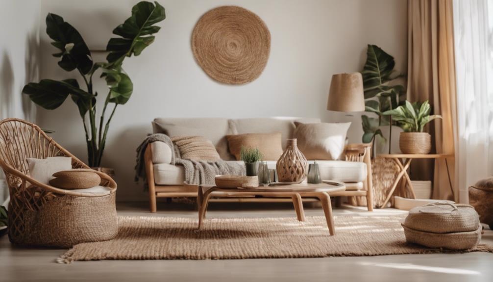
How Can These Palettes Be Used in Modern Interior Design?
You can use these palettes in modern interior design by creating luxury accent walls with deep greens, blues, or plums to add richness and depth. Incorporate statement furniture in complementary shades to make a bold impact. Keep the rest of your space neutral to let these colors shine. Use sleek lines and minimal decor to maintain a contemporary vibe while highlighting the luxurious color choices.
Are These Colors Suitable for All Skin Tones?
These colors are like a versatile wardrobe, fitting many skin tones with ease. Generally, deep greens, blues, and plums suit a variety of skin tones, but lighter shades might wash out fair skin, while richer hues complement darker or medium tones. Keep cultural significance in mind, as some colors hold special meaning in different cultures. When used thoughtfully, these palettes can enhance your space and reflect your personal style beautifully.
What Lighting Conditions Enhance These Rich Colors Best?
You’ll find these rich colors shine best in natural light, where their depth and vibrancy truly pop. During daylight, soft sunlight enhances the greens, blues, and plums, making them look more vivid. In artificial lighting, opt for warm or neutral tones to avoid dullness or color distortion. Avoid harsh, fluorescent lights, which can wash out these deep hues. Proper lighting will make your colors stand out beautifully.
Conclusion
Embrace these rich color palettes as your secret whisper of sophistication, inviting subtle elegance into your space. While they may whisper of depth and mystery, they also gently encourage you to explore new horizons with confidence. Let these deep greens, blues, and plums serve as a quiet reminder that true beauty often lies in the understated, waiting patiently for you to uncover its full story. Sometimes, the most profound impressions are made in the softest hues.