
To pair bold colors and patterns without chaos, start with a neutral base to create visual calm. Choose a dominant color to anchor your look and repeat it across different elements for cohesion. Mix large and small patterns to add variety without overwhelming, and keep to a limited number of bold accents to maintain balance. Use accessories and accents to tie everything together. Continue exploring for more tips to perfect your bold, harmonious style.
Key Takeaways
- Limit bold colors and patterns to a few key focal pieces to prevent visual overload.
- Use neutral backgrounds and bases to balance and temper vibrant hues and busy patterns.
- Mix large, bold patterns with smaller, subtle ones to create contrast and harmony.
- Repeat colors and motifs across different elements to unify the overall look.
- Incorporate accessories and accents strategically to add interest without clutter.
Understanding Color Theory and Pattern Balance
Understanding color theory and pattern balance is essential when pairing bold colors and patterns. The color wheel helps you see which hues complement each other, whether through harmony or contrast. Using complementary colors from the wheel creates vibrant yet balanced looks, while analogous colors offer a more cohesive feel. Equally important is pattern symmetry; symmetrical patterns provide a sense of order that balances boldness. When mixing patterns, aim for a sense of rhythm, where large patterns are offset by smaller, more subdued ones. This balance prevents chaos and keeps your design visually appealing. Remember, understanding how colors interact and maintaining pattern symmetry helps you create bold, lively spaces without overwhelming. Additionally, considering vetted design resources can guide you in choosing the right color palettes and pattern combinations. With these principles, you’ll confidently pair colors and patterns that work beautifully together.
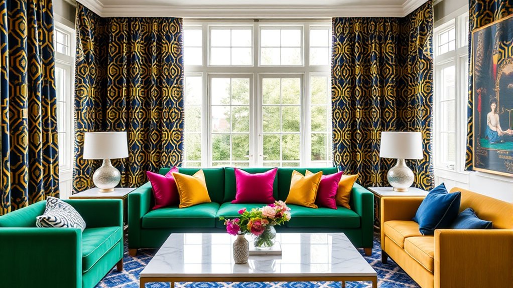
Starting With a Neutral Base for Visual Ease
Starting with a neutral base creates a calm foundation that makes bold colors and patterns easier to incorporate. A neutral foundation offers visual simplicity, allowing your statement pieces to stand out without overwhelming the space. Using shades like beige, gray, or white provides a balanced backdrop that doesn’t compete with your selected colors and patterns. This approach helps you maintain harmony and prevents chaos in your design. When your base is neutral, you can experiment more confidently with vibrant accents and eye-catching patterns, knowing they won’t clash. It also makes future updates simpler, as you can swap out accessories or textiles without overhauling the entire look. Ultimately, a neutral foundation sets the stage for a cohesive, vibrant space with effortless style.
Choosing a Dominant Color to Anchor Your Look

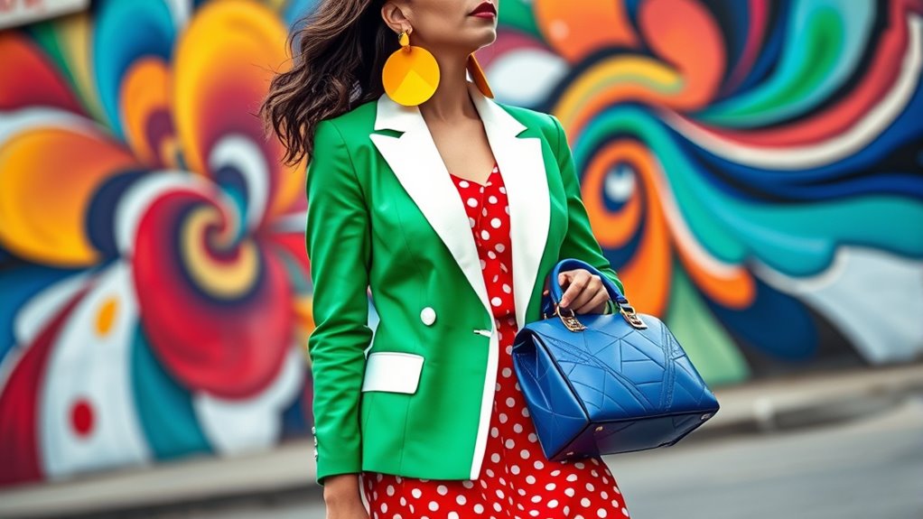
Pick a bold color to serve as the focal point of your outfit, guiding the eye and creating balance. This dominant hue helps establish a clear visual anchor, making your look more cohesive. Use neutral shades to temper the intensity and keep everything feeling polished. Incorporating free crypto opportunities can also be a fun way to add an unexpected, vibrant element to your style.
Establish a Visual Focal Point
Choosing a dominant color is the key to creating a cohesive and eye-catching look when pairing bold colors and patterns. This color acts as your focal point, guiding the eye and establishing a clear visual hierarchy within your space. When you select a single hue as your anchor, it helps to balance the other elements, preventing chaos. Your eye naturally gravitates toward the dominant color first, so use it strategically in larger or more prominent pieces. This approach ensures that even with multiple patterns and bright shades, your overall design feels intentional and harmonious. Incorporating color palettes can help you maintain consistency and avoid visual clutter. By establishing a clear focal point through your chosen dominant color, you create a visual flow that feels polished and inviting rather than overwhelming.
Use Neutral to Balance
Incorporating neutrals as a balancing element allows your bold colors and patterns to stand out without overwhelming the space. A neutral palette provides a calm backdrop that anchors your look, making vibrant hues and lively patterns feel intentional and harmonious. Use subtle textures in your neutrals—like soft linens, matte finishes, or woven fabrics—to add depth without competing with the statement pieces. This approach creates visual stability while allowing your bold choices to shine. When you choose neutral tones as your dominant color, you set a foundation that’s flexible and timeless, making it easier to refresh your space later. Additionally, safety features in home furnishings like heated mattress pads ensure comfort and security, allowing you to create a cozy environment without worry. Ultimately, neutrals act as a visual rest, helping your colorful, patterned elements to pop beautifully without chaos.
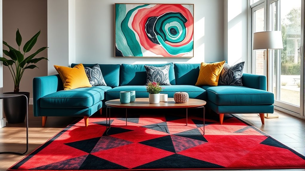
Using Repetition to Create Cohesion
Repetition is a powerful tool for creating visual harmony when pairing bold colors and patterns. It establishes pattern consistency, making your design feel unified rather than chaotic. Use repetition techniques like repeating colors, shapes, or motifs across different elements to tie the space together. Consistent patterns or motifs help your eye move smoothly from one area to another, reducing visual clutter. To illustrate, consider this table:
| Pattern Element | Repetition Technique |
|---|---|
| Bright Blue | Repeat in throw pillows and curtains |
| Geometric Shapes | Use in rugs and artwork |
| Bold Stripes | Apply on furniture upholstery |
| Floral Motifs | Incorporate in wallpaper and accessories |
Applying these techniques ensures your bold colors and patterns work in harmony, creating a cohesive, eye-catching space. Incorporating visual rhythm into your design can further enhance the sense of cohesion and flow throughout the space.
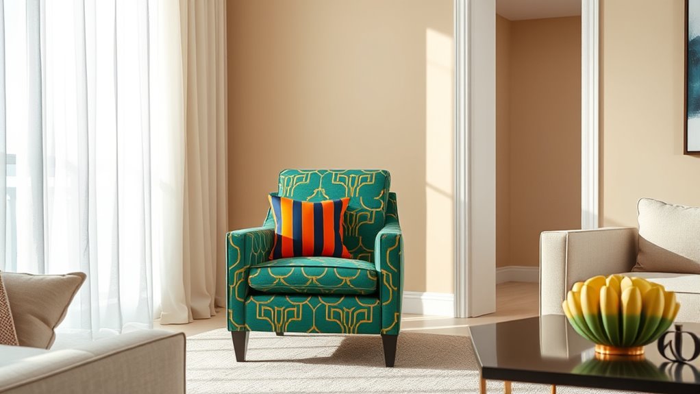
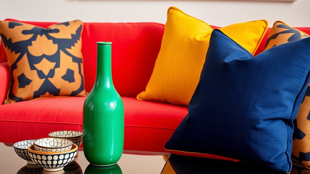
Incorporating Solid Colors to Break Up Patterns
To prevent bold colors and patterns from overwhelming a space, adding solid colors is an effective strategy. Solid hues create visual breaks, allowing patterns to breathe and stand out without clashing. Monochrome layering is a great way to incorporate solid colors; pick different shades of the same color for a cohesive look that adds depth without chaos. Color blocking with solid pieces, like cushions or curtains, can also segment a busy pattern, providing relief for the eye. These techniques help balance vibrant patterns with grounding solid tones, making the space feel intentional and harmonious. By thoughtfully integrating solid colors, you prevent patterns from dominating and create a more sophisticated, well-curated environment.
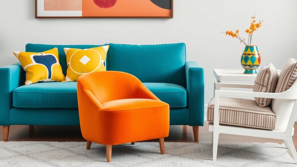
Playing With Scale and Proportion for Visual Harmony
To create visual harmony, you need to contemplate the sizes of your patterns and how they relate to each other. Balancing large and small elements prevents your space from feeling overwhelming or dull. Experimenting with different pattern sizes can add depth and interest to your overall design. Incorporating appetizer concepts can also inspire color and texture choices that enhance your space’s visual appeal.
Balancing Large and Small
Balancing large and small patterns is essential for creating visual harmony in bold color pairings. When mixing patterns, consider texture contrast, as different textures can enhance the distinction between large and small designs. Use a large, bold pattern as a focal point, then incorporate smaller patterns to support it without overwhelming the space. This balance prevents chaos and keeps your pattern mixing cohesive. Pay attention to scale: large patterns anchor the design, while smaller ones add detail without competing. Think of it as a visual conversation—each pattern should complement the other. By playing with scale and proportion thoughtfully, you create a layered look that feels intentional and polished, ensuring your bold colors and patterns work together beautifully rather than clashing. Additionally, understanding retail hours can help you plan shopping trips to find the perfect fabrics and accessories to complete your design.
Varying Pattern Sizes
Varying pattern sizes is a powerful technique for creating visual interest and harmony in your space. By playing with scale contrast, you can emphasize certain areas or add depth to your design. Incorporate pattern variety by mixing large, bold prints with smaller, subtler ones to prevent the look from becoming overwhelming. This contrast helps to balance bold colors and patterns, making your space feel dynamic yet cohesive. When selecting patterns, consider how different sizes interact, ensuring they complement rather than compete with each other. Using a mix of large and small patterns adds rhythm and movement, guiding the eye smoothly across the room. Additionally, understanding the role of visual hierarchy can help you strategically emphasize focal points within your design. Ultimately, mastering scale contrast and pattern variety allows you to create a lively, balanced environment without chaos.
Limiting the Number of Bold Elements
When incorporating bold colors and patterns, it is essential to limit the number of standout elements you use at once. Too many bold choices can create chaos rather than harmony. Focus on a few key pieces and use techniques like color blocking to keep the look clean and organized. Color blocking allows you to pair large blocks of bold hues without overwhelming the eye. When pattern mixing, choose one or two patterns and keep the rest of your outfit simple. This restraint ensures the bold elements complement each other instead of competing. Remember, less is more; limiting your bold elements creates a balanced, eye-catching ensemble that feels intentional rather than chaotic. Incorporating self-awareness about your personal style choices can help you achieve a cohesive and harmonious look. This approach keeps your look vibrant and cohesive without overwhelming your overall style.
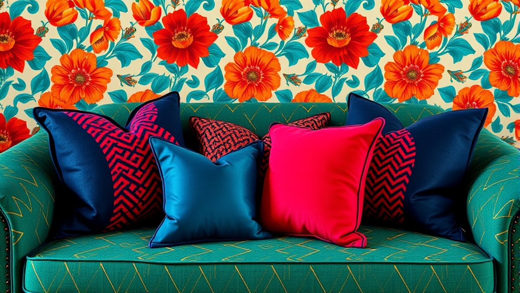
Mixing Patterns With Similar Color Schemes
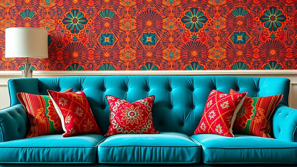
Mixing patterns with similar color schemes is an effective way to create a cohesive and stylish look. By focusing on color matching, you guarantee that different patterns complement each other rather than clash. To achieve seamless pattern coordination, consider pairing items with shades that share a common hue, like navy and cobalt or blush and rose. For visual interest, mix different pattern types—stripes with florals, polka dots with geometric shapes—while keeping the color palette consistent. Imagine a floral pillow with pink and green tones paired with a striped throw in similar shades. This approach keeps the overall look unified, preventing chaos. Remember, the key is balancing pattern diversity with harmonious color matching to craft a polished, intentional aesthetic. Additionally, understanding how contrast ratio influences visual clarity can help you better combine patterns for optimal impact.
Experimenting With Accessories and Small Accents
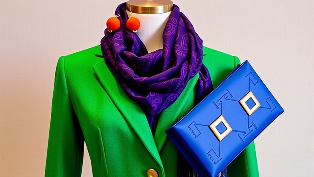
Experimenting with accessories and small accents is a simple way to elevate your bold color and pattern combinations. Statement accessories, like chunky necklaces or colorful scarves, draw attention without overwhelming your look. Statement accents, such as vibrant cushions or patterned artwork, add visual interest to a space. Use these small touches to balance bold hues and patterns, creating harmony instead of chaos. Incorporate diverse designs to enhance your aesthetic and avoid visual clutter. Here’s a quick guide to pairing statement pieces:
| Accessory Type | Ideal Use | Tips |
|---|---|---|
| Jewelry | Outfits | Keep metals neutral with bold colors |
| Decorative Pillows | Living spaces | Mix patterns with contrasting colors |
| Art & Prints | Walls | Choose pieces with accent colors |
| Small Decor Items | Shelves & Tables | Use pops of color for focus |
Frequently Asked Questions
How Can I Incorporate Patterns Into Small Spaces Effectively?
To incorporate patterns into small spaces effectively, focus on pattern placement and scale balance. Use smaller patterns to avoid overwhelming the room, and position them thoughtfully on accent walls or furniture pieces. Mix bold patterns with neutral backgrounds to create contrast without chaos. Keep larger patterns minimal, and layer different textures subtly. This approach maintains harmony, making your small space feel lively yet cohesive.
What Are Common Mistakes to Avoid When Pairing Bold Colors?
You’ll want to dodge the mistake of color clashing—imagine a rainbow throwing a tantrum on your walls. Avoid pattern overuse, or your space will look like a circus tent. Stick to one or two bold colors and balance them with neutral tones. Remember, less is more; too many patterns or bright hues can overwhelm. Keep it simple, striking, and let your bold choices shine without turning chaos into your décor.
How Do Lighting Conditions Affect Color and Pattern Perception?
Lighting impact greatly influences your color perception, making bold colors appear different under various conditions. Natural light enhances true hues, while artificial lighting can cast warm or cool tones, altering how you see patterns and colors. To avoid chaos, consider how your space’s lighting affects your design choices, and test colors under different lighting conditions. This way, you guarantee your bold pairing remains vibrant and harmonious, no matter the lighting.
Can Mixing Vintage and Modern Patterns Create a Cohesive Look?
Mixing vintage and modern patterns creates an eclectic harmony that feels fresh and intentional, like a well-curated art gallery. You can achieve this by balancing bold patterns with neutral tones or subtle textures, allowing each piece to shine without overwhelming. Focus on a cohesive color palette and scale of patterns, so your vintage modern blend looks stylish and unified. This approach transforms your space into a vibrant, yet harmonious, reflection of your personality.
How Do I Update My Bold Pattern Style Seasonally?
You can update your bold pattern style seasonally by incorporating seasonal color updates, like warmer tones for fall or brighter hues for spring. Add pattern accessories such as scarves, pillows, or statement jewelry that reflect the season’s vibe. This way, you keep your look fresh and cohesive without overwhelming your space or outfit. Mixing in new patterns and colors each season helps you stay stylish and vibrant, year-round.
Conclusion
By balancing bold colors and patterns, you create a look that’s lively yet harmonious. Think of chaos as the wild brushstrokes on a canvas—necessary for impact but controlled by thoughtful choices. When you anchor with neutrals and repeat elements, the chaos turns into a compelling story. So, embrace the contrast, but keep it curated. After all, in fashion as in art, boldness shines brightest when it’s expertly balanced.