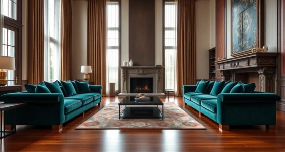

To create contrast between jewel tones and pastels, use bold, rich colors like emerald or sapphire against softer shades like blush or mint to make each hue stand out. Jewel tones command attention with their deep vibrancy, ideal for making a statement, while pastels offer a gentle, understated elegance. Mixing these two can balance boldness and softness, enhancing your style or space. Keep exploring how contrasting the two can elevate your look or décor in unique ways.
Key Takeaways
- Use jewel tones for bold, high-contrast combinations against neutral or pastel shades to create striking visual impact.
- Pair pastels with darker jewel tones to achieve subtle contrast that enhances softness and sophistication.
- Incorporate contrasting colors through accessories or accents to emphasize either jewel tones or pastels in your look.
- Mix jewel tones with complementary hues on the color wheel for vibrant contrast, and combine pastels with analogous shades for gentle blending.
- Balance intensity by combining jewel tones with subdued pastels to craft eye-catching yet harmonious contrast.
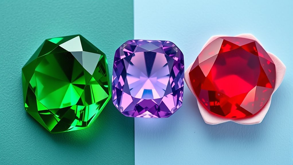
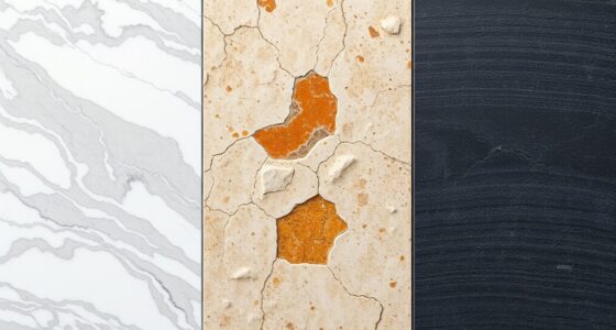
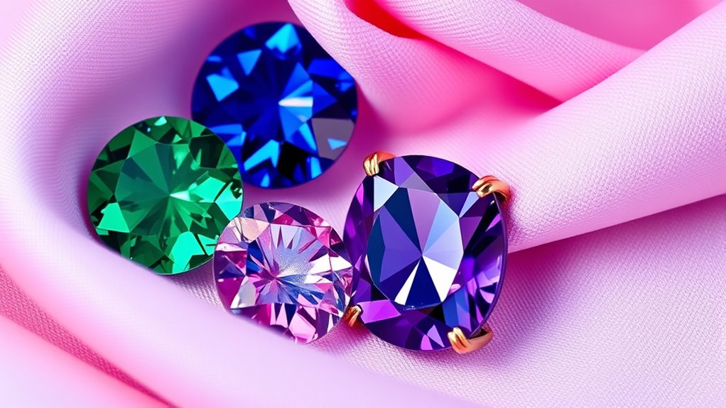
Have you ever wondered which color palette suits you best—rich jewel tones or soft pastels? The choice often boils down to understanding how color intensity and seasonal compatibility influence your look. Jewel tones, with their deep, vivid hues like emerald, sapphire, and amethyst, are known for their high color intensity. These colors command attention and evoke a sense of luxury and sophistication. In contrast, pastels are characterized by their gentle, muted shades such as blush pink, baby blue, and mint green. They exude softness and serenity, making them perfect for creating a calm and delicate aesthetic.
When considering color intensity, think about how bold or subtle you want your wardrobe or space to be. Jewel tones are intense, making them ideal if you’re after a striking, confident statement. They tend to stand out more, especially when paired with neutral tones or contrasting shades. Pastels, on the other hand, have a lower color intensity, offering a more understated and soothing visual impact. Their subtlety makes them versatile, especially for those who prefer a more understated elegance or want a gentle background that doesn’t overpower.
Seasonal compatibility plays a significant role in determining which palette suits you best. If you find yourself drawn to the richness of autumnal shades—deep reds, warm browns, and emerald greens—jewel tones align well with your natural coloring and seasonal palette. These hues often complement warm skin tones and enhance features with their depth. Conversely, if you feel more connected to spring or summer, where lighter, airy shades dominate, pastels tend to harmonize better. They echo the freshness of blooming flowers and clear skies, aligning with warmer or lighter skin undertones.
Your personal style and the vibe you want to project also matter. Jewel tones often communicate confidence, power, and elegance, making them suitable for formal occasions or when you want to stand out. Pastels, with their soft and airy feel, suit casual, romantic, or creative settings, offering a relaxed yet refined appearance. Remember, seasonal compatibility isn’t just about your skin tone; it’s also about the mood you want to convey and the context in which you wear these colors.
Understanding the color psychology behind these palettes can further help you select shades that align with your personality and the message you want to send. Ultimately, understanding how color intensity and seasonal compatibility influence your choices helps you craft a look that’s not only visually appealing but also authentic to your personality. Whether you lean toward the depth of jewel tones or the softness of pastels, knowing these factors allows you to create contrast effectively, making your style truly your own.
Frequently Asked Questions
How Do Jewel Tones Influence Mood Compared to Pastels?
Jewel tones create a bold, energetic mood due to their rich, vibrant color psychology, making you feel confident and powerful. In contrast, pastels evoke calmness and softness, promoting relaxation and serenity. The emotional impact of jewel tones is more intense and stimulating, while pastels offer a gentle, soothing vibe. When choosing colors, consider how their emotional impact aligns with the atmosphere you want to create.
Which Color Palette Suits Formal Versus Casual Settings?
You’ll find jewel tones perfect for formal settings, like a regal crown, thanks to their seasonal versatility and rich depth. They exude elegance and command attention, especially when matching skin tones. Pastels, however, are like a gentle breeze—ideal for casual occasions, offering softness and lightness. Their subtle charm pairs well with daytime events. Choose jewel tones for sophistication, and pastels for relaxed, effortless style.
Can Jewel Tones and Pastels Be Combined Effectively?
Yes, you can combine jewel tones and pastels effectively through color blocking and layering techniques. Start by pairing a bold jewel tone with a soft pastel to create contrast. Use layering to balance the look—layer a pastel blouse under a jewel-toned blazer or vice versa. This approach adds depth and interest, making your outfit visually striking while maintaining harmony between the vibrant and muted hues.
What Accessories Best Complement Jewel Tones or Pastels?
Think of your accessories as the Penelope to your Odysseus—subtle yet impactful. For jewel tones, choose statement accessories like bold earrings or a striking clutch to elevate your look, complemented by elegant jewelry that adds sparkle without overpowering. With pastels, opt for delicate, minimalist pieces that enhance the softness. Always aim for complementary jewelry that balances your outfit, making your style both harmonious and memorable.
How Do Lighting Conditions Affect the Appearance of These Colors?
Lighting conditions considerably influence how jewel tones and pastels appear. When light intensity is high, these colors look vibrant and bold, especially in daylight. Cooler color temperatures, like daylight or fluorescent light, enhance pastels’ softness, while warmer temperatures make jewel tones appear richer. You should consider the light’s color temperature and intensity to accurately showcase the contrast and depth of these colors in your space.
Conclusion
By choosing between jewel tones and pastels, you’re painting your wardrobe with a palette as vibrant as a sunset or as gentle as a breeze. Think of jewel tones as bold brushstrokes that demand attention, while pastels whisper softly, creating delicate harmony. Whichever you pick, remember that contrast is your secret weapon—like yin and yang, it balances and highlights your style. So, embrace the spectrum, and let your fashion sense shine brighter than a diamond or a cloud.