
When choosing color palettes for wellness spaces, focus on soft, calming hues like gentle blues, warm beiges, and pale greens that promote relaxation and mental clarity. Avoid bright or stimulating colors like reds or neon shades, as they can increase stress. Incorporate natural textures and layer subtle tones to deepen tranquility. If you want to learn more about creating soothing environments, there’s plenty to discover about thoughtful color combinations and design choices that foster peace and well-being.
Key Takeaways
- Use soft, muted tones like gentle blues, warm beiges, and pale greens to promote relaxation and stress reduction.
- Incorporate neutral shades and natural textures to enhance natural light and create a calming atmosphere.
- Avoid bright, stimulating colors such as reds or neon shades to maintain a peaceful environment.
- Layer subtle, harmonious colors to deepen tranquility and support mindfulness.
- Select accent colors carefully to complement the overall palette without overwhelming the senses.
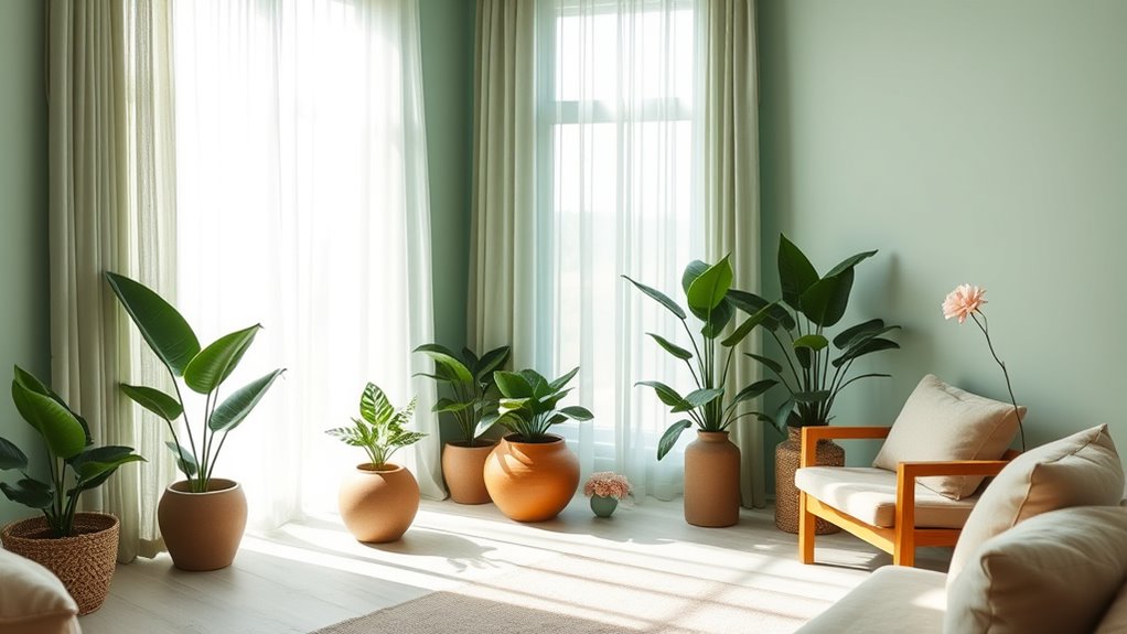
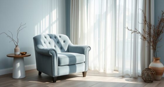
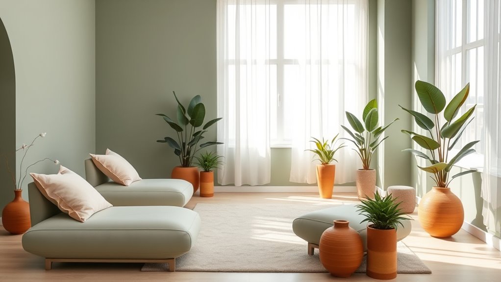
Creating a calming and inviting environment in wellness spaces starts with choosing the right color palette. When you select mindful color schemes and calming ambient tones, you set the foundation for a space that promotes relaxation and mental clarity. These choices influence how clients feel the moment they step inside, so it’s essential to focus on hues that foster peace and tranquility. Soft, muted shades like gentle blues, warm beiges, and pale greens are excellent options because they evoke serenity without overwhelming the senses. These colors work together to create a balanced atmosphere that encourages mindfulness and restful focus.
Opting for mindful color schemes means you’re intentionally selecting colors that support the purpose of your wellness space. For example, blues and aquas are known for their calming properties and can help reduce stress, making them perfect for meditation rooms or therapy areas. Warm neutrals like taupe or sand evoke warmth and comfort, inviting visitors to unwind and feel at ease. When you incorporate these calming ambient tones, you’re not just decorating — you’re designing an environment that encourages mindfulness and emotional well-being. These tones provide a neutral backdrop that allows other elements, like natural light or soft furnishings, to shine and enhance the overall sense of calm.
Choosing calming neutrals like taupe and sand creates a warm, inviting environment that fosters mindfulness and emotional well-being.
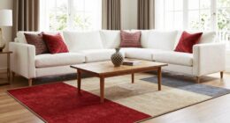
Remember, it’s not just about choosing colors that look good; it’s about selecting shades that resonate with the purpose of your space. If you want to foster a sense of balance and focus, avoid overly bright or stimulating colors like reds or neon shades, which can create energy rather than calm. Instead, stick with subdued, harmonious tones that blend seamlessly and avoid visual clutter. Using mindful color schemes also means paying attention to how colors interact with each other—layering soft tones can deepen the sense of tranquility, while accent colors should be subtle and rarely jarring.
Additionally, understanding how AI in retail influences customer experience can help you tailor your environment to better suit your clients’ needs by leveraging data-driven insights for optimal calming effects.
Incorporating calming ambient tones into your design isn’t just about aesthetics; it’s about creating a sensory experience that gently guides your clients into a state of relaxation. Think about how natural light interacts with your chosen palette, enhancing the soothing effect. You can also introduce natural textures and materials that complement your color choices, reinforcing the peaceful vibe. When you carefully curate your color palette with mindfulness, you craft a space that naturally encourages mindfulness, stress relief, and overall well-being. Your clients will feel the difference, and they’ll appreciate the thoughtfulness behind your design choices.

MAHITOI Palette for Watercolors, Oil & Acrylic Paints, Mix & Separate Colors, White, Art 20 Wells, 13” x 10” 4 slated Squares, 4 Squares, 4 Large circulars, and 8 Small Circular Wells for All Levels
20 WELLS PAINT PALETTE – Measuring 13” x 10”, this large artist palette has 20 wells of varying…
As an affiliate, we earn on qualifying purchases.
As an affiliate, we earn on qualifying purchases.
Frequently Asked Questions
How Do Lighting Choices Influence Color Perception in Wellness Spaces?
Lighting choices markedly influence how you perceive colors in wellness spaces by shaping the lighting ambiance. Soft, warm lighting enhances calming colors, making spaces feel cozy and inviting, while bright, cool lighting highlights energizing hues. Your understanding of color psychology helps you select lighting that reinforces the desired mood, ensuring the space promotes relaxation or revitalization. Ultimately, thoughtful lighting choices can transform the environment and support your wellness goals.
What Are the Best Color Combinations for Different Types of Wellness Environments?
You should choose color combinations based on color psychology to evoke specific feelings. For relaxation, opt for soft blues and greens that promote calmness, ensuring design harmony with balanced tones. In energetic spaces, use vibrant yellows and oranges to boost mood, while neutral palettes with earthy tones foster grounding in meditation areas. Always consider how the colors interact, creating a cohesive environment that aligns with the wellness space’s purpose.
How Can Color Palettes Promote Relaxation and Reduce Stress Effectively?
Color psychology reveals that certain hues can promote relaxation and reduce stress effectively. You can harness the psychological effects of soft, muted colors like blues and greens, which calm the mind and body. These shades lower cortisol levels and foster tranquility. By choosing calming palettes, you create a soothing environment that encourages relaxation, making your wellness space more inviting and beneficial for those seeking stress relief.
Are There Specific Colors Recommended for Sensory or Meditation Rooms?
For sensory or meditation rooms, you should choose calming colors like soft blues, gentle greens, or muted neutrals based on color psychology, which promote relaxation. Incorporate material textures such as plush fabrics, smooth stones, or natural wood to enhance sensory experience. These textures, combined with soothing colors, help create a tranquil environment that encourages mindfulness and reduces stress effectively. Remember, simplicity and harmony are key.
How Do Cultural Differences Impact Color Selection in Wellness Design?
Imagine designing a wellness space for a Japanese client; you’ll want to contemplate cultural symbolism like the calming effect of indigo. Cultural differences greatly influence color preferences—what’s soothing in one culture might be energizing in another. You should research regional color symbolism and adapt your palette accordingly, ensuring your design resonates emotionally and culturally, creating a welcoming environment that respects diverse perceptions of color.

Ambient Lighting, 216 Modes Mood Lighting, 3-in-1 Sunset Lamp & Ocean Lamp & Northern Lights Projector with Remote, Room Lights for Bedroom,Gifts for Teenage Girls,13 Year Old Girl Gifts
🔮 Crystal Light Projector for Bedroom: UPGRADED Crystal Ball ambient lighting composed of crystal glass and wood grain…
As an affiliate, we earn on qualifying purchases.
As an affiliate, we earn on qualifying purchases.
Conclusion
Choosing the right color palette transforms your wellness space into a sanctuary, much like a gentle breeze clears away stress. When you select calming hues, you create an environment that nurtures relaxation and peace. Remember, colors set the mood, so trust your instincts. By thoughtfully blending soothing tones, you craft a space that welcomes and heals, turning everyday moments into a peaceful retreat. Your wellness space becomes a haven, as comforting as a warm hug.

ANONYO Boho Wooden Chain Links Decorative Object for Coffee Table & Shelf | Handmade Mango Wood Knot Sculpture Rustic Modern Arch Décor for Living Room, Entryway, Console, Office Home Accent (Natural)
🏡 MULTIPURPOSE DECOR ACCENT: A stylish addition to any entryway, coffee table, console, or built-in shelf. Use this…
As an affiliate, we earn on qualifying purchases.
As an affiliate, we earn on qualifying purchases.

Zen Decor, Meditation Accessories, Spiritual Decorations, Yoga Room Meditation Room Decors, Quiet The Mind And The Soul Will Speak Sign (B06)
Dimension: The wooden plaque measuring 5" x 5" with retro metal stand. 1 wood sign with stand per…
As an affiliate, we earn on qualifying purchases.
As an affiliate, we earn on qualifying purchases.