Color blocking in interiors involves using bold, contrasting, or harmonious color sections to define spaces and add visual interest. You can create dynamic effects by choosing complementary or analogous color schemes, planning layouts with horizontal, vertical, or geometric shapes, and balancing bold hues with neutrals. Carefully sharp lines and proper surface preparation are key for a polished look. If you keep exploring, you’ll discover how to master this versatile design technique with confidence.
Key Takeaways
- Use bold, contrasting color blocks guided by color theory to create visual interest and space definition.
- Apply painter’s tape meticulously for clean, sharp edges and precise geometric shapes.
- Plan layouts with horizontal, vertical, or geometric blocks to enhance room proportions and focal points.
- Balance vibrant color blocks with neutral tones and accessories for a harmonious, dynamic interior.
- Vary block sizes and placements while considering contrast ratios for a professional, cohesive look.

Duck Brand Clean Release Painter's Tape, 0.94 Inch x 60 Yards (240193)
Perfect purchase for a gift
As an affiliate, we earn on qualifying purchases.
As an affiliate, we earn on qualifying purchases.
Understanding the Principles of Color Blocking
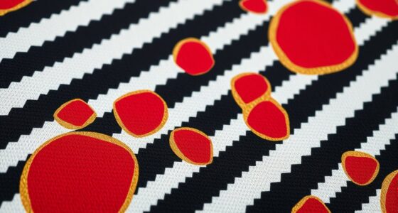
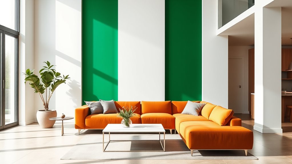
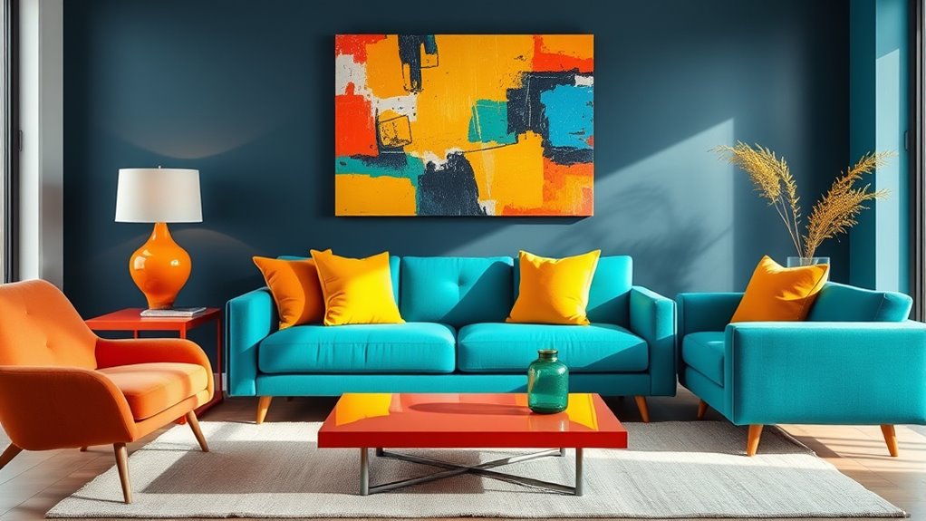
Color blocking in interior design involves using bold, contrasting blocks of color to create visual interest and define spaces. To master this technique, understanding color theory is essential. It guides you in selecting colors that complement each other and evoke specific emotional impacts. For example, warm hues like reds and oranges can energize a room, while cool tones like blues and greens promote calmness. By carefully applying these principles, you can craft spaces that feel balanced and dynamic. The key is to contemplate how colors interact and influence mood, ensuring they work harmoniously rather than clash. This foundational knowledge helps you make intentional choices, transforming ordinary rooms into visually striking environments with a clear purpose and emotional resonance.
Large Boho Geometric Wall Decal Abstract Art Sticker, Modern Irregular Bohemian Shapes Decals, Peel and Stick Black Vinyl Wall Stickers for Bedroom, Living Room Decor
Easy peel&stick. Removable and no residue left. No transparent or white edge, as if painted on wall.
As an affiliate, we earn on qualifying purchases.
As an affiliate, we earn on qualifying purchases.
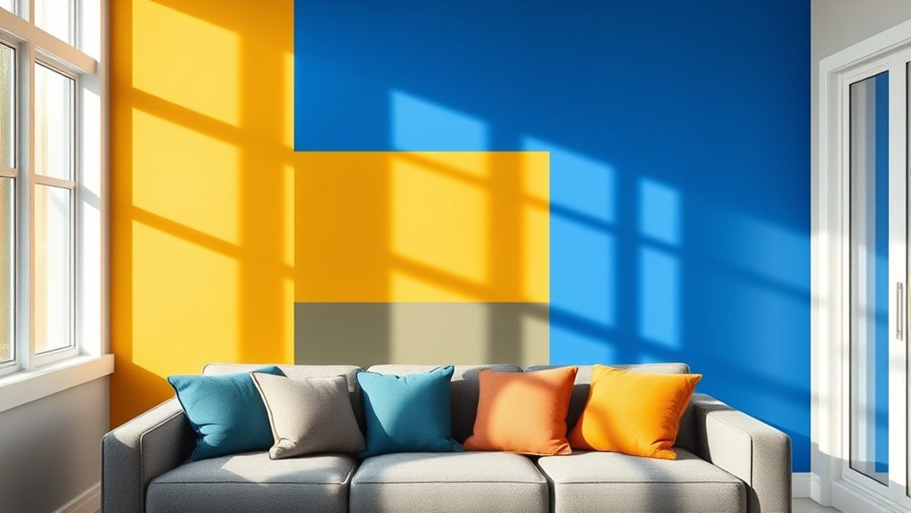
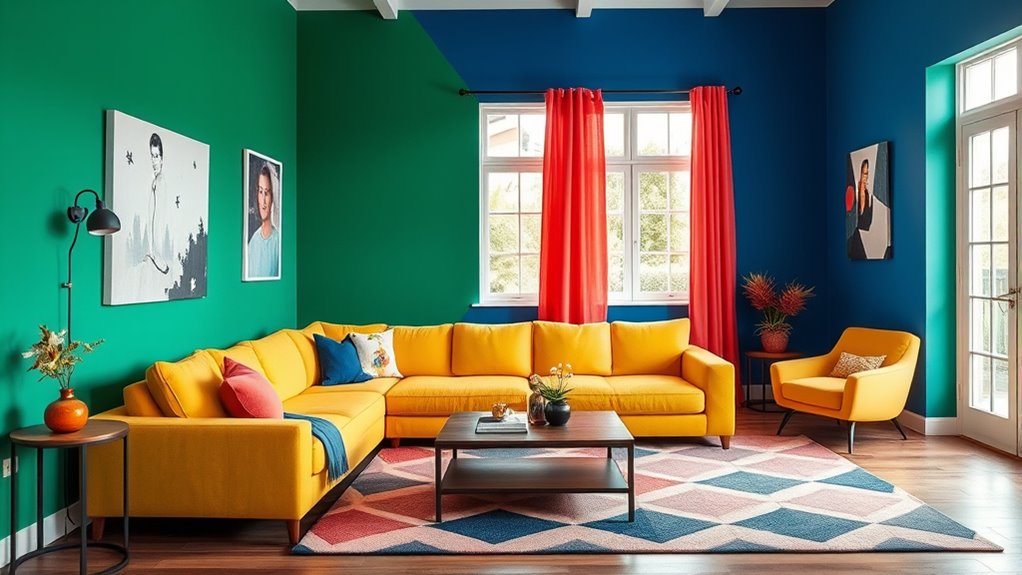
Choosing the Right Color Combinations for Impact

Choosing the right color combinations can transform a space from ordinary to extraordinary by creating visual impact and emotional resonance. To achieve this, consider complementary palettes, which pair colors opposite each other on the wheel for vibrant contrast. Monochromatic schemes, using different shades of a single hue, create harmony and depth. Use the table below to explore ideas:
| Color Scheme | Effect | Example Combinations |
|---|---|---|
| Complementary Palettes | Bold, energetic, high contrast | Blue and orange |
| Monochromatic Schemes | Calm, cohesive, sophisticated | Light blue, navy |
| Analogous Colors | Harmonious, subtle transition | Green, yellow-green |
| Triadic Schemes | Balanced, vibrant, lively | Red, yellow, blue |
| Split-Complementary | Dynamic, less intense contrast | Purple, yellow-green |
In addition, understanding color theory can help in selecting harmonious combinations that evoke the desired mood.

6 Rolls Colored Masking Tape,colored painters tape,0.6" x14.3Yard Drafting Tape,Colored Painters Tape for Arts and Crafts,Labeling Tape, Paper Tape,DIY Decorative Coding Decoration Teaching Supplies
【Value Package】6 Rollstotal 252ft, each roll is 14 .3yards (13m) long,0.6 inch (15mm) wide, .In 6 Vibrant Colors
As an affiliate, we earn on qualifying purchases.
As an affiliate, we earn on qualifying purchases.
Planning the Layout: Horizontal, Vertical, and Geometric Blocks
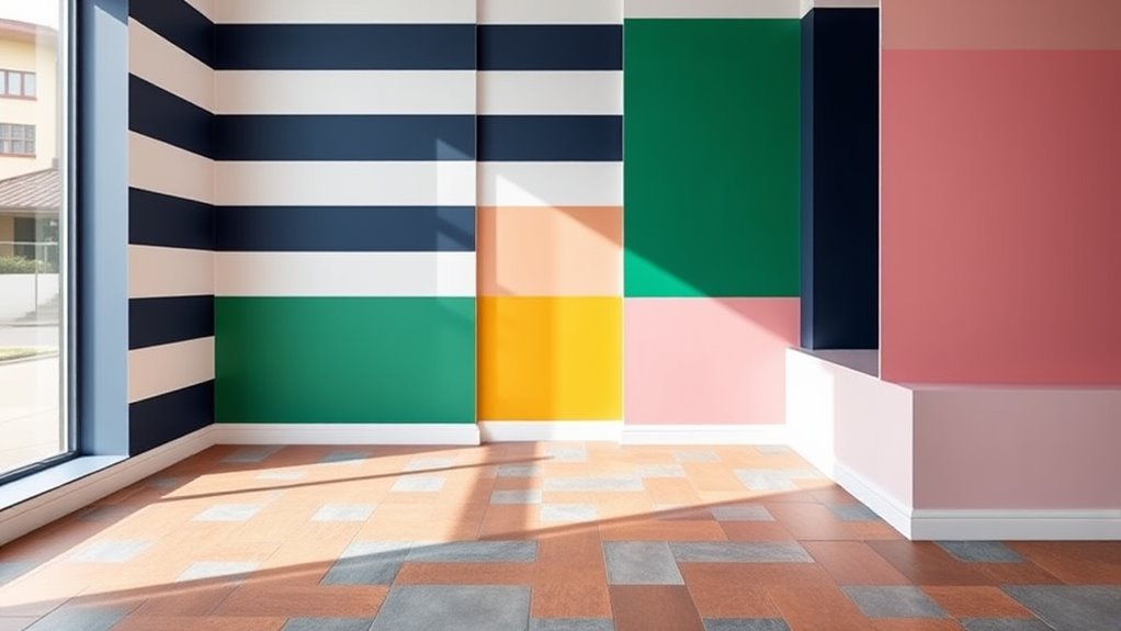
When planning your interior layout, integrating horizontal, vertical, and geometric blocks can dramatically influence the space’s visual flow and energy. These elements serve as effective tools for space division, creating distinct zones without walls. Horizontal blocks, like wide stripes, expand the area and add openness, while vertical blocks draw the eye upward, enhancing height. Geometric blocks introduce dynamic shapes that break monotony and add visual interest. To achieve balance, consider pattern repetition—repeating these blocks consistently across walls or furniture to unify the design. This approach emphasizes cohesion and guides movement naturally through the room. Additionally, understanding visual balance can help you create a harmonious environment where all elements work together effectively. By thoughtfully combining these layout techniques, you can craft a lively, harmonious space that feels both structured and inviting.

4 Rolls Premium Painters Tape, Blue Tape, Masking Tape, Paint Tape for Multi-Purpose, Painting, Painter's, DIY Crafts Arts (88yd =0.94IN*22yd*4) Decoration Labeling No Residue, Easy Removal
Professional Mask Tape – Multi-Surface adhesive tape made of high quality blue crepe paper not easy to lift…
As an affiliate, we earn on qualifying purchases.
As an affiliate, we earn on qualifying purchases.
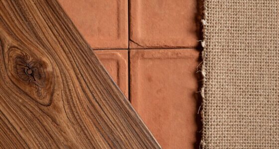
Selecting Paints and Finishes for a Cohesive Look
When choosing paints and finishes, focus on harmonizing your color schemes to create a seamless look. Opt for durable finishes that withstand daily wear and tear, especially in high-traffic areas. This combination guarantees your space remains cohesive and long-lasting.
Harmonizing Color Schemes
To create a cohesive look in your space, selecting the right paints and finishes is essential. Achieving harmony involves understanding color harmony concepts and choosing complementary palettes that enhance each other. When your colors work together, your space feels balanced and visually appealing. Focus on these key points:
- Use color wheels to find complementary shades that create contrast and interest
- Incorporate neutral finishes to ground bold hues
- Mix matte and gloss finishes for depth and dimension
- Stick to a consistent color temperature for uniformity
- Test paint samples in different lighting to see how finishes affect the overall look
Choosing Durable Finishes
Selecting the right finishes can make or break the durability and maintenance of your interior design. To achieve a long-lasting, beautiful space, opt for durable finishes that stand up to daily wear and tear. Look for low maintenance coatings that are easy to clean and resist stains, scratches, and moisture. Satin or semi-gloss finishes are excellent choices for high-traffic areas, as they provide a subtle sheen while offering added protection. Matte finishes work well for walls that don’t require frequent cleaning but may be less resistant to scrubbing. When selecting paints, choose high-quality products designed for durability. Applying these finishes correctly guarantees your color blocking remains vibrant and intact over time, making your space both stylish and practical.
Incorporating Color Blocking in Different Rooms
Incorporating color blocking into different rooms allows you to create dynamic and visually engaging spaces that reflect your personality. You can draw inspiration from color blocking art and fashion to choose bold color combinations that energize any area. Use vibrant blocks on walls to define zones or highlight focal points, or incorporate contrasting furniture and décor for striking effects. Consider painting one wall in a bold hue while keeping others neutral, or add color-blocked textiles like rugs and curtains for cohesion. Remember, balance is key—don’t overdo it. Here are some ideas to get you started:
- Use contrasting colors on accent walls
- Incorporate multi-colored furniture pieces
- Play with color blocking art as wall décor
- Mix bold and neutral tones thoughtfully
- Highlight architectural features with color blocks
- Experiment with interior support hours to plan your decorating projects at optimal times.
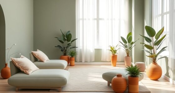
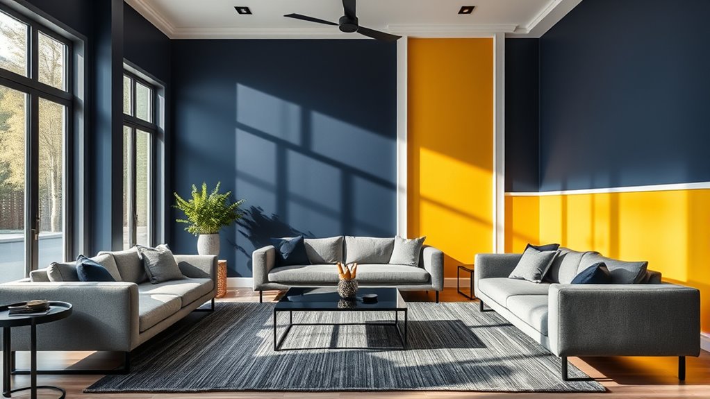
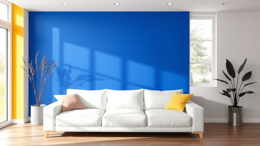
Balancing Bold Colors With Neutral Tones
To create a balanced look, start by anchoring bold colors with neutral tones that ground the space. Incorporate accent pieces like pillows or artwork to add pops of color without overwhelming the room. Achieving visual harmony means carefully mixing these elements so that vibrant and neutral shades complement each other seamlessly. To enhance the overall aesthetic, consider integrating rustic decor elements that naturally blend bold and subdued hues for a cohesive appearance.
Anchoring With Neutrals
When you introduce bold colors into a space, grounding them with neutral tones creates a sense of balance and sophistication. Using a neutral palette acts as an anchor, allowing vibrant hues to stand out without overwhelming. To achieve this, consider these tips:
- Choose neutral shades like beige, gray, or taupe for walls or large furniture
- Use subtle contrast to highlight bold accents without clashing
- Incorporate neutral-colored textiles and accessories
- Balance bright colors with neutral storage or framing elements
- Keep larger surfaces simple to let the bold colors be focal points
- Incorporating neutral tones helps to enhance skin texture and radiance, making your overall decor more cohesive.
Using Accent Pieces
Using accent pieces is an effective way to balance bold colors with neutral tones, creating visual harmony in your space. By strategically placing accent pieces, you draw attention to focal points without overwhelming the room. For example, a vibrant throw pillow or a colorful vase can serve as eye-catching accents that complement neutral walls and furniture. These pieces add pops of color that energize the space while maintaining a sense of balance. When choosing accent pieces, consider their placement and scale to ensure they enhance rather than compete with the overall design. The goal is to create a cohesive look where bold colors support the neutrals, making the space feel vibrant yet calming. Accent pieces are your tools for achieving this subtle yet impactful color blocking effect. Additionally, incorporating visual balance ensures your space remains harmonious and inviting.
Achieving Visual Balance
Achieving visual balance in color blocking involves carefully pairing bold hues with neutral tones to create harmony and prevent overwhelm. By balancing color harmony with neutral shades, you establish a cohesive look that feels lively yet calming. To maintain visual rhythm, distribute bold colors thoughtfully across the space, avoiding clumping. Use these tips:
- Incorporate neutral tones as a backdrop for bold accent walls or furniture
- Limit the number of vibrant colors to two or three for consistency
- Use subtle shades to soften progressions between bold blocks
- Vary the size and placement of color blocks to create visual interest
- Balance bold elements with understated accessories or decor
- Understanding contrast ratios helps in choosing the right color combinations for optimal visual impact.
These techniques help you prevent overpowering effects while emphasizing the vibrant colors. The key is to create a harmonious flow that guides the eye comfortably through your space.
Using Furniture and Accessories to Enhance Color Blocking
Furniture and accessories play a crucial role in amplifying the impact of color blocking in your interior design. Proper furniture placement can highlight contrasting colors or create cohesive zones, making your space feel intentional. Accessory selection is equally important; choosing pieces in complementary or bold hues enhances your color blocks and adds visual interest. For example, a vibrant cushion against a neutral wall or a colorful lamp can serve as focal points. Consider this table for guidance:
| Furniture Placement | Accessory Selection |
|---|---|
| Position furniture to frame color blocks | Use accessories in contrasting or matching hues |
| Create balance by spacing furniture evenly | Add small accent pieces in bold colors |
| Highlight specific zones with placement | Incorporate textured accessories for depth |
| Use furniture to anchor color zones | Select accessories that complement your palette |
| Avoid cluttering with too many pieces | Use accessories to unify the design |
Additionally, understanding color harmony principles can help you make more informed choices when selecting accessories and furniture to ensure a cohesive and visually appealing space. These simple choices elevate your color blocking strategy effectively.
Tips for Achieving Sharp Lines and Crisp Edges

To create clean, sharp lines and crisp edges in your color blocking projects, precise preparation and careful application are essential. Start by selecting high-quality, sharp tape designed for clean edges. Use painter’s tape or painter’s tape with sharp tape edges to prevent paint bleed. Make sure surfaces are clean and dry before applying tape to promote adhesion. When applying tape, press down firmly along the edges to prevent gaps. Remove the tape slowly and at a 45-degree angle after the paint has dried. For extra sharpness, consider using a small brush to touch up any uneven lines. Additionally, choosing the right tape type is crucial for achieving the best results in your project.
- Use sharp tape for crisp edges
- Press tape firmly along edges
- Remove tape before paint fully dries
- Maintain even, consistent pressure
- Touch up with a fine brush if needed
Common Mistakes to Avoid in Color Blocking Projects
One common mistake in color blocking projects is failing to plan your design ahead of time, which can lead to uneven color distribution and mismatched lines. Many believe color blocking is simple, but misunderstanding color blocking myths can cause frustration and poor results. For example, some assume it only works with bold, contrasting colors, but subtle shades can also create stunning effects if planned properly. Additionally, neglecting the historical color blocking trend can result in outdated or mismatched choices. To avoid these pitfalls, sketch your layout first, choose a cohesive color palette, and understand the origins of color blocking in design history. Proper planning helps you achieve a balanced, professional look and prevents mistakes that could compromise your space’s overall harmony. Being aware of design trends and their evolution can also inform your choices and enhance your project’s success.
Frequently Asked Questions
How Can I Incorporate Color Blocking Into Small or Irregularly Shaped Rooms?
To incorporate color blocking in small or irregularly shaped rooms, choose bold blocks to define space and create visual balance. Use light colors on ceilings and floors to enhance space optimization, while contrasting shades on walls can highlight architectural features. Keep blocks simple and avoid clutter; this maintains openness. Strategically placing color blocks can make your room feel more cohesive and spacious, even with challenging layouts.
What Are the Best Tools for Achieving Precise Color Blocking Edges?
To achieve precise color blocking edges, use painter’s tape to create clean, sharp lines by carefully pressing it down along your design. For extra accuracy, employ edge trimming tools or a small, angled brush to refine edges where tape meets the wall. Make certain to remove the tape slowly once the paint is dry to avoid smudging. These tools ensure crisp, professional-looking color blocks in your space.
How Do Lighting Conditions Affect the Appearance of Color Blocking?
Lighting impact greatly influences how your color blocking appears; different lighting conditions can alter color perception, making shades look warmer, cooler, or more muted. Natural light highlights true hues during the day, while artificial lighting can shift colors, especially if it’s warm or cool-toned. To guarantee your design looks consistent, test your color blocks under various lighting conditions, adjusting as needed for the best overall effect.
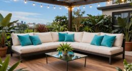
Can Color Blocking Be Used Effectively in Outdoor or Semi-Outdoor Spaces?
Yes, you can use color blocking effectively in outdoor or semi-outdoor spaces. Choose an exterior palette with bold, contrasting colors to create visual interest. Make certain to apply weatherproof finishes to protect your surfaces from the elements. Use color blocking to define different areas or highlight architectural features, enhancing the space’s overall aesthetic. Proper planning ensures your vibrant design remains durable and striking over time.
How Do I Maintain Color Integrity Over Time With Different Paints and Finishes?
Like a painter wielding a master’s brush, you can maintain color integrity by choosing high-quality paint with excellent durability and ensuring finish compatibility. Opt for paints designed for your specific space, whether matte, satin, or gloss, and apply a protective sealant if needed. Regular cleaning and touch-ups help preserve vibrant hues over time, ensuring your color blocking remains stunning as the years go by.
Conclusion
Now that you know the ins and outs of color blocking, you’re ready to transform your space with bold, stylish choices. Remember to plan carefully, balance hues, and don’t be afraid to get creative—think of it as your own modern art gallery. With patience and a keen eye, you’ll craft a room that’s as striking as a masterpiece. So go ahead, channel your inner Picasso and make your interiors truly stand out—no need to wait for the Renaissance!