
TL;DR

Get furniture and decor delivered free with Prime
- Fast, free delivery on millions of items
- Prime Video, Amazon Music and more included
- Member-only deals all year
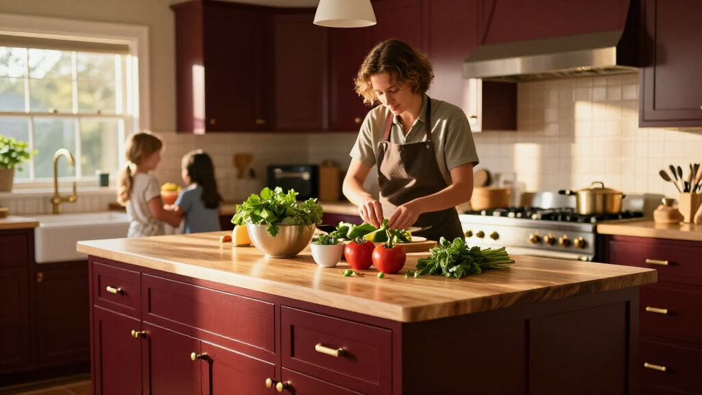
House Beautiful reports that some interior designers are moving away from white and cream kitchens in favor of reds ranging from burgundy to earthy scarlet. Designers quoted in the report recommend balancing red with warm neutrals, natural materials and texture; the article does not establish how widespread the shift is.
Some interior designers are turning to red kitchens as an alternative to the cream, ivory and white palettes that have long been common, according to a report by House Beautiful. The designers describe using shades from deep burgundy to earthy red, while recommending restrained color placement and complementary materials to keep the rooms balanced.
The report features projects by New York firms Opa Architecture and Lichten Architects, as well as British designer Uns Hobbs. In one city apartment by Opa Architecture, Benjamin Moore’s Classic Burgundy appears on a kitchen peninsula. Hobbs used deVOL’s Refectory Red in her own kitchen, while Lichten selected Benjamin Moore’s Red Parrot for a project for a family drawn to Victorian colors.
The designers do not describe red as a single look. Hobbs says she prefers deeper reds for a traditional, rich effect; Lichten says brighter tones can work if they do not appear artificial. The report presents these examples as designers’ choices and advice, not as evidence that most homeowners have changed their kitchens.
For combining the color with other finishes, Lichten advises paying attention to proportion and balance. In a project featured by House Beautiful, red lower cabinets are paired with gray upper cabinets. Hobbs suggests warm neutrals, granite, brass, marble and wood, while Opa Architecture’s Aria Jahanshahi emphasizes texture and supporting details that temper the dominant color.
How Red Changes the Kitchen Palette
The development matters to homeowners planning a renovation because cabinet and wall colors are prominent, costly-to-change design decisions. The report offers practical ways to use red without committing every surface to it: introduce the shade on a peninsula or lower cabinets, or set it against neutral cabinetry and natural finishes. Those are designers’ recommendations, not guarantees about resale value or how a color will suit every home.
The shift also reflects a design preference for kitchens that feel more personal and visually distinctive. Hobbs says people have grown bored with playing it safe, while Jahanshahi describes kitchens as places where family routines and socializing happen alongside cooking. Their comments explain their approach; the report provides no market survey or sales data showing how many households share it.
As an affiliate, we earn on qualifying purchases.
From White Kitchens to Warmer Reds
For years, white, ivory and cream have been familiar choices for kitchens. The House Beautiful report says some designers now see those palettes as tired and are considering cherry, tomato and brick tones instead. It does not identify a specific point when the change began or quantify its pace, so the development is best understood as a design trend described through selected professionals and projects.
Red is often associated with energy and appetite, a connection the report notes through the use of red in fast-food branding. But Jahanshahi cautions against reducing the kitchen to food preparation: he describes it as an informal gathering place for conversation and family life. The report raises, but does not substantiate, a possible connection between red kitchens and the popularity of appetite-suppressing medication; Jahanshahi rejects that explanation as too simple.
“People have become a little bored with playing it safe and want more personality in their homes.”
— Uns Hobbs, British interior designer, as quoted by House Beautiful
How Broad Is the Red Kitchen Shift?
The report does not provide surveys, renovation data or sales figures to show how common red kitchens are or whether neutral kitchens are losing popularity among homeowners overall. Its examples come from a small group of designers and selected projects. It also does not establish whether the trend is being driven by changing household habits, social media, product availability or another factor. The proposed link to appetite-suppressing medication is raised as speculation, not supported as an explanation.
What Homeowners May Watch
No industry forecast or follow-up milestone is included in the report. For readers considering the look, the next step is to evaluate specific shades and materials in the intended kitchen, rather than treating “red” as one uniform choice. The examples suggest starting with a smaller area, such as an island or lower cabinets, and comparing it with existing light and finishes before making a larger commitment.
Whether red becomes a lasting alternative to neutral kitchens remains unknown. More evidence would come from broader designer surveys, renovation data or later reporting that tracks which colors homeowners are choosing. For now, the article documents a design preference among the featured professionals, not a measured industry-wide change.
Key Questions
Are designers replacing neutral kitchens with red?
Some designers featured by House Beautiful are using red as an alternative to neutral palettes. The report does not provide data showing that designers or homeowners overall are abandoning neutrals.
Which red shades do the designers recommend?
Uns Hobbs favors deeper reds such as burgundy for a traditional feel. Kevin Lichten says brighter reds can work when they look earthy rather than artificial.
How can red be balanced in a kitchen?
The designers suggest using red on selected surfaces, pairing it with warm neutrals or gray, and adding materials such as wood, stone, brass and textured finishes.
Is the red kitchen trend linked to appetite-suppressing medication?
The report raises that possibility but does not establish a link. Opa Architecture’s Aria Jahanshahi says the kitchen’s role as a gathering place offers a broader reason for making it warm and expressive.
Source: rss
Fall Picks
fall essentials
As an affiliate, we earn on qualifying purchases.