TL;DR
Interior designers say olive green can work as a warm, nature-linked neutral, and recommend pairing it with brown, light natural fabrics, earthy reds, lavender, chalky pastels and muted blues. Their advice is based on design experience, not a new study or formal trend measurement.
Interior designers featured in a new home-design report recommend pairing olive green with brown, light natural fabrics, terracotta and other earthy reds, lavender, chalky pastels and muted blues, with inspiration from green paint colors. The advice gives homeowners practical palette options for using olive as a grounding color, while the designers caution that some bright or overly dark combinations can be harder to balance.

Get furniture and decor delivered free with Prime
- Fast, free delivery on millions of items
- Prime Video, Amazon Music and more included
- Member-only deals all year
Chicago-based designer Tom Stringer describes olive as a shade that can connect warm and cool colors and bring a sense of history to an interior. He says some homeowners are seeking rooms that feel lived-in rather than as spare as spaces dominated by gray and bright white. That is his interpretation of the renewed interest; the source provides no survey or market data measuring the trend.
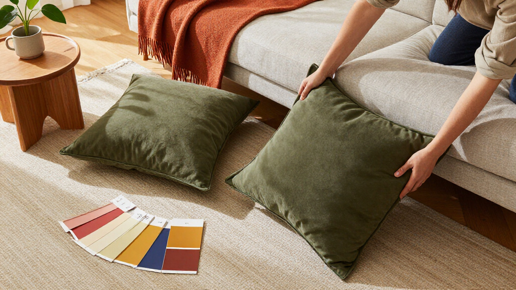
Brown and olive are presented as a natural match, particularly alongside oak, walnut or mahogany furniture, as part of an earthy home palette. Nashville designer Robin Rains says olive works with a range of wood tones, from a pale French chest to darker woods. The report also recommends lighter natural materials—such as linen, jute, seagrass and wicker—to soften olive’s richness, alongside coordinated green decor. Philadelphia designer Lucy O’Brien advises choosing lighter-toned fabrics even when their patterns have depth.
For more color, Rains recommends terracotta and cinnamon, whose muted, brown-based red tones complement olive without relying on bright holiday-style red and green. O’Brien favors lavender as a cooler counterpoint. Stringer’s preferred softer pairings include sky blue and petal pink in chalky, sun-faded shades. For blue, O’Brien suggests navy or slate rather than crisp cobalt, which she says can sit awkwardly against olive’s muddier character.
Olive Green at Home Colors that complement it
Interior designers treat olive as a grounding, nature-linked neutral. Softer shades and light materials can help balance its richness.
Build a balanced palette
Pair olive with earthy materials for warmth, or softer, cooler shades for contrast.
Brown and wood
Oak, walnut and mahogany bring out a natural, grounded feel.
Light fabrics
Linen, jute, seagrass and wicker soften olive’s richness.
Terracotta and cinnamon
Muted, brown-based reds add warmth without a bright red-green contrast.
Lavender and muted blues
Lavender, navy and slate offer cooler counterpoints to olive.
Chalky pastels
Sky blue and petal pink work best in softened, sun-faded shades.
Choose by tone and intensity
Designers favor softened, earthy pairings that balance olive’s muddy character.
- Light natural fabrics
- Muted terracotta or cinnamon
- Navy or slate blue
- Chalky, sun-faded pastels
- Crisp cobalt blue
- Bright red and green together
- Overly dark combinations
Test the palette in your room
The same colors can read differently with another olive shade, material or amount of daylight.
Compare olive with your existing furniture, finishes and fabrics.
Test a natural textile, wood finish, terracotta, lavender or muted blue.
Judge the samples together under your room’s own lighting.
Building a Balanced Olive Palette
The recommendations matter to homeowners because olive can be treated as a flexible base color, rather than a shade that requires an entirely green room or a single matching accent. Brown and woven materials emphasize a natural, grounded look; terracotta adds warmth; lavender and muted blues introduce contrast; and pale pastels offer a softer effect.
The advice also points to a practical design distinction: undertone and intensity can matter as much as the color name. The designers favor softened, earthy shades and suggest using brighter colors with restraint. These are professional opinions, not rules that guarantee a particular result; lighting, materials and the exact olive shade can change how a palette reads in a room.
Products Worth Considering

Dyson V8 Cordless Vacuum

TCL 65-Inch 4K UHD Smart LED TV (65S425)

Dyson Cyclone V10 Origin Cordless Vacuum
As an affiliate, we earn on qualifying purchases.
Why Designers Favor Olive
The source describes color preferences as cyclical, citing changing interest in greens such as chartreuse and sage. It presents olive as a shade with longer-lasting appeal because of its connection to nature and its ability to work across different interior styles. No dates or sales figures are provided to establish how widespread or recent the shift is.
Stringer links interest in olive to a desire for interiors with a collected, lived-in feel. Rains connects it with renewed interest in brown furniture. Those comments offer designers’ explanations for the color’s appeal, rather than independently verified accounts of consumer behavior. The report’s focus is how to combine olive with other colors and materials, not a measured forecast of what will be fashionable next.
“Olive has warmth and history. It feels collected, as if it’s been there a while.”
— Tom Stringer, Chicago-based interior designer
How Broad Is the Olive Trend?
The source does not provide a publication date, sales figures, survey results or other data showing how many homeowners are choosing olive green. Claims that interest is rising are attributed to the designers’ observations, so the scale and duration of any trend remain unverified.
The article also does not prescribe specific paint codes, proportions or lighting conditions. A combination that works in one room may look different with another olive shade, surface finish or amount of daylight. The suggested pairings are guidance, not tested outcomes, and the source does not identify a single palette as best for every home.
Choosing Colors for Your Room
Homeowners considering olive can start by comparing samples in the room where they will be used, alongside existing furniture and fabrics. A lighter natural textile, a wood finish or a small accent in terracotta, lavender or muted blue can help test the palette before a larger commitment. The source offers no announced follow-up research or specific next milestone; the practical next step is to judge the colors together under the room’s own lighting.
Key Questions
Which colors do designers recommend with olive green?
The designers recommend brown, light natural tones, terracotta and cinnamon, lavender, chalky pastels, and muted blues. Their suggestions are based on design experience rather than a formal comparison study.
What kind of blue works with olive green?
Designer Lucy O’Brien recommends navy or slate blue, which have more depth or smokier undertones. She cautions that crisp shades such as cobalt may be difficult to balance with olive.
Can olive green be paired with red?
Yes, the report’s designers suggest muted, earthy reds such as terracotta and cinnamon. They describe these as softer options than bright red; a vivid accent can be used sparingly, according to the report.
Why pair olive with light fabrics?
O’Brien says lighter fabrics can soften the richness of olive. Examples in the report include linen, jute, seagrass and wicker, with the choice depending on the room and its existing materials.
Source: veranda.com