

To do monochromatic color schemes right, start by choosing a primary hue that matches your mood or message. Then, incorporate shades, tints, and tones to add depth and variation, making your design visually interesting without clashing. Balance contrast and brightness carefully to guide viewers’ focus, and use textures or patterns for added dimension. Keep your palette consistent yet dynamic, and explore ways to refine your approach for stunning results—more tips await as you continue.
Key Takeaways
- Choose a primary hue that aligns with the mood you want to evoke, then build your palette with shades, tints, and tones.
- Maintain balance by adjusting brightness and saturation to create depth and visual interest.
- Incorporate textures and patterns subtly to add layers without overwhelming the monochromatic scheme.
- Ensure proper contrast and lighting to guide focus and enhance the overall harmony of your design.
- Test your palette across different mediums and devices to ensure consistent, accurate color reproduction.

Nicpro Acrylic Paint Set, 24 Colors with 12 Brushes & Palette, Non Toxic Art Supplies Kit for Painting Fabric, Canvas, Clay, Wood, Rock & Ceramic, Easter Eggs, Rich Pigments for Beginners, Students & Professional Artists (2 oz, 60 ml)
Artist-Quality Acrylic Paint Set: This set features 24 premium acrylic colors, each in a 60ml/2oz bottle. It also…
As an affiliate, we earn on qualifying purchases.
As an affiliate, we earn on qualifying purchases.
Understanding the Basics of Monochromatic Color Schemes
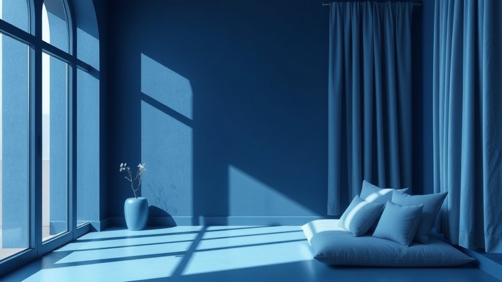
Monochromatic color schemes revolve around using variations of a single hue to create a cohesive and harmonious look. This approach emphasizes color harmony by blending different shades, tints, and tones of one color, resulting in a unified appearance. It simplifies your design, offering visual simplicity that’s easy to grasp and pleasing to the eye. With fewer colors to manage, you can focus on balance and contrast within the same hue, making your space or artwork feel intentional and refined. Monochromatic schemes are versatile and timeless, allowing you to achieve depth and interest without overwhelming the viewer. Additionally, understanding how to maximize space and organization can help enhance the overall aesthetic and functionality of your environment. By understanding this basic principle, you set a strong foundation for creating elegant, unified visuals that feel both soothing and sophisticated.

The Complete Color Harmony, Pantone Edition: Expert Color Information for Professional Results
The Complete Color Harmony: Pantone Edition
As an affiliate, we earn on qualifying purchases.
As an affiliate, we earn on qualifying purchases.
Choosing the Right Primary Color and Its Variations

Choosing the right primary color is essential because it sets the tone for your entire monochromatic scheme. To achieve a strong color harmony, pick a primary color that resonates with the mood you want to create. Consider how the color’s emotional impact aligns with your project’s purpose. Once you’ve selected your primary color, explore its variations—shades, tints, and tones—to add depth and interest. These variations help balance the scheme without losing cohesion. Focus on maintaining harmony by adjusting brightness and saturation to create a seamless flow across your design. Remember, the primary color anchors your scheme, so choose one that reflects your desired atmosphere and complements the space or message you want to convey. Incorporating color psychology can further enhance the emotional resonance of your monochromatic palette.

TSSART 3 Pack White Artist Tape – Masking Artists Tape for Drafting Art Watercolor Painting Canvas Framing – Acid Free 0.6inch Wide 540FT Long Total
RESIDUE-FREE : Removed and repositioned without leaving a sticky residue. Can be written so as to create removable…
As an affiliate, we earn on qualifying purchases.
As an affiliate, we earn on qualifying purchases.
Incorporating Shades, Tints, and Tones for Depth

To create visual interest and depth in your monochromatic color scheme, incorporating shades, tints, and tones is essential. Shade variation, achieved by adding black, darkens your base color and enhances color depth, making your palette more dynamic. Tints, created by mixing in white, introduce lighter elements that brighten the overall design without losing harmony. Tones, which result from adding gray, soften the color and add subtle complexity. Combining these variations allows you to build layers within your monochromatic scheme, giving it richness and dimension. This approach prevents your design from appearing flat or monotonous. By skillfully incorporating shades, tints, and tones, you can guide the viewer’s eye and evoke the desired mood, all while maintaining a cohesive, sophisticated look.

COLOR MUSE Colorimeter – Mobile Color Matching Tool – Instantly identify closest matching paint colors, products, and digital color values
SIMPLE AND PORTABLE – Scan any flat surface to find the closest matching paint colours and products in…
As an affiliate, we earn on qualifying purchases.
As an affiliate, we earn on qualifying purchases.
Balancing Contrast and Brightness for Visual Interest

You can create visual interest by adjusting brightness levels to highlight key areas and add dimension. Balancing contrast helps guide the viewer’s eye and establish a clear visual hierarchy. When done right, it makes your monochromatic scheme more engaging and easy to navigate. Additionally, understanding the importance of lighting in Halloween decorations can enhance the overall atmosphere and accentuate your color choices.
Adjusting Brightness Levels
Adjusting brightness levels is essential for creating a balanced monochromatic color scheme that captures viewers’ attention. Proper brightness enhances lighting effects, making your design more dynamic and engaging. By fine-tuning brightness, you control the contrast between lighter and darker shades, which influences mood creation. Bright areas can evoke energy and optimism, while darker tones add depth and sophistication. Use subtle adjustments to highlight key elements without overpowering the overall harmony. Keep in mind that too much brightness can flatten the composition, while too little can make it dull. Experiment with varying levels to find the perfect balance that maintains visual interest and reinforces the intended emotional tone. Mastering brightness adjustments guarantees your monochromatic scheme remains compelling and visually cohesive. Additionally, understanding color harmony helps in selecting the right contrast levels to achieve a pleasing and balanced visual effect.
Creating Visual Hierarchy
Creating a strong visual hierarchy in a monochromatic color scheme hinges on balancing contrast and brightness to guide viewers’ attention effectively. To achieve this, focus on subtle color differentiation, using varying shades, tints, and tones to emphasize key elements. Higher contrast areas naturally draw the eye first, so make important information stand out by increasing brightness or darkness slightly. For secondary elements, lower contrast helps create a sense of depth and hierarchy without overwhelming the viewer. Consistently applying contrast and brightness variations guarantees your design feels cohesive while still directing focus. Remember, successful visual hierarchy relies on intentional color differentiation; it’s about guiding the viewer smoothly through your content without clutter or confusion. Incorporating psychological research into your design choices can further enhance viewer engagement and comprehension.
Using Texture and Patterns to Add Dimension

Texture and patterns are powerful tools for adding depth and visual interest to monochromatic color schemes. By incorporating texture variety, you create layers that catch the eye and prevent the design from feeling flat. Different textures—smooth, rough, matte, glossy—offer subtle contrasts that enhance the overall look. Pattern integration also plays a vital role; it breaks up solid areas and introduces focal points without disrupting the monochromatic palette. Mix delicate patterns with bold ones to maintain balance and harmony. When used thoughtfully, these elements help you achieve a dynamic, engaging space or design that feels rich and cohesive. Keep in mind that moderation is key: too many textures or patterns can become overwhelming, so select and combine them intentionally for maximum impact. Additionally, understanding how market volatility affects precious metals can guide you in choosing the right textures and patterns to reflect stability and security in your design.
Applying Monochromatic Schemes Across Different Mediums

When applying monochromatic schemes across various mediums, you need to consider digital design adaptation to ensure colors look consistent on screens. You also have to maintain print material accuracy, so your colors match your digital choices. Focusing on these points helps create a seamless visual experience regardless of the medium. Additionally, understanding how color accuracy impacts overall image quality can guide you in selecting and calibrating your color palette effectively.
Digital Design Adaptation
Applying monochromatic color schemes across different digital mediums requires careful adjustment to maintain visual harmony and impact. You need to contemplate typography choices carefully, as font style and weight can influence how the color scheme’s mood is perceived. For instance, bold typefaces can enhance a strong, confident feel, while lighter fonts evoke elegance and delicacy. Additionally, understanding color psychology helps you adapt the scheme effectively; certain shades may evoke specific emotions, so you should tweak hues to suit the platform’s purpose. Screen brightness, contrast, and resolution also play roles in how colors appear, so testing your monochromatic palette across devices ensures consistency. By thoughtfully balancing typography and color psychology, you create a cohesive, engaging digital experience that resonates across all platforms.
Print Material Consistency
To guarantee your monochromatic color schemes remain consistent across various print materials, you need to pay close attention to color reproduction and material choices. Print material consistency is essential to maintain color harmony and ensure your design looks cohesive everywhere. Different paper types and finishes can alter how colors appear, so choose high-quality, coated papers that accurately reflect your chosen monochrome palette. When printing, work closely with your printer to match color profiles and avoid unwanted shifts. Be mindful of lighting conditions and viewing angles, which can affect perception. material choices can significantly influence how your monochromatic scheme appears in print, making this an important aspect to consider. Consistent color reproduction across mediums builds brand recognition and reinforces your visual message. By carefully selecting materials and managing print processes, you ensure your monochromatic scheme stays harmonious, professional, and impactful.
Common Mistakes to Avoid When Using Monochromatic Palettes

Using a monochromatic palette might seem straightforward, but it’s easy to fall into common pitfalls that can diminish its effectiveness. One major mistake is allowing color clash, which happens when different shades don’t harmonize well, creating visual discord. To prevent this, choose shades that complement each other and maintain balance. Another common error is overuse—relying too heavily on a single hue can make your design dull or monotonous, losing viewer interest. To keep your palette engaging, introduce subtle variations in tone, saturation, and brightness. Be mindful of contrast levels to ensure elements stand out without overwhelming the viewer. Additionally, understanding color harmony principles can help in selecting shades that work well together. By avoiding these pitfalls, you’ll create a cohesive, visually appealing monochromatic scheme that enhances your overall design.
Tips for Transitioning Monochromatic Designs From Concept to Reality

Turning your monochromatic concept into a finished design can be challenging, but planning and preparation make the process smoother. Start by understanding color psychology to choose shades that evoke the right mood and emotional response. Use the monochromatic versatility to create visual interest by varying saturation and brightness, ensuring your design isn’t flat. Test different shades in real-world settings to see how they interact with lighting and surroundings. Incorporate textures or patterns subtly to add depth without disrupting the harmony. Keep your palette consistent, but don’t be afraid to introduce small accents for contrast. This approach helps your design feel cohesive yet dynamic, making the progression from concept to reality seamless and effective. Considering electric bike features and accessories can also inspire innovative color choices that align with modern design trends.
Frequently Asked Questions
How Can Monochromatic Schemes Evoke Different Moods?
You can evoke different moods with monochromatic schemes by adjusting hue, saturation, and brightness. A soft, pastel palette creates a calm, relaxing vibe, while bold, saturated tones evoke energy and excitement. Light shades promote serenity, whereas darker shades add drama or intimacy. This variation in emotional impact allows you to craft the perfect atmosphere, making your space or design feel precisely how you want through mood variation in your monochromatic color scheme.
What Are the Best Tools for Selecting Monochromatic Colors?
Ever find yourself stuck choosing perfect shades? The best tools for selecting monochromatic colors are a color wheel and digital palettes. The color wheel helps you see harmonious shades and tints, while digital palettes from apps like Adobe Color or Coolors make experimenting easier. These tools streamline your process, ensuring you pick cohesive hues effortlessly, so your design feels balanced and intentional.
How Do Monochromatic Schemes Perform in Different Lighting Conditions?
In different lighting conditions, monochromatic schemes can look stunning or dull, depending on lighting variability. You should test your colors under various lights to see how they affect color perception. Bright lighting may enhance subtle shades, while dim or warm lighting can mute or distort them. Adjust your scheme accordingly, ensuring the colors maintain their harmony and impact across all lighting environments for a consistent and appealing look.
Can Monochromatic Palettes Be Effective in Branding and Marketing?
Did you know that 84% of consumers say that color influences their purchasing decisions? Monochromatic palettes can be highly effective in branding and marketing because they leverage color psychology to evoke specific emotions. By creating visual harmony, you make your brand memorable and cohesive. When used thoughtfully, these schemes help establish a strong, consistent identity that resonates with your audience, boosting recognition and trust.
How to Adapt Monochromatic Designs for Accessibility and Inclusivity?
You can adapt monochromatic designs for accessibility by adjusting contrast levels to guarantee text stands out clearly against backgrounds. Use contrast adjustments to improve readability and prevent eye strain. Additionally, prioritize font accessibility by choosing legible typefaces and appropriate sizes. Incorporate visual cues like patterns or textures to differentiate elements without relying solely on color, making your design more inclusive for users with visual impairments.
Conclusion
With a monochromatic palette, you craft a seamless visual journey, like walking through a forest of varying shades and textures. By carefully balancing tones and adding subtle patterns, you create depth that invites the eye to explore. When you master these techniques, your designs become immersive landscapes of harmony and contrast. Embrace the simplicity, and watch your creations come alive with elegance, drawing viewers into a mesmerizing monochrome world of endless possibilities.