Color Harmony: Split-Complementary Vs Triadic Schemes
Unlock the differences between split-complementary and triadic color schemes to elevate your designs—discover which approach truly makes your projects stand out.
An alluring guide to pairing chartreuse with rich golds and greens reveals vibrant combinations that elevate your design—discover how to create stunning harmony.
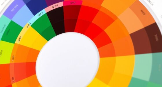
Color Pairing Rules: Triadic, Analogous, Complementary
Keen to master color pairing rules like triadic, analogous, and complementary schemes? Discover how these strategies can transform your designs and captivate your audience.
I’m here to help you master boho color drenching with monochrome palettes that create stunning, harmonious outfits—discover how to elevate your style today.
Aiming to create a visually appealing space, understanding contrast versus harmony in room design reveals how to balance excitement and calm effectively.