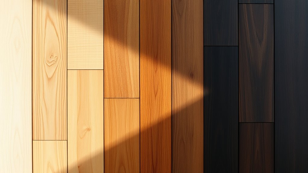

To harmonize light, medium, and dark wood tones, focus on balancing color and grain patterns. Use your dominant wood as the foundation, then add lighter and darker accents to create depth and contrast. Incorporate similar finishes and textures to unify the look, and select decor that complements the overall palette. Avoid clashes by maintaining consistent grain flow and color harmony. Keep exploring, and you’ll discover more tips to perfect your wood tone balance.
Key Takeaways
- Balance light, medium, and dark wood tones to create visual depth and contrast within the space.
- Use grain patterns and textures to enhance harmony and prevent visual clutter among different wood tones.
- Incorporate consistent finishes and stain techniques to unify varying wood colors and maintain cohesive style.
- Consider the dominant wood tone that reflects your overall aesthetic and complements existing elements.
- Add decor and accessories that echo or complement the wood tones for a polished, harmonious look.

SEISSO Wood Repair Kit Touch up Paint Restore Any Wooden Furniture Stain, 12 Colors Cover Surface Scratch for Wooden Floor Table, Filler Furniture Paint Oak, Cabinet, Door, Veneer, Walnut
RICH INCLUSIONS: This wooden filler set comprises 12 unique colors of resin repair fillers, offering a hassle-free solution…
As an affiliate, we earn on qualifying purchases.
As an affiliate, we earn on qualifying purchases.
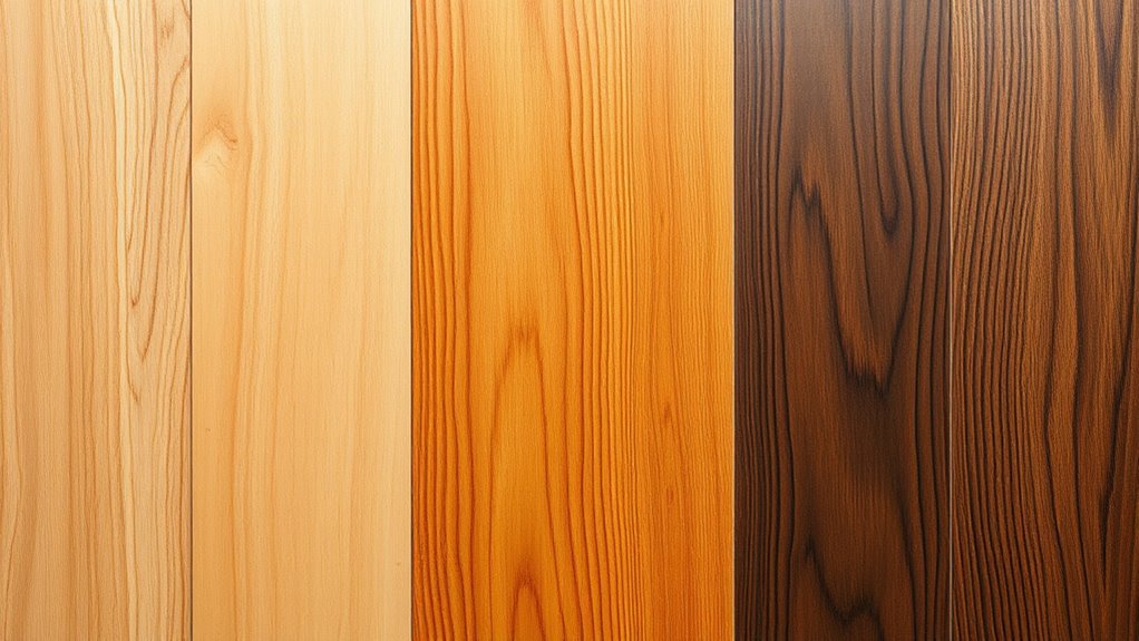
Understanding the Characteristics of Different Wood Tones
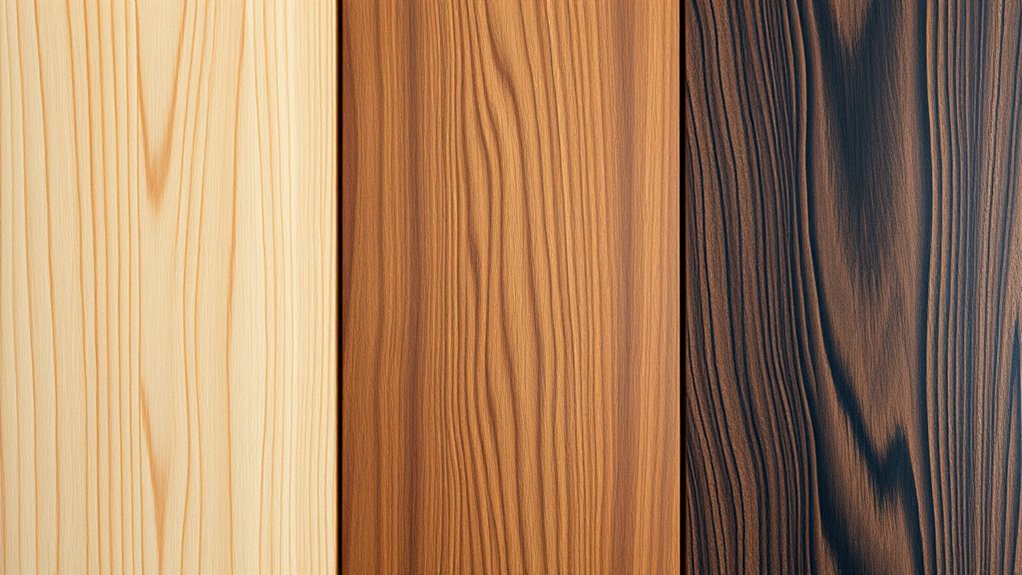
Understanding the characteristics of different wood tones is essential if you want to create a harmonious and visually appealing space. Grain patterns vary widely between species, influencing the overall texture and movement in your design. Some woods display tight, straight grains, offering a sleek look, while others showcase bold, wavy patterns that add character. Equally important is considering wood durability; harder woods like oak and maple resist dents and scratches, making them suitable for high-traffic areas. Softer woods, such as pine, are easier to work with but may require more careful handling. By understanding these traits, you can select wood tones that complement each other, ensuring your space feels balanced and cohesive. Recognizing grain patterns and durability helps you make informed choices for both beauty and longevity.

Coloch 12 Pieces Wood Appliques Onlays, Decorative Wooden Applique Trim Carved Unpainted DIY Onlay for Bed, Door, Cabinet, Dresser, Wardrobe, Furniture Decoration, 2 Sizes
Coloch wood appliques set contains 2 long appliques and 10 corner appliques. The size of the long ones…
As an affiliate, we earn on qualifying purchases.
As an affiliate, we earn on qualifying purchases.
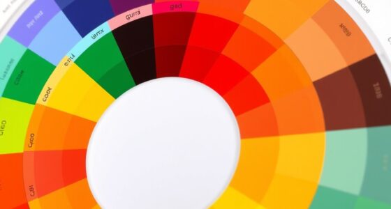
The Importance of Color Balance in Wood Combinations
Balancing wood colors is key to achieving visual contrast and making your design pop. When you combine different tones thoughtfully, you create depth and keep the space feeling harmonious. Paying attention to color balance guarantees your wood choices work together seamlessly. Incorporating multi-functional furniture can enhance space efficiency while maintaining aesthetic balance in your design.
Visual Contrast Enhancement
Achieving visual contrast in wood combinations is essential for creating dynamic and appealing designs. It highlights different wood grain patterns and enhances color saturation, making each piece stand out. To balance contrast, consider pairing lighter woods with darker ones, emphasizing the texture and variation in grain. Use the following table to guide your choices:
| Light Wood | Medium Wood | Dark Wood |
|---|---|---|
| Soft oak | Cherry | Walnut |
| Maple | Teak | Mahogany |
| Birch | Hickory | Ebony |
This table demonstrates how combining various shades enhances visual interest while maintaining harmony. Remember, contrast isn’t just about color; it’s also about texture and grain pattern. Properly balancing these elements ensures your design remains cohesive yet striking. Incorporating material durability considerations can also help ensure your wood design remains attractive over time.
Creating Depth and Harmony
Creating depth and harmony in wood combinations hinges on mastering color balance, which guides the eye smoothly across your design. Achieving this involves paying attention to grain patterns and wood grain variations that add visual interest. To create a cohesive look:
- Mix light and dark woods to establish contrast without overwhelming.
- Consider grain patterns—straight or wavy—to complement or contrast each other.
- Balance medium tones with lighter and darker shades for depth.
- Use consistent wood grain flow to maintain harmony across surfaces.

Rubio Monocoat Wood Stain & Finish Sample – Walnut | Oil Plus Part A | Quick-Dry, Eco-Friendly Linseed Wood Oil for Indoor Use | Ideal for Sampling Oil Plus 2C & Touch Ups | 20 mL
ONE LAYER APPLICATION: Test the simple 1 layer application process to protect & color your interior wood with…
As an affiliate, we earn on qualifying purchases.
As an affiliate, we earn on qualifying purchases.
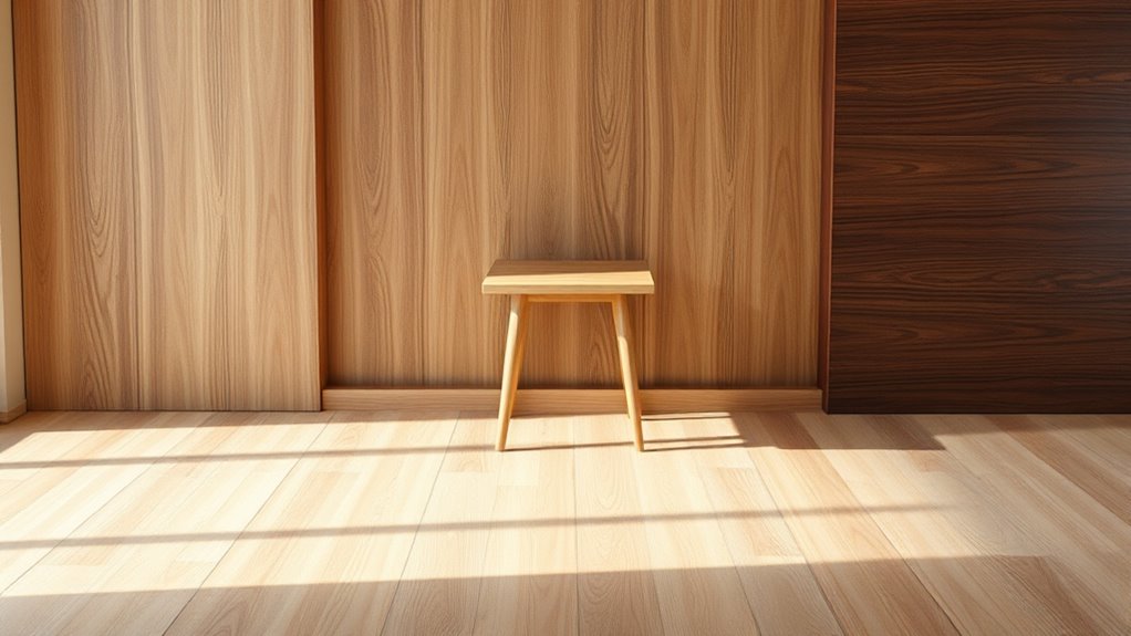
Tips for Selecting a Dominant Wood Tone in Your Space
Choosing a dominant wood tone sets the foundation for your entire space, so it’s important to pick one that complements your style and existing elements. Consider the wood grain patterns; a prominent grain can add texture and visual interest, while a smoother grain offers a sleek look. Think about wood durability too—hardwoods like oak or maple withstand daily use, making them ideal for floors and furniture. Lighter tones can brighten a room and create an airy feel, whereas darker woods add warmth and sophistication. Balance is key: select a tone that harmonizes with your other design features but still stands out as the focal point. By carefully choosing your dominant wood tone, you establish a cohesive, inviting environment that reflects your personal style.
Flybunny Repair Pen Wooden Furniture Floor Scratch Repair Markers and Wax Sticks Set of 21 for Stains, Scratches, Wood Floors, Tables, Desks, Carpenters, Bedposts, Touch Ups, and Cover Ups
Product Details: 21 pieces furniture repair kit, 10 touch up markers and 10 wax sticks with 1 sharpener.It…
As an affiliate, we earn on qualifying purchases.
As an affiliate, we earn on qualifying purchases.
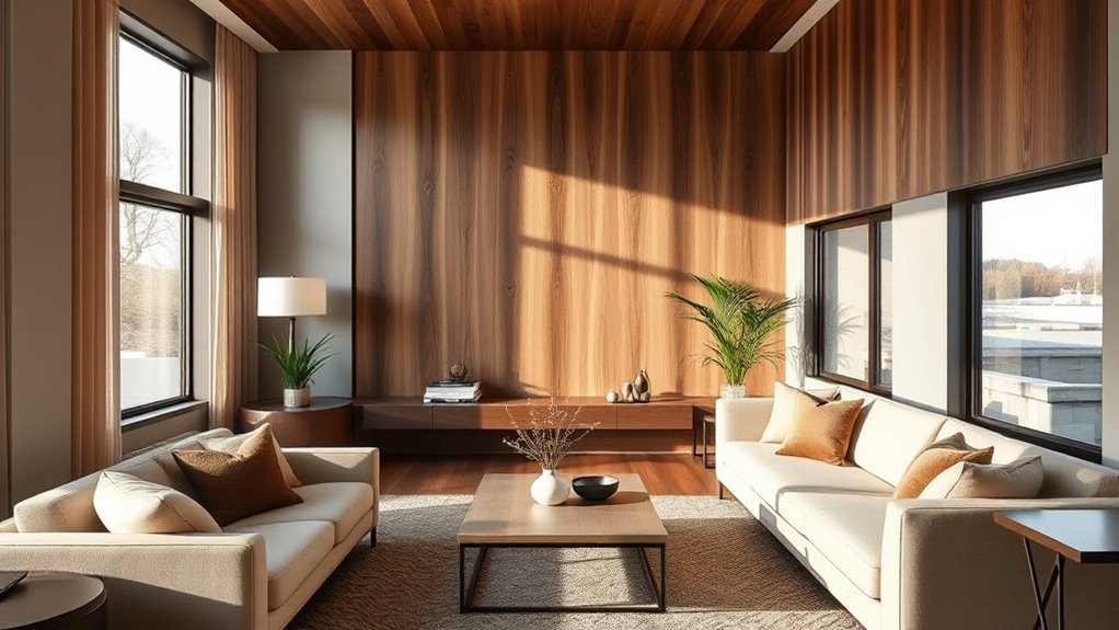
Creating Visual Harmony With Complementary and Contrasting Woods
Once you’ve selected a dominant wood tone, balancing it with other woods becomes key to achieving visual harmony. To do this effectively, consider how wood species and grain patterns interact. Mixing contrasting grain patterns—smooth with highly figured—adds visual interest and depth to the space. Pairing rustic and refined wood species with different tones, like oak and walnut, creates a balanced look that enhances the farmhouse aesthetic. Use contrasting woods in small doses, such as a dark tabletop with lighter chairs, to create focal points and prevent visual overload. Be mindful of grain directions; aligning or contrasting them can influence the overall flow and harmony. Incorporating different textures and finishes can also contribute to a layered, cohesive environment. This approach ensures your space feels cohesive, whether you’re combining light, medium, or dark woods. Playing with grain patterns and wood species allows you to craft a layered, harmonious environment.
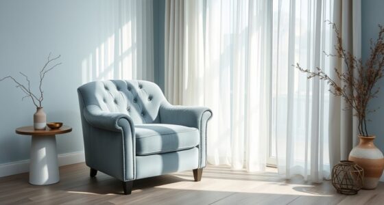
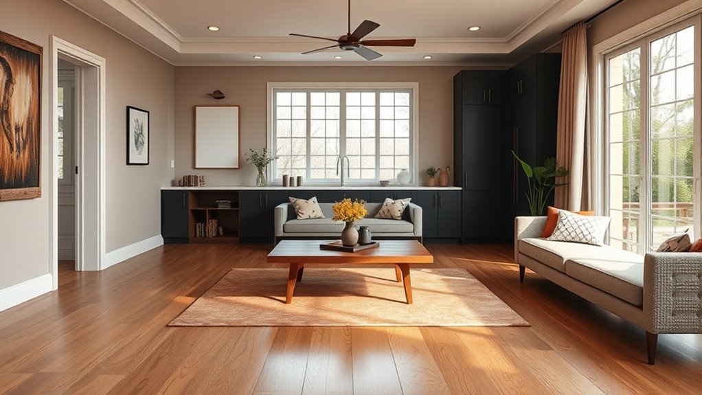
Incorporating Neutral Elements to Balance Varied Wood Shades
Incorporating neutral elements is an effective way to balance varied wood shades and create a cohesive look. A neutral palette, such as whites, beiges, or soft grays, acts as a calm backdrop that harmonizes different wood tones without overpowering them. To add interest, include subtle color accents through textiles, artwork, or decorative accessories. These accents provide visual interest while maintaining overall harmony. Neutral elements help soften contrast, making light, medium, and dark woods feel more connected. When you choose neutral colors, you create a versatile foundation that allows your wood tones to stand out naturally. Incorporating wall organization systems can further enhance this balance by introducing functional yet stylish elements to your space. This approach ensures your space feels balanced, inviting, and thoughtfully curated, no matter the mix of wood shades you incorporate.
Using Finishes and Textures to Enhance Wood Tone Integration

Choosing the right finishes can bring harmony to different wood tones, making them feel cohesive. By enhancing texture variations, you add visual interest and depth to your space. Balancing tone shifts guarantees your overall design feels seamless and well-integrated. Incorporating finish techniques that complement various wood tones can further unify the look and create a more polished appearance.
Choosing Complementary Finishes
Selecting the right finishes and textures can considerably enhance how wood tones harmonize in a space. To achieve this, focus on matching grain patterns and stain colors for a seamless look. Here are key tips:
- Match grain patterns to create visual consistency across furniture and flooring.
- Use stain matching to ensure different wood pieces complement each other, avoiding stark contrasts.
- Select finishes that highlight natural grain textures, adding depth and richness.
- Consider subtle variations in tone to prevent overpowering or clashing, especially with medium and dark woods.
- Incorporate understanding of interior design basics to effectively blend beauty with practicality in your finishing choices.
Enhancing Texture Variations
Building on the foundation of matching finishes and grain patterns, enhancing texture variations can add visual interest and depth to your wood tones. You can achieve this by playing with surface textures like matte, gloss, or satin finishes, which influence how light interacts with the wood. Incorporate subtle changes in surface textures to highlight different grain patterns, creating a dynamic look. For example, a smooth, polished surface accentuates the grain, while a distressed or brushed finish adds tactile dimension. These variations help emphasize the natural character of each wood tone, making the overall design more engaging. By thoughtfully selecting finishes that contrast or complement the grain patterns, you create a layered, harmonious effect that elevates your space’s aesthetic. Texture manipulation techniques can further enhance the visual depth and tactile experience of your wood surfaces.
Balancing Tone Transitions
To create seamless wood tone progressions, you need to carefully manage how finishes and textures interact across different surfaces. This involves balancing the grain pattern and wood grain to guarantee smooth transitions. Here are key strategies:
- Use similar finishes to unify different tones, emphasizing consistent gloss or matte effects.
- Apply stain techniques that highlight or mute grain patterns, creating visual harmony.
- Incorporate textured finishes to complement the wood grain, smoothing abrupt changes.
- Adjust the application layer to gradually shift from light to dark areas, aligning grain patterns smoothly.
- Ensuring accuracy and consistent documentation throughout the process can help prevent discrepancies and facilitate smooth financial settlements in complex projects.
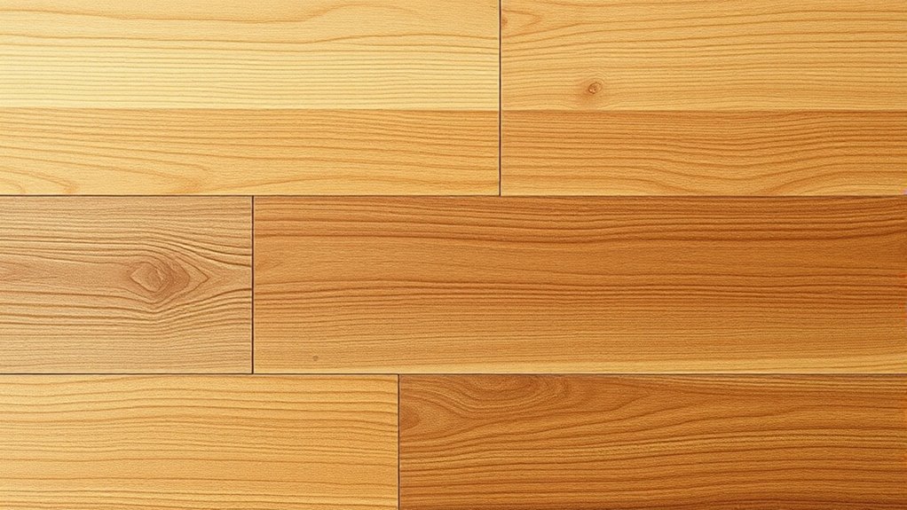
Practical Examples of Mixing Light, Medium, and Dark Woods
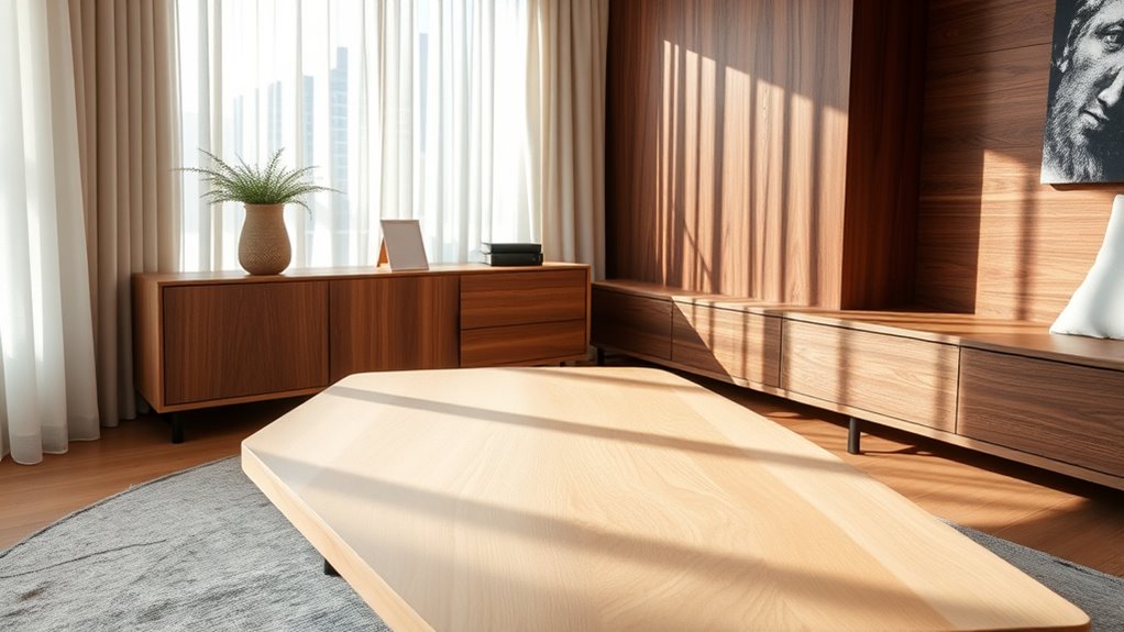
Mixing light, medium, and dark woods can create a stunning, balanced look when done thoughtfully. Pay attention to grain patterns; contrasting or complementary grains add visual interest. For example, pairing a smooth, straight-grain light oak with a darker, more textured walnut can highlight differences while maintaining harmony. Moisture content is key—guarantee all woods are properly dried to prevent warping or gaps over time. Combining woods with similar moisture levels minimizes issues and ensures a cohesive finish. Use light woods like maple or ash for accents or furniture, medium woods like cherry or teak for main pieces, and dark woods such as mahogany or ebony for depth or accents. This approach creates depth and contrast without overwhelming the space, resulting in a refined, harmonious aesthetic. Proper wood drying techniques are essential to prevent issues like warping and ensure the longevity of your project.
Common Mistakes to Avoid When Combining Different Wood Hues
Are you aware of the common pitfalls when combining different wood hues? One mistake is ignoring wood grain patterns, which can clash and disrupt visual harmony. Second, inconsistent stain application can create uneven color, making pieces look mismatched. Third, mixing woods with vastly different tones without a unifying element can look chaotic. Fourth, neglecting to consider the overall style may lead to an eclectic look that feels disjointed. Always pay attention to grain patterns to maintain flow. Make certain stain consistency to achieve a cohesive appearance. Avoid combining woods that are too contrasting without a deliberate design plan. Additionally, understanding remote work benefits can inspire a more adaptable and harmonious home environment. By being mindful of these mistakes, you’ll create a balanced, harmonious space where different wood hues complement each other seamlessly.
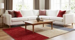
Maintaining a Cohesive Look Through Accessories and Decor

Even when you’ve carefully selected and matched your wood tones, accessories and decor play a crucial role in maintaining a cohesive look. Focus on fabric patterns that complement your wood hues; for example, neutral or subtle patterns work well with darker woods, while lighter tones pair nicely with softer, more delicate fabrics. When choosing artwork, consider pieces that echo your wood tones or incorporate colors that harmonize with your overall palette. Consistency in style and color helps unify the space, preventing it from feeling disjointed. Avoid mixing too many contrasting patterns or overly vibrant artwork that can clash with your wood tones. Instead, select decor items that enhance your chosen palette, creating a balanced, harmonious environment that feels thoughtfully curated. Paying attention to color harmony can further ensure your accessories seamlessly tie everything together.
Frequently Asked Questions
How Do Natural Lighting Conditions Affect Wood Tone Perception?
Natural light profoundly influences how you perceive wood tones, making them appear warmer or cooler depending on the time of day. During the day, natural light highlights the wood’s true color, while artificial lighting can alter its hue, sometimes making it look dull or overly warm. You should evaluate your wood under both natural and artificial lighting to verify harmony and consistency, especially when choosing or matching wood tones in your space.
Can Mismatched Wood Tones Affect the Longevity of Furniture?
Ever wondered if mismatched wood tones can impact your furniture’s longevity? They generally won’t, but poor wood tone harmony can make furniture look mismatched and less appealing over time. While mismatched tones won’t weaken the material, they might affect your satisfaction and perceived quality. To guarantee your furniture stays beautiful longer, choose wood tones that complement each other, enhancing both aesthetics and overall harmony in your space.
Are There Specific Wood Types Best Suited for Mixing in a Room?
You should choose wood types with complementary finishes for a cohesive look. Opt for classic wood pairing options like oak with walnut or cherry with maple, as their finishes often match well. Look for finish compatibility to guarantee the textures and sheen blend seamlessly. By doing so, you create a balanced, stylish space. Remember, mixing different wood types can be visually appealing when you prioritize finish compatibility and thoughtful wood pairing.
How Does Room Size Influence Wood Tone Choices?
If your room feels like a vast canyon or a cozy nook, your wood tone choices matter big time. In large spaces, go for medium to dark woods to create warmth and prevent the room from feeling empty. Small rooms thrive with light tones, which maximize space and keep the area feeling open. Focus on space optimization and tonal consistency to make your room look balanced and inviting, no matter its size.
What Tools Can Help Visualize Wood Tone Combinations Before Installation?
You can use digital visualization tools and mood board apps to see how different wood tone combinations will look before installation. These tools let you upload images, experiment with various shades, and create realistic previews of your space. By visualizing your options, you can easily compare light, medium, and dark wood tones, ensuring your choices harmonize perfectly with your room’s style and size.
Conclusion
When mixing wood tones, trust the idea that balance creates harmony. Combining light, medium, and dark woods can elevate your space, but only if you consider contrast and complementarity. Think of it like a well-balanced diet—diversity enhances the overall appeal. Embrace neutral elements and thoughtful accessories to tie everything together. Ultimately, experimenting with these principles helps you achieve a cohesive, stylish look that feels intentional and inviting.