
To shift from neutrals to moody tones smoothly, start by introducing rich, darker hues alongside your existing neutrals gradually. Use complementary textures like velvets and heavy woods to enhance the mood, and incorporate accent colors and metallic finishes for cohesion. Adjust lighting to warm, dim settings to create a cozy atmosphere. This seamless flow makes your space feel sophisticated and layered—continue exploring to discover more tips on achieving a balanced, moody aesthetic.
Key Takeaways
- Gradually introduce moody hues alongside neutrals to create a seamless, cohesive color transition.
- Use richer textures like velvets and heavier woods to enhance the depth of moody palettes.
- Incorporate accent colors and metallics to unify and complement both neutral and darker tones.
- Adjust lighting to warm, dim settings that enhance the cozy, moody atmosphere and highlight color shifts.
- Consider seasonal influences by shifting from light neutrals to richer, deeper shades aligned with seasonal mood changes.

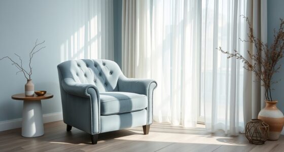
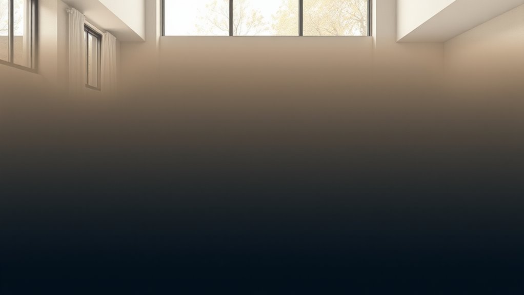
Changing palettes can be a powerful way to refresh your designs and create smoother visual flows. When you shift from neutrals to moody tones, you’re not just changing colors—you’re altering the entire mood and energy of your space or project. To do this seamlessly, understanding color harmony is essential. color harmony ensures that your new palette feels cohesive and visually appealing, even as you introduce darker or more intense shades. It’s about finding the right balance so your design doesn’t feel jarring or disconnected. As seasons change, so do our perceptions of color and mood. Seasonal shifts naturally influence our color choices, making it a perfect time to transition from neutral tones—like beige, ivory, and soft gray—to richer, moodier hues such as deep blues, charcoal, or emerald green. These darker shades evoke a sense of intimacy and sophistication, perfect for creating a cozy atmosphere or adding depth to your design.
When you begin transitioning your palette, start by gradually introducing moody colors alongside your neutrals. This slow blend helps your eye adapt without feeling overwhelmed. For example, if your neutral base is warm beige, add in accents of burnt orange or deep terracotta to introduce warmth and depth. As you progress, replace some of your lighter neutrals with darker counterparts—think replacing a soft gray wall with a charcoal or navy. This approach maintains color harmony because it creates a natural progression, rather than a stark contrast. Keep in mind that seasonal shifts aren’t just about colors; they also influence the textures and materials you choose. Incorporate richer fabrics like velvets or heavier woods to complement your darker palette, reinforcing the mood you want to evoke.
Another tip is to use accent colors that tie your neutral and moody tones together. Metallics like brass or matte black hardware can add a modern touch and help unify your palette. Lighting also plays a vital role—warm, dim lighting enhances the cozy, moody vibe, especially during autumn and winter months. As you transition, pay attention to how your chosen colors interact in different lighting conditions. Your goal is to create a smooth visual flow from neutrals to moody shades, making the change feel intentional and natural. By thoughtfully balancing color harmony and considering seasonal shifts, you’ll craft a space that feels both fresh and sophisticated, perfectly aligned with the changing times and your evolving style.

StangH Soft Floral Velvet Throw Pillow Covers for Living Room, 18×18 Vintage Print Flower Decorative Square Cushion Pillowcases for Sofa Couch Armchair, Black, Set of 2
PRODUCT FEATURE: These super soft pillowcases are made of high quality velvet, wrinkle, shrink and fade resistance. Every…
As an affiliate, we earn on qualifying purchases.
As an affiliate, we earn on qualifying purchases.
Frequently Asked Questions
How Do I Choose the Right Accent Colors for a Moody Palette?
To choose the right accent colors for a moody palette, focus on complementary schemes that add depth and contrast. You’ll want bold, rich hues like deep reds, emerald greens, or navy blues to create striking focal points. When selecting accent colors, consider how they enhance your primary shades and bring balance. Trust your instincts, and test small swatches to see how the colors interact before committing, ensuring a cohesive and dramatic look.
What Lighting Is Best to Enhance Transitional Color Schemes?
You should use a mix of natural light and ambient lighting to enhance progression color schemes. Natural light highlights the true depth and richness of your moody palette during the day, while ambient lighting creates a warm, inviting atmosphere in the evenings. Opt for dimmable fixtures to adjust the mood easily, and choose bulbs with a soft, warm tone to complement the darker hues and bring out the palette’s subtle nuances.
How Can I Incorporate Texture Into Moodier Color Palettes?
Think of your space as a symphony, where texture adds depth and richness. You can incorporate texture into moody color palettes through textural layering and fabric choices. Use velvet cushions, woven throws, or matte wall finishes to create visual interest. These elements give your room a tactile dimension, balancing the intensity of moody colors and making the space feel inviting yet sophisticated.
Are There Specific Room Types Suited for Darker Colors?
You can definitely use darker colors in rooms where you want to create a cozy, intimate atmosphere, like bedrooms or dens. Color psychology shows that deep hues evoke calm and relaxation, making them perfect for these spaces. Opt for matte or satin paint finishes to add depth and reduce glare, enhancing the mood. Just verify the room has good lighting and complementary decor to balance the darker shades.
How Do I Maintain Balance When Using Bold, Moody Hues?
To maintain balance with bold, moody hues, focus on color contrast and visual harmony. Use lighter or neutral tones alongside darker shades to create contrast, preventing the space from feeling overwhelming. Incorporate varied textures and strategic lighting to soften the boldness. Keep furniture and decor simple, ensuring the color palette remains cohesive. This approach helps your space feel balanced, inviting, and visually interesting without overpowering.

DALUXshop Amber Sleep Light Bulbs, Blue Light Blocking, A19 9W(60 Watt Equivalent) Dim Light Bulbs for Lamp, 1800K Warm Light Bulb, E26 for Healthy Sleep Bedroom Kids Room, 4.30X2.35X2.35 Inch, 2 Pack
Blue Light-Free: The DALUXshop sleep aid soft light bulb is 99.9% free of blue spectrum light, promoting the…
As an affiliate, we earn on qualifying purchases.
As an affiliate, we earn on qualifying purchases.
Conclusion
As you embrace these shifting palettes, think of them as the changing seasons—neutral tones as the steady earth, grounding your space, while moody hues are the stormy skies, adding depth and drama. Your room becomes a canvas, shifting from calm dawn to vibrant dusk, reflecting your evolving style. Just as nature’s colors tell a story, your palette journey transforms your space into a living, breathing symbol of growth and mood, inviting you to continually evolve.

Joogour Small Heart Hands Sculpture-Gold Shelf Decor for Living Room, Love Finger Statue Modern Aesthetic Unique Accent Decor Bedroom Knick Knacks -Gifts for Wedding Christmas Birthday(Gold)
【Petite & Premium Craftsmanship】 Measures 4.92"D x 1.37"W x 2.75"H – perfectly sized for subtle elegance. Handcrafted from…
As an affiliate, we earn on qualifying purchases.
As an affiliate, we earn on qualifying purchases.
H.VERSAILTEX Natural Linen Blended Semi Sheer Curtains 84 Inches Long Rich Linen Textured Window Draperies for Living, Country Rustic Curtain Drapes for Village Cabin Garden (Linen, 2 Panels)
NATURAL LINEN: These fashionable and luxurious textured linen curtains are crafted from open weave linen blended fabric, showcase…
As an affiliate, we earn on qualifying purchases.
As an affiliate, we earn on qualifying purchases.