
Choosing between split-complementary and triadic color schemes depends on your desired effect. Split-complementary offers balance with subtle contrast, making it versatile for harmonious designs, while triadic schemes create vibrant, energetic visuals with bold contrasts. Each has its advantages and challenges, so consider the emotional tone and cultural implications. Mastering both helps you craft more impactful, appealing compositions—exploring their differences guarantees your projects stand out even more.
Key Takeaways
- Split-complementary schemes balance harmony with subtle contrast by pairing a base color with its adjacent complement on the color wheel.
- Triadic schemes involve three evenly spaced colors, creating vibrant, energetic palettes with bold contrasts.
- Split-complementary designs are versatile and suitable for subtle emotional cues, while triadic schemes are ideal for lively, attention-grabbing visuals.
- Triadic schemes may appear more complex or chaotic if not carefully managed, whereas split-complementary maintains harmony with moderate complexity.
- Choice depends on desired visual impact: harmonious subtlety versus energetic vibrancy, considering cultural and emotional context.

JimKing Creative Color Wheel, Paint Mixing Learning Guide, Art Class Teaching Tool for Makeup Painting Tattoo,Blending Board Chart Color Mixed Guide Hardboard(9.25inch)
Helps organise colours to make choices and combinations easier;Defines common terms and helps the artist to understand colour…
As an affiliate, we earn on qualifying purchases.
As an affiliate, we earn on qualifying purchases.
Understanding Color Schemes and Their Importance
Have you ever wondered how certain colors naturally seem to work well together? Understanding color schemes is essential because it influences how your design communicates and feels. Color psychology plays a significant role, as different colors evoke specific emotions and reactions. For example, blue often promotes calmness, while red can energize viewers. Cultural implications also shape our perception of colors; a color that symbolizes luck in one culture might signify mourning in another. Recognizing these nuances helps you create harmonious color combinations that resonate with your audience. Whether you’re designing a website, logo, or interior space, knowing how colors interact ensures your message is clear and impactful. Mastering color schemes empowers you to craft visually appealing and culturally sensitive compositions. Additionally, understanding split-complementary and triadic schemes can help you develop more dynamic and balanced color palettes.

12 Colors Face Body Paint Palette,Split Cake Face Paint Palette FX Makeup, Water Activated Non Toxic Rainbow Body Painting with Brush for Halloween Makeup,Festivals & Events
【Water-base Face Paint kit】:This Rainbow Face and Body Paint Palette is water-based , be easily activated with minimal…
As an affiliate, we earn on qualifying purchases.
As an affiliate, we earn on qualifying purchases.
Defining Split-Complementary Color Scheme
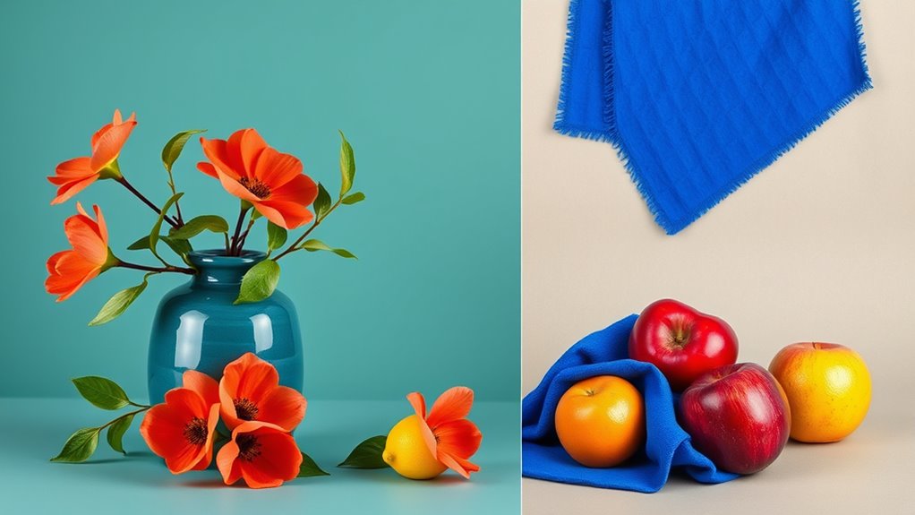
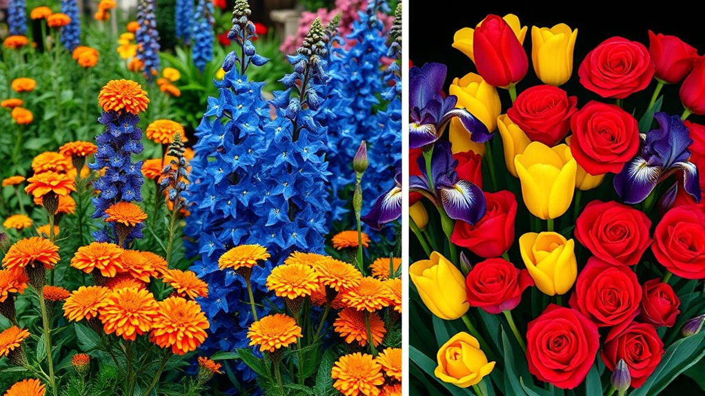
A split-complementary color scheme offers a versatile way to create visual interest without the tension often found in direct complementary pairings. It balances harmony and contrast vibrancy by selecting a base color and the two colors adjacent to its complement on the color wheel. This arrangement introduces subtle contrast while maintaining harmony, making your design more engaging. It’s ideal when you want vibrancy without overwhelming the viewer. Imagine a rich blue paired with warm orange-yellow and fiery orange-red, resulting in a dynamic yet balanced palette. This scheme provides:
Split-complementary schemes balance harmony and contrast for vibrant, engaging designs.
- Harmony balance through adjacent hues that complement the base color
- Contrast vibrancy by adding variety without clashing
- Visual interest achieved via subtle color differences that keep the design lively

Creative Color Wheel, Paint Mixing Learning Guide Art Class Teaching Tool for Makeup Blending Board Chart Color Mixed Guide Mix Colours (9.25inch)
This package include one Creative Color Mixing Board with one regular Color Wheel (9.25 inch).
As an affiliate, we earn on qualifying purchases.
As an affiliate, we earn on qualifying purchases.
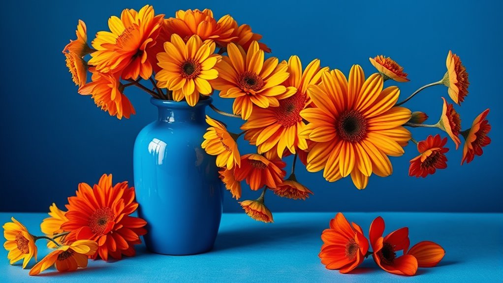
Exploring Triadic Color Scheme
Building on the balanced contrast of a split-complementary scheme, a triadic color scheme introduces a vibrant harmony by selecting three colors evenly spaced around the color wheel. This approach aligns with complementary color theory, which emphasizes contrasting hues that create visual interest. By applying color harmony principles, you can achieve a lively yet balanced palette that maintains harmony without feeling chaotic. Triadic schemes are versatile, allowing you to create dynamic designs that stand out while remaining cohesive. When choosing your colors, focus on maintaining proportion and ensuring that one color dominates to prevent overstimulation. This scheme is ideal for projects that require energetic visuals with a sense of unity, making it a popular choice in art, fashion, and interior design. Additionally, understanding color relationships can help in selecting the most effective palette for your creative goals.

COLOR MUSE Colorimeter – Mobile Color Matching Tool – Instantly identify closest matching paint colors, products, and digital color values
SIMPLE AND PORTABLE – Scan any flat surface to find the closest matching paint colours and products in…
As an affiliate, we earn on qualifying purchases.
As an affiliate, we earn on qualifying purchases.
Comparing Visual Effects of Split-Complementary and Triadic Schemes
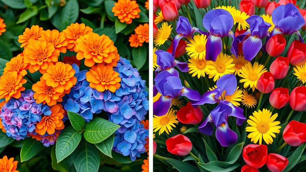
While both split-complementary and triadic color schemes create vibrant visuals, they produce distinct emotional and visual effects. Split-complementary schemes offer harmony balance with subtle saturation contrast, making designs feel lively yet stable. They emphasize contrast without overwhelming, highlighting specific elements. Triadic schemes, on the other hand, deliver a more dynamic look, with equal saturation levels that generate energetic harmony. You’ll notice that triadic palettes often evoke excitement and movement, while split-complementary schemes feel more refined and balanced. Additionally, understanding the color wheel helps in selecting effective color combinations for each scheme.
Practical Applications of Split-Complementary Colors

Are you looking for a versatile color scheme that balances vibrancy with harmony? Split-complementary colors are perfect for creating dynamic yet cohesive designs. By choosing a base color and its two adjacent colors on the color wheel’s opposite side, you can evoke specific emotions through color psychology—such as calmness or energy—while maintaining visual interest. This scheme also respects cultural symbolism, allowing you to use colors thoughtfully within different contexts or communities. For example, pairing blue with orange and red can symbolize trust, passion, and enthusiasm, depending on cultural interpretations. Additionally, understanding vetted Halloween product reviews can help you select the right colors to enhance themed decorations or costumes. Practical applications include interior design, branding, and fashion, where you want to attract attention without overwhelming. Split-complementary schemes offer a flexible, balanced approach that enhances clarity and emotional impact.
When to Use Triadic Color Combinations

Triadic color combinations are most effective when you want to create a vibrant, balanced palette that maintains harmony without feeling chaotic. You should consider this scheme when aiming for a lively, engaging look that still feels cohesive. It works well for projects where you want to draw attention while keeping color harmony intact. Unlock savings on hosting and VPS services today with promotional codes to enhance your website’s visual appeal and performance.
Advantages and Disadvantages of Each Scheme
Understanding the advantages and disadvantages of each color scheme helps you make better choices for your projects. You’ll find that some schemes offer strong visual contrast, while others can be more complex to implement. Considering their versatility and complexity guarantees you select the best option for your design goals. Additionally, color harmony plays a crucial role in creating aesthetically pleasing and balanced designs.
Visual Contrast Strengths
Visual contrast is a powerful tool in color harmony, allowing you to create focal points and guide viewers’ attention effectively. With split-complementary schemes, you get moderate contrast, offering a balanced look that emphasizes harmony while highlighting specific areas. Triadic schemes, however, deliver vibrant contrast, making colors pop and creating dynamic visual interest. Your choice influences how viewers perceive the design through color psychology and cultural influences, shaping emotional responses. Consider these aspects:
- Split-complementary schemes provide subtle contrast, fostering a harmonious yet noticeable effect.
- Triadic schemes generate bold contrasts, capturing attention quickly and energizing the composition.
- Cultural influences may affect how contrast is interpreted, as some color combinations evoke different emotions across cultures.
Additionally, understanding AI in Education can inspire innovative uses of color schemes in digital learning environments to enhance engagement and comprehension.
Color Scheme Complexity
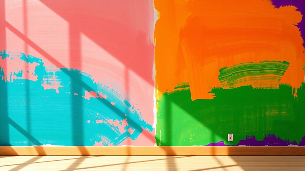
Choosing the right color scheme involves balancing its advantages and disadvantages to suit your design goals. Split-complementary schemes offer moderate complexity, making it easier to achieve balanced palette coordination without overwhelming the viewer. They provide a harmonious color harmony while allowing some variety, which is ideal for those seeking visual interest without chaos. On the other hand, triadic schemes are more complex, featuring three evenly spaced colors on the color wheel. This creates vibrant and dynamic palette coordination but can be challenging to balance effectively. If not carefully managed, triadic schemes risk appearing too busy or chaotic. Your choice depends on your comfort level with complexity and the desired visual impact. Simpler schemes tend to be more versatile, while complex schemes demand more thoughtful execution. Incorporating layered textures and colors can help manage complexity and add warmth to your design.
Versatility in Design
When selecting a color scheme, you’ll find that split-complementary palettes are highly versatile because they balance harmony with variety, making them suitable for many design contexts. They adapt well across different themes, whether you’re highlighting color psychology or cultural symbolism. This scheme offers a wide range of emotions and meanings without overwhelming the viewer. However, triadic schemes can be more challenging to balance, requiring careful placement to avoid chaos. They’re ideal when you want bold, energetic contrasts that emphasize cultural symbolism or evoke specific emotions. Both schemes provide flexibility, but split-complementary palettes excel in creating harmonious yet dynamic designs. You might use split-complementary for subtle emotional cues, while triadic schemes suit vibrant, lively environments. Your choice depends on the desired level of contrast and cultural resonance. Additionally, understanding the principles of penetration testing can help inform how you evaluate and refine your color choices to ensure they effectively communicate your message.
Tips for Implementing These Color Strategies Effectively

To effectively implement color strategies, start by understanding the principles behind each approach and applying them thoughtfully to your design. Use the color wheel as your guide to visualize relationships between hues, ensuring your choices enhance aesthetic appeal. With split-complementary schemes, balance the boldness of contrasting colors by adjusting saturation and brightness, creating harmony without overwhelming the viewer. For triadic schemes, maintain visual stability by evenly distributing your chosen colors across the palette, avoiding cluttered or chaotic looks. Always consider the context and mood you want to evoke, and test color combinations in real-world settings before finalizing. Additionally, understanding Honda Tuning modifications can inspire dynamic visual themes that match your color schemes and elevate your overall design. By staying mindful of these tips, you’ll craft designs that are both vibrant and cohesive, making your color strategies more impactful.
Examples of Successful Use in Design and Art

You can see how artists and designers use color combinations to create striking visual effects. Effective design examples showcase harmony that guides your eye and evokes emotion. Exploring these successes helps you understand how to apply color harmony in your own work. Additionally, understanding the importance of timely resolution in financial aspects can inspire more efficient and harmonious project planning.
Color Combinations in Art
Color combinations have long played a vital role in shaping the impact and mood of artworks. Artists skillfully use the color wheel to select harmonious schemes, balancing color saturation to evoke specific emotions. For example, Monet’s Impressionist paintings often feature vibrant, high-saturation colors that create lively scenes, while subdued palettes convey calmness. You’ll notice how artists apply complementary or triadic schemes to enhance visual interest and harmony. The right combination can draw your attention, set a tone, or suggest movement. Whether it’s the bold reds and greens in Van Gogh’s “The Starry Night” or the harmonious pastel hues in a Rococo piece, effective color pairing influences your perception and emotional response. Mastering these combinations helps you create art that resonates deeply with viewers. Additionally, understanding color harmony principles can guide artists in making deliberate choices to evoke specific feelings and reactions.
Effective Design Examples
Have you ever noticed how some designs immediately catch your eye and feel perfectly balanced? That’s often thanks to effective use of color schemes like split-complementary or triadic harmony. For example, a website using a triadic scheme with vibrant reds, blues, and yellows creates an energetic vibe that appeals to viewers’ color psychology, enhancing engagement. Cultural implications also influence success; in Western cultures, green and gold evoke wealth and growth, while in other regions, colors may carry different meanings. In branding, companies leverage these insights to evoke specific emotions and connect with audiences. Additionally, understanding support hours can help designers plan their project timelines more effectively, ensuring timely completion and alignment with client schedules. These successful examples demonstrate that understanding color psychology and cultural implications allows you to craft designs that resonate, communicate effectively, and feel visually harmonious, making your work stand out.
Frequently Asked Questions
How Do Cultural Differences Influence Color Scheme Choices?
Cultural differences markedly influence your color scheme choices because cultural symbolism and regional preferences shape perceptions of colors. In some cultures, red symbolizes luck and prosperity, so you might choose it for celebrations. In others, certain shades may carry negative connotations. Understanding these cultural nuances helps you select color schemes that resonate positively, ensuring your designs communicate the intended message while respecting regional symbolism and preferences.
Can Split-Complementary and Triadic Schemes Be Combined Creatively?
Like mixing a painter’s palette, you can creatively combine split-complementary and triadic schemes for stunning color blending and striking visual contrast. Experiment with balancing the vibrant hues of a triadic scheme while highlighting accents with split-complementary pairs. This approach adds depth and harmony, making your design more dynamic. Don’t be afraid to explore and push boundaries—your unique combination will create a mesmerizing, harmonious look that stands out.
What Tools Assist in Selecting Effective Color Schemes?
You can use color wheels and digital palettes to select effective color schemes easily. Color wheels help you visualize complementary, split-complementary, and triadic relationships, making it simple to pick harmonious colors. Digital palettes, available in design software or apps, let you experiment with various combinations quickly. These tools streamline the process, ensuring your color choices are balanced and visually appealing, whether you’re designing graphics, interiors, or fashion.
How Do Lighting Conditions Affect Color Harmony Perception?
Lighting conditions act like a chameleon, changing how your colors appear. When ambient influences shift, your perception of color harmony transforms—what looks vibrant in daylight might seem dull or altered under warm indoor lighting. Bright, cool light enhances contrast, while dim, warm light softens hues. You’ll find that lighting perception directly influences your sense of color harmony, making it feel alive or subdued depending on the environment you’re in.
Are There Specific Industries That Favor One Scheme Over the Other?
You’ll notice that industries like fashion and branding strategies often favor triadic schemes for their vibrant, balanced look, making products stand out. Conversely, product packaging in food and cosmetics tends to use split-complementary schemes to create visual contrast without overwhelming the consumer. Choosing between these schemes depends on your goal: to attract attention or to maintain harmony, guiding how you design your visuals for maximum impact.
Conclusion
By understanding color harmony, by exploring schemes, and by comparing effects, you open endless creative possibilities. Embrace the contrast of split-complementary for vibrancy, the balance of triadic for harmony, and know when to apply each. Experiment, refine, and adapt your choices to suit your vision. With these strategies, you craft designs that captivate, communicate, and connect—making every color decision intentional, impactful, and uniquely yours.