
To use a color wheel, start by identifying the primary, secondary, and tertiary colors to understand basic hues and blends. Notice how related colors form schemes like complementary, analogous, and triadic for harmony or contrast. Use the wheel to pick combinations that evoke the right mood or balance, considering warm and cool tones. If you keep exploring, you’ll discover how to apply these concepts to create visually appealing and effective designs.
Key Takeaways
- Identify primary, secondary, and tertiary colors to understand their relationships on the wheel.
- Recognize complementary, analogous, and triadic schemes for creating harmonious color combinations.
- Use the wheel to select contrasting or matching colors based on desired visual effects and emotional impact.
- Observe color temperature (warm vs. cool) to influence mood and balance in your design.
- Apply principles like contrast, balance, and psychology to enhance visual appeal and communicate effectively.

JimKing Creative Color Wheel, Paint Mixing Learning Guide, Art Class Teaching Tool for Makeup Painting Tattoo,Blending Board Chart Color Mixed Guide Hardboard(9.25inch)
Helps organise colours to make choices and combinations easier;Defines common terms and helps the artist to understand colour…
As an affiliate, we earn on qualifying purchases.
As an affiliate, we earn on qualifying purchases.
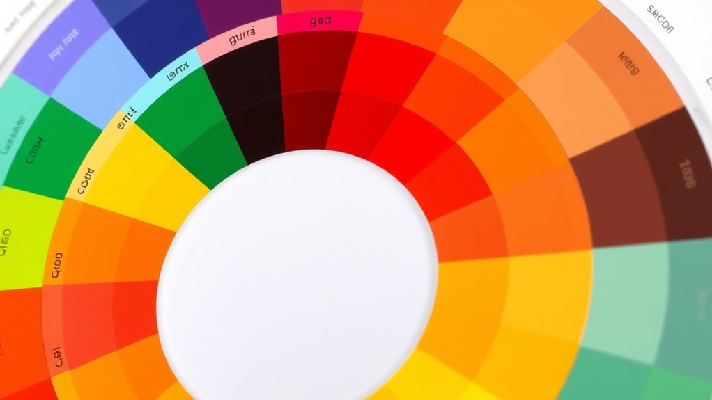
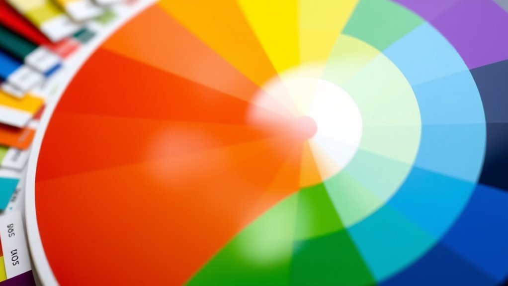
Understanding the Layout of a Color Wheel
The layout of a color wheel is designed to visually organize colors based on their relationships and similarities. To understand this, it helps to know about the color wheel history and its evolution. Originally, artists and scientists created early versions to categorize colors systematically. Over time, the color wheel evolved from simple diagrams to more all-encompassing tools, reflecting advancements in color theory. Today’s color wheel displays hues arranged in a circle, showing how colors blend and contrast. The wheel’s structure makes it easier for you to see relationships between colors, such as complementary or analogous pairs. This organization enables you to make more informed choices in design, painting, or decorating, based on understanding how colors naturally relate to each other within the layout. Additionally, understanding the development of color theory can deepen your ability to select harmonious color combinations.

The Pocket Complete Color Harmony: 1,500 Plus Color Palettes for Designers, Artists, Architects, Makers, and Educators
The Pocket Complete Color Harmony
As an affiliate, we earn on qualifying purchases.
As an affiliate, we earn on qualifying purchases.
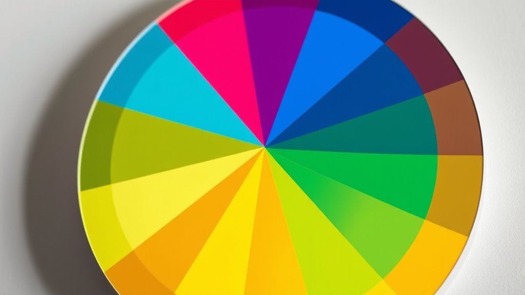
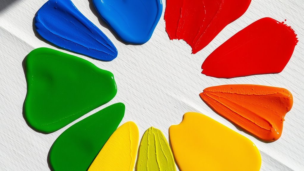
Identifying Primary, Secondary, and Tertiary Colors
You’ll learn how to recognize primary colors, which are the foundation of all other hues. Then, you’ll see how mixing these primaries creates secondary colors, like green, orange, and purple. Finally, you’ll explore tertiary colors, which result from blending a primary with a neighboring secondary. Understanding the significance of tableware materials can also enhance your appreciation of color choices in dinnerware design.
Primary Colors Explained
Primary colors are the foundation of all other hues on the color wheel, meaning they can’t be created by mixing other colors. They are essential because they determine the palette’s core and influence color symbolism and cultural influences. Understanding these colors helps you make intentional choices in design and art. The three primary colors are red, blue, and yellow. Here’s a quick overview:
| Color | Symbolism | Cultural Influence |
|---|---|---|
| Red | Passion, energy | Used in flags and celebrations |
| Blue | Calm, trust | Associated with professionalism |
| Yellow | Happiness, optimism | Brightens and attracts attention |
Recognizing primary colors allows you to build harmonious color schemes and understand their impact across different cultures.
Tertiary Colors Mixture
Tertiary colors result from mixing a primary color with its neighboring secondary color on the color wheel, creating hues that are more nuanced and complex. In color theory, understanding these mixtures helps you identify and use colors effectively. When you blend a primary color like red with a secondary color such as orange, you get a tertiary color like red-orange. This process involves precise color mixing to achieve the desired hue. Tertiary colors deepen your palette, offering more variety and subtlety in your artwork or design. Recognizing these hues is essential for creating harmonious color schemes and understanding the relationships between colors on the wheel. Mastering tertiary colors allows you to expand your color vocabulary and apply color theory with confidence. Additionally, an understanding of color accuracy ensures that your hues are true to their intended shades, enhancing the overall quality of your work.

Palette Scout: Create Beautiful Color Harmonies with 180 Color Palette Cards. Choosing Tints, Tones & Shades from The Color Wheel, Makes Color Theory Fun & Intuitive
A Fun Way To Learn About Color – Palette Scout uses a unique method of repeating shapes around…
As an affiliate, we earn on qualifying purchases.
As an affiliate, we earn on qualifying purchases.
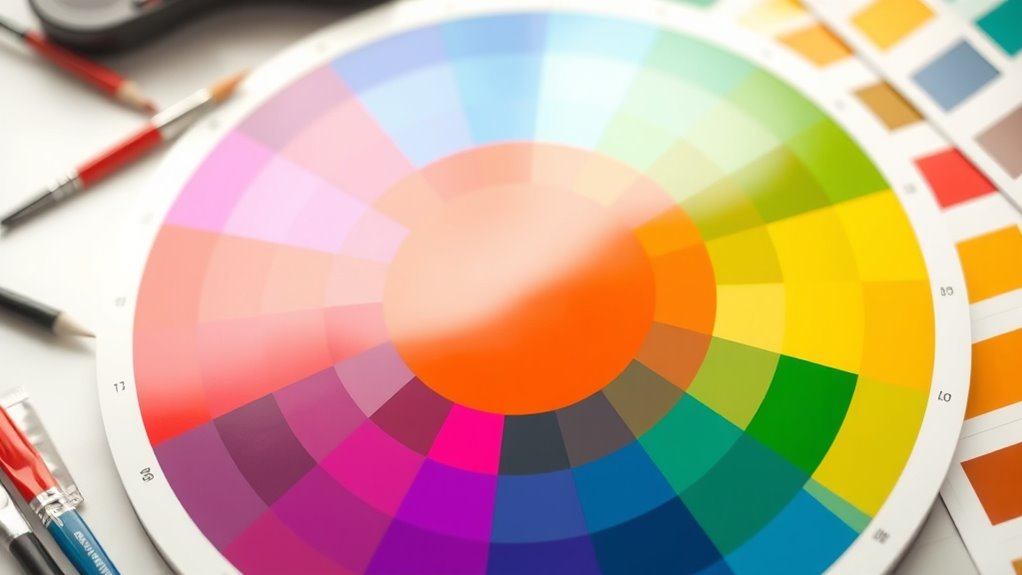
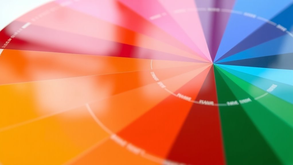
Recognizing Color Relationships and Schemes
Understanding color relationships helps you create visually appealing designs, so recognizing different schemes is essential. You can identify schemes like complementary or analogous by observing how colors are positioned on the wheel. Mastering these principles makes it easier to choose harmonious color combinations for any project. Additionally, farmhouse bedroom design often benefits from carefully selected color schemes that evoke warmth and rustic charm.
Color Harmony Principles
Recognizing color relationships and schemes is essential for creating visually appealing designs. One key principle is complementary contrasts, where you pair colors opposite each other on the wheel to produce vibrant, eye-catching combinations. These schemes add energy and focus to your work. Monochromatic schemes involve using variations of a single hue, from light to dark, creating harmony and unity. They’re perfect for subtle, sophisticated designs that feel cohesive without overwhelming the viewer. Understanding these principles helps you choose colors intentionally, ensuring your compositions communicate the desired mood or message. Whether you want bold, dynamic contrasts or subtle, harmonious tones, mastering these basic relationships gives you a strong foundation for effective color use. Additionally, considering water-inspired themes can evoke calmness and clarity in your palette choices.
Scheme Identification Techniques
To identify color schemes effectively, start by examining the relationships between colors on the wheel. Look for color contrasts, which highlight differences and create visual interest. For example, complementary schemes use opposite colors, offering strong contrast and vibrancy. Analogous schemes involve neighboring colors, providing harmony and seamless progressions. Triadic schemes arrange three colors evenly spaced around the wheel, producing vibrant but balanced contrasts. Recognizing scheme variations helps you understand how different colors interact and influence mood. Pay attention to how schemes shift with slight adjustments, like changing saturation or brightness. Understanding color relationships enhances your ability to select and combine hues intentionally, ensuring your designs communicate the desired message and aesthetic effectively.
JimKing Creative Color Wheel, Paint Mixing Learning Guide, Art Class Teaching Tool for Makeup Painting Tattoo,Blending Board Chart Color Mixed Guide Hardboard(9.25inch)
Helps organise colours to make choices and combinations easier;Defines common terms and helps the artist to understand colour…
As an affiliate, we earn on qualifying purchases.
As an affiliate, we earn on qualifying purchases.
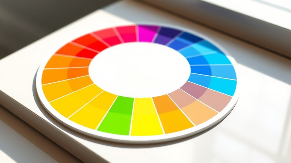
Using the Color Wheel to Create Harmonious Combinations
The color wheel is a powerful tool for creating harmonious color combinations that are visually appealing and balanced. By understanding color relationships, you can select colors that work well together, enhancing your design or space. Using color psychology, you can choose hues that evoke specific emotions—like blue for calm or red for energy. Additionally, considering cultural color meanings helps guarantee your choices resonate appropriately across different audiences, avoiding misunderstandings. Complementary colors, positioned opposite each other on the wheel, create vibrant contrast, while analogous colors, side by side, produce a soothing effect. Triadic schemes, evenly spaced around the wheel, offer lively but balanced combinations. Mastering these principles allows you to craft combinations that are both aesthetically pleasing and meaningful. Recognizing the color wheel as a fundamental element in design ensures you make informed and effective choices for any project.
Applying Contrast and Balance With Color Choices
Building on your understanding of harmonious color schemes, applying contrast and balance is key to creating visually compelling designs. Complementary contrasts involve pairing colors directly opposite each other on the wheel, like blue and orange, to generate vibrant energy. Use these contrasts strategically to highlight focal points or add excitement. Achieving warm cool balance involves combining warm tones (reds, yellows, oranges) with cool tones (blues, greens, purples) to create harmony and prevent visual overload. Balance your color choices by distributing warm and cool hues thoughtfully across your design, ensuring no single area dominates excessively. This approach helps your composition feel dynamic yet cohesive, guiding the viewer’s eye comfortably through your work. Understanding color psychology and how different hues influence perception can further enhance your use of contrast and balance. Mastering contrast and balance elevates your color application from simple to striking.
Practical Tips for Using the Color Wheel in Projects
Using the color wheel effectively in your projects starts with understanding how to select and combine colors intentionally. One practical tip is to leverage complementary contrasts, placing opposite colors on the wheel to create vibrant, eye-catching designs. This technique adds visual interest and balance when used thoughtfully. Additionally, consider warm versus cool colors; warm tones like reds and oranges evoke energy and excitement, while cool tones such as blues and greens promote calmness and serenity. Mixing these opposites can create dynamic compositions that guide viewers’ emotions. Always test your color choices in context to see how they interact. Keep in mind that small adjustments—like tweaking saturation or brightness—can make a significant difference in achieving harmony and impact in your project. Understanding color psychology can further enhance your ability to evoke specific emotions through your color choices.
Frequently Asked Questions
How Can I Customize the Color Wheel for Specific Design Needs?
You can customize the color wheel by adjusting the hue, saturation, and brightness to match your design specific adjustments. Use design software with color wheel tools to fine-tune colors precisely, creating custom palettes that fit your project’s needs. You might also add or remove color segments or shift their positions for better harmony. This hands-on approach guarantees your color choices support your overall design goals effectively.
What Are Common Mistakes to Avoid When Using a Color Wheel?
You’ll want to avoid common mistakes like ignoring color harmony principles or creating a color clash that’s painfully jarring. Don’t rely solely on the color wheel without considering contrast and balance; otherwise, your design could look chaotic. Always test your color choices in context and remember that overusing bold colors can overwhelm. Keep harmony in mind, and your work will radiate with professional polish instead of chaos.
How Do I Choose Complementary Colors for Different Projects?
To choose complementary colors, focus on color harmony by selecting pairs opposite each other on the color wheel. For different projects, consider the mood you want to create—vibrant or calm—and pick contrasting colors that enhance each other through effective color pairing. Avoid clashing by testing combinations in small areas first, and remember to balance bold choices with neutral tones to keep your design cohesive and visually appealing.
Can the Color Wheel Help in Understanding Cultural Color Meanings?
Sure, the color wheel can help you understand cultural symbolism, but don’t rely on it solely. It’s ironic—colors often have different meanings across regional palettes, so what’s sacred in one culture might be taboo in another. Use the wheel as a guide, but remember to research regional nuances. Ultimately, understanding cultural color meanings requires more than just the wheel—it demands awareness of diverse symbolism and regional palettes.
How Does Lighting Affect Color Perception on the Wheel?
Lighting effects markedly influence your perception shifts on the color wheel. When lighting changes, colors may appear brighter, duller, warmer, or cooler, affecting how you interpret their relationships. For example, natural light highlights true hues, while artificial light can distort them. You should always consider lighting conditions to accurately assess color harmony and contrast, as they directly impact how colors interact and appear to your eyes.
Conclusion
Think of the color wheel as your artistic compass, guiding you through a vibrant landscape of choices. With it, you’re the explorer discovering harmonious paths and bold contrasts. Trust your instincts, experiment freely, and let the wheel be your map. Before long, you’ll navigate color like a seasoned traveler, creating stunning visuals that speak your unique style. Embrace this tool, and watch your projects come alive with confidence and colorfully inspired flair.