
Color scheme trends show that pastels evoke calm, delicacy, and serenity, making them perfect for subtle, minimalist designs, while jewel tones bring vibrancy, luxury, and confidence, ideal for bold accents and striking visuals. Pastels are often linked to softness and approachability, whereas jewel tones reflect richness and strength. Understanding these moods helps you choose the right palette for your space or style. Keep exploring to discover how blending these palettes can create truly balanced and enthralling designs.
Key Takeaways
- Pastel schemes evoke calm and serenity, popular in spring and summer, emphasizing minimalism and subtle elegance.
- Jewel tone palettes convey luxury and energy, favored in fall and winter for bold, opulent accents.
- Current trends favor natural, earthy pastel shades for sustainability and emotional well-being.
- Jewel tones are increasingly used to create striking, high-impact visuals in branding and interior design.
- Combining pastels and jewel tones enhances versatility, balancing softness with vibrancy for modern, sophisticated aesthetics.
KJX 24 Pcs Plastic Speckled Easter Eggs, 2.4in 4 Colors Faux Pastel Speckled Eggs Bowl Vase Filler, Decorative Easter Eggs for Home Tables Centerpieces DIY Craft Spring Decor (Pastel)
VIBRANT SPRING COLOR SET: Get ready for Easter with this complete set of 24pcs speckled easter eggs! The…
As an affiliate, we earn on qualifying purchases.
As an affiliate, we earn on qualifying purchases.
Origins and Historical Significance of Pastel and Jewel Tones
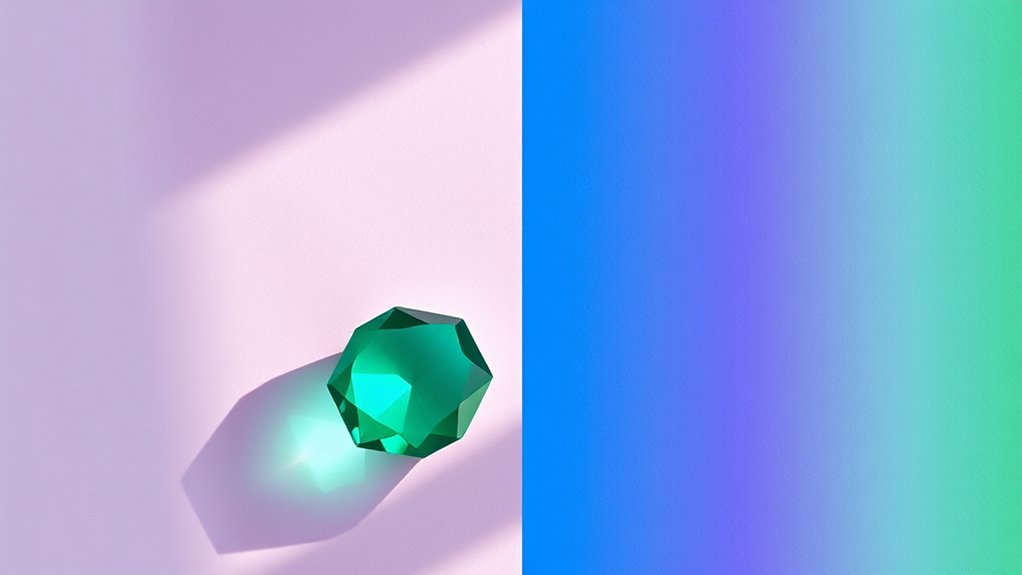
Pastel and jewel tones have rich origins rooted in history and culture, shaping their enduring appeal today. Pastels, with their soft, muted shades, often symbolize delicacy and innocence, tracing back to European Renaissance art and 18th-century fashion. They carried historical symbolism of purity and youth, influenced by cultural preferences for subtle elegance. Jewel tones, vibrant and luxurious, have long represented wealth and power, rooted in the use of precious gemstones like sapphires, rubies, and emeralds. These colors gained prominence in royal attire and religious icons across various cultures, emphasizing status and spiritual significance. Both palettes reflect deep cultural influences, with pastels evoking a sense of serenity and refinement, and jewel tones embodying opulence and energy. Incorporating color symbolism into decor enhances the emotional and aesthetic impact of these palettes. These historical and cultural roots continue to shape their popularity today.
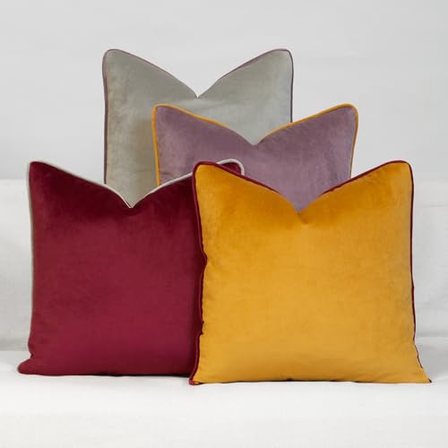
Daisy Linens Decorative Throw Pillow Set of 4, 18" x 18" Solid Colorful Velvet Accent Pillow Covers, Jewel Tones
100% polyester, set of 4 pillow covers, with hidden zipper closure. Imported.
As an affiliate, we earn on qualifying purchases.
As an affiliate, we earn on qualifying purchases.
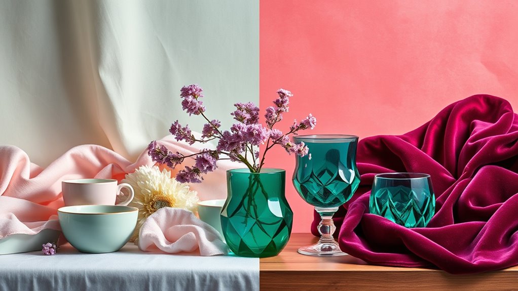
Psychological Impact and Mood Enhancement of Both Palettes
The colors you choose can considerably influence your mood and emotional well-being. Pastel palettes tend to evoke feelings of calm, softness, and serenity, promoting relaxation and reducing stress. Their gentle tones can help modulate emotions, making spaces feel welcoming and peaceful. Jewel tones, on the other hand, evoke strong emotional responses like confidence, energy, and luxury. These rich hues can boost motivation and focus, creating an invigorating atmosphere. Both palettes impact mood in distinct ways, with pastels offering soothing effects and jewel tones providing stimulation. Your choice depends on the emotional response you seek; whether you want to foster tranquility or energize your environment, understanding their psychological impact is key to mood modulation. Additionally, selecting colors aligned with your vibrational state can further enhance your emotional well-being and manifestation efforts.

Arteza Metallic Acrylic Paint, Set of 8 Jewel Tones Colors in 4.06oz Tubes, Rich Pigments, Non Fading, Paints for Artists and Hobby Painters
Shimmering Metallic Acrylic Paints: These glossy acrylic paints are heavy-bodied and filled with glimmering pigment. They’re perfect for…
As an affiliate, we earn on qualifying purchases.
As an affiliate, we earn on qualifying purchases.
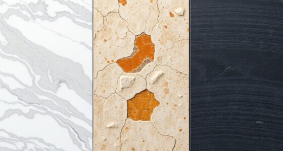
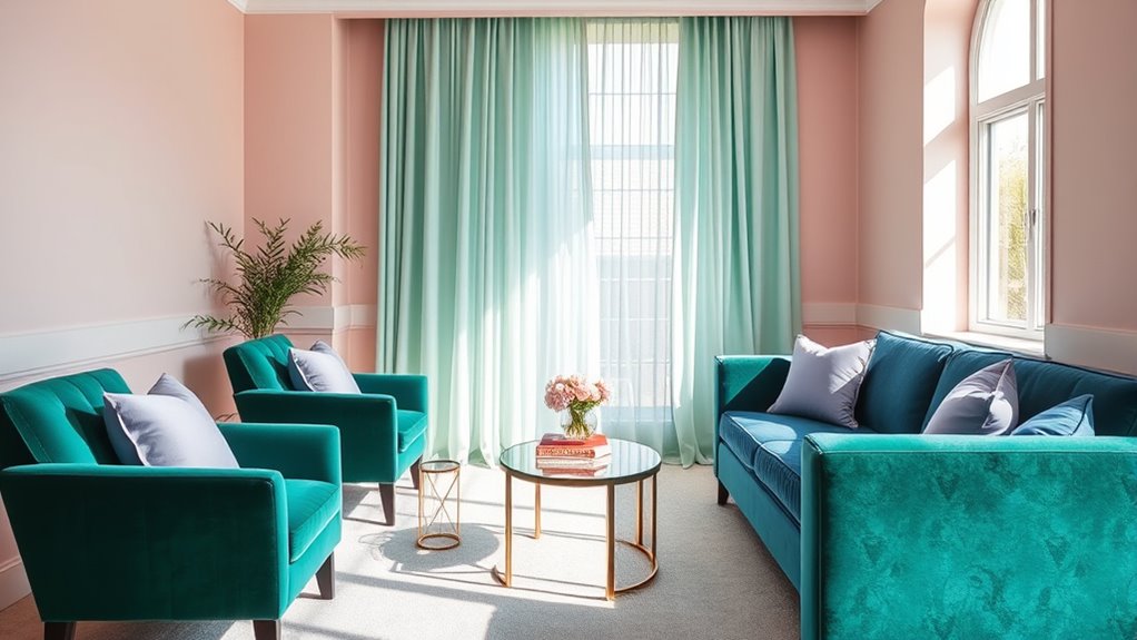
Popular Applications in Interior Design and Home Decor
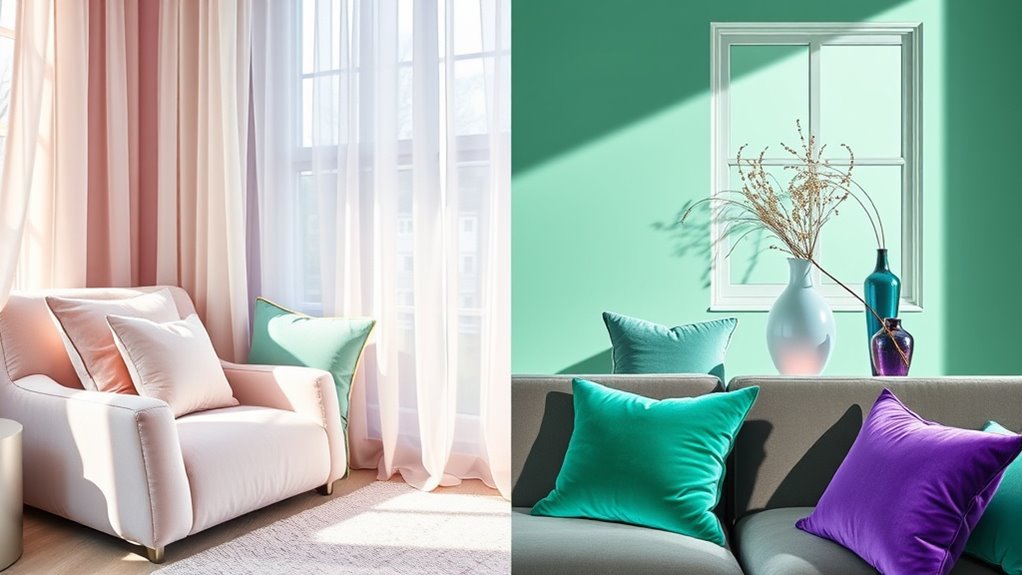
Color schemes play a pivotal role in shaping the ambiance of interior spaces, guiding your choices in home decor. Pastel tones bring an elegant simplicity to rooms, creating a calm, inviting atmosphere with soft hues that blend seamlessly. These shades are perfect for minimalist designs or spaces where you want to emphasize serenity. Conversely, jewel tones introduce vibrant contrast, making a bold statement and adding richness to your decor. They work well as accent walls, plush furnishings, or decorative accessories, bringing depth and sophistication. Both palettes are versatile in interior design, allowing you to tailor your space to your personality. Whether you prefer the understated charm of pastels or the striking allure of jewel tones, understanding their applications helps you craft a stylish, balanced environment. Recognizing how color schemes influence mood can further refine your interior choices, ensuring your space reflects the desired atmosphere and personality.

Velvet Curtains 84 Inch Length 2 Panels Set Gold Brown Light Blocking Thermal Insulated Room Darkening Window Drapes Soft Luxury Curtain for Living Room Bedroom Back Tab Pleated Pocket 7ft Long Golden
Ready Made: Package includes 2 velvet curtain panels. Each panel measures 52 inches wide by 84 inches long….
As an affiliate, we earn on qualifying purchases.
As an affiliate, we earn on qualifying purchases.
Fashion and Styling Trends Featuring Pastel and Jewel Tones
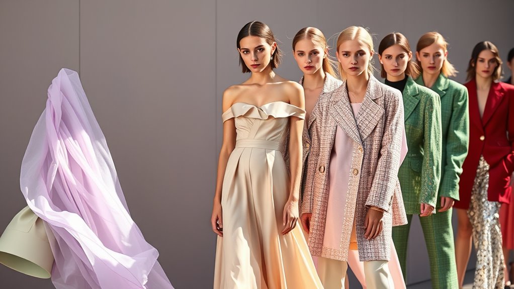
In fashion and styling, the influence of color schemes from interior design is unmistakable, with pastel and jewel tones shaping modern trends. You’ll notice seasonal variations, as pastels thrive in spring and summer, evoking freshness and softness, while jewel tones dominate fall and winter, adding richness and depth. Cultural symbolism also plays a role; pastels often symbolize innocence and tranquility, whereas jewel tones convey luxury and strength. Designers incorporate these colors into clothing, accessories, and even makeup, reflecting mood and occasion. Here’s a quick overview:
| Seasonal Variations | Cultural Symbolism |
|---|---|
| Pastels for Spring/Summer | Pastels: Innocence, Calm |
| Jewel Tones for Fall/Winter | Jewel Tones: Power, Wealth |
Additionally, understanding self-watering plant pots can inspire creative ways to incorporate greenery into your styling space or fashion shoots, emphasizing sustainability and modern design.
Digital and Graphic Design: Choosing the Right Color Scheme

When selecting a color scheme for digital and graphic design, you need to consider how color harmony strategies create visual balance. Think about how your choices appeal to your target audience and reinforce your brand identity. Making thoughtful decisions in these areas ensures your design resonates effectively. Additionally, understanding the latest color scheme trends can help you stay current and engaging in your visual communication.
Color Harmony Strategies
Choosing the right color harmony strategy is essential for creating visually appealing and effective digital and graphic designs. You should consider how color contrast and monochromatic schemes influence mood and clarity. High contrast enhances readability, making key elements stand out, while monochromatic schemes offer harmony and simplicity. To illustrate, here’s a comparison:
| Aspect | Effect |
|---|---|
| Color Contrast | Creates emphasis and visual interest |
| Monochromatic Schemes | Provides unity and subtle variation |
| Balance | Ensures visual harmony without clutter |
Using these strategies, you can craft designs that are both engaging and cohesive, guiding the viewer’s eye and communicating your message effectively. Additionally, understanding how color harmony impacts emotional response can help you select the most appropriate palette for your project.
Audience Appeal Factors
Selecting the right color scheme directly influences how your audience perceives and connects with your design. Cultural symbolism plays a significant role—colors can evoke specific emotions or meanings depending on cultural context, affecting engagement. For example, red may symbolize luck in some cultures, while representing danger in others. Seasonal variations also impact audience appeal; pastel tones often evoke freshness and calm during spring, whereas jewel tones create a sense of richness and warmth in winter. Understanding these factors helps you choose colors that resonate deeply, ensuring your message aligns with audience expectations. Additionally, vetting color choices based on proven color psychology enhances the effectiveness of your design. By considering cultural symbolism and seasonal influences, you craft designs that not only look appealing but also foster authentic connections and positive responses.
Brand Identity Alignment
Aligning your color scheme with your brand identity is essential for creating a cohesive and memorable digital presence. When your colors reflect your brand’s core values, it strengthens branding consistency and reinforces your visual identity. Choose pastel tones if your brand aims for approachability, softness, and a friendly vibe. Conversely, jewel tones convey luxury, confidence, and sophistication, aligning with a premium or bold brand image. Consistency across digital platforms ensures that your audience instantly recognizes your brand, building trust and loyalty. By thoughtfully selecting colors that mirror your brand personality, you create a unified visual identity that resonates with your target audience. Remember, your color choices should enhance your brand story and support your overall marketing goals. Incorporating color scheme trends that align with industry standards can also help position your brand as contemporary and relevant.
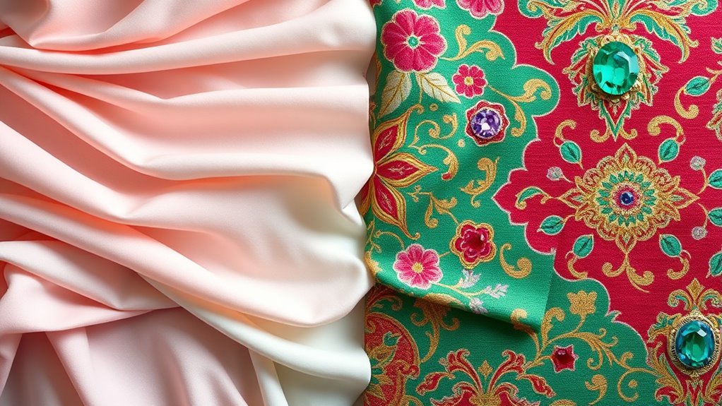
Combining Pastel and Jewel Tones for Harmonious Designs
When mixing pastel and jewel tones, you create a design that feels both soft and bold. To achieve harmony, balance the gentle hues with striking accents that draw attention without overwhelming. Using complementary colors as accents helps unify the overall look and enhances visual interest. Incorporating color coordination techniques can further refine the balance between the tones, ensuring a cohesive and polished appearance.
Balancing Soft and Bold
Blending pastel and jewel tones creates a dynamic balance that can elevate any design. To achieve a harmonious look, focus on contrast vibrancy by pairing softer shades with richer, more intense hues. Use color blending techniques to seamlessly integrate these tones, ensuring they complement rather than clash. For example, combine a pastel pink with a deep emerald green or a soft lavender with a bold amethyst. Keep the overall palette balanced by limiting the number of jewel tones and letting pastels soften the impact. This approach allows you to create a visual interest that’s both lively and calming. Remember, the key is to carefully consider the contrast vibrancy between tones, ensuring the boldness enhances the softness without overwhelming it. Additionally, understanding the nutritional advantages of green juice can inspire more vibrant and healthful color choices in your palette.
Using Complementary Accents
Building on the idea of balancing soft and bold tones, incorporating complementary accents can further enhance your color schemes. Complementary accents involve using colors opposite each other on the color wheel, creating visual interest and harmony. When combining pastel and jewel tones, strategic color pairing strategies guarantee the contrast remains balanced. For example, a soft mint green can be accentuated with deep coral or ruby, adding vibrancy without overwhelming the senses. These accents serve as focal points, guiding the eye and emphasizing key design elements. By thoughtfully applying complementary accents, you can unify pastel’s delicacy with the richness of jewel tones, resulting in a cohesive and dynamic aesthetic that feels both harmonious and striking.
Future Trends: Evolving Preferences in Color Schemes

As designers and consumers become more conscious of sustainability and emotional well-being, color scheme preferences are shifting toward more natural and calming palettes. You’ll see a growing emphasis on sustainable color choices that prioritize eco-friendly dyes and materials. Additionally, cultural symbolism in palettes is gaining importance, with colors reflecting heritage and collective identity. Future trends favor muted earth tones, soft greens, and gentle blues that evoke tranquility and balance. These choices not only promote emotional well-being but also align with a broader movement toward mindful consumption. You can expect a move away from overly vibrant or artificial hues, favoring palettes that feel authentic and rooted in nature. This evolution highlights a desire for designs that foster connection, sustainability, and cultural awareness. Moreover, evidence-based insights are increasingly guiding color decisions, ensuring that trends are both meaningful and supported by research.
Frequently Asked Questions
How Do Cultural Differences Influence the Popularity of Pastels and Jewel Tones?
Cultural differences greatly influence the popularity of pastels and jewel tones through cultural celebrations and fashion influences. In some cultures, vibrant jewel tones symbolize wealth and tradition, making them more popular during festivities. Conversely, pastels often reflect softness and tranquility, appealing in fashion influenced by Western trends emphasizing subtlety. Your choices in color schemes can reflect cultural values, celebrations, and current fashion trends, shaping what feels most meaningful or stylish to you.
What Are the Environmental Impacts of Sourcing Pastel Versus Jewel Tone Pigments?
When sourcing pastel and jewel tone pigments, you should consider their environmental impacts. Eco-friendly sourcing methods reduce harmful chemicals and waste, benefiting the environment. Generally, jewel tones often require more intensive extraction, leading to a higher carbon footprint comparison with pastels, which may use more sustainable, mineral-based sources. Choosing eco-conscious suppliers helps minimize your overall environmental impact, regardless of the color palette you prefer.
How Do Lighting Conditions Affect the Perception of Pastel and Jewel Tone Colors?
Lighting effects considerably influence your perception of pastel and jewel tone colors. Under natural light, pastels appear softer and more delicate, while jewel tones look richer and more vibrant. In dim or artificial lighting, both can seem muted or altered, making jewel tones sometimes appear darker and pastel shades more subdued. You should consider lighting conditions carefully to guarantee your chosen colors evoke the intended mood and visual impact.
Are There Specific Age Groups That Prefer One Palette Over the Other?
You might find that age-specific preferences lean toward different palettes, influenced by generational color trends. Younger people often favor pastel shades for their softness and modern vibe, while older groups tend to prefer jewel tones for their richness and timeless appeal. Your taste can reflect these trends, but personal style always plays a key role. Ultimately, choosing between pastel and jewel tones depends on what resonates with your age and individual preferences.
What Technological Advancements Are Shaping Future Color Palette Choices?
You might worry technology will limit creativity, but AI color prediction and virtual reality palettes actually expand your options. These advancements allow you to experiment with innovative combinations and visualize colors in immersive environments before committing. As a result, you can craft more personalized, dynamic palettes that resonate with your style and preferences, making future color choices more intuitive and exciting than ever before.
Conclusion
As you explore pastel and jewel tones, remember that choosing colors is like painting your own story—each shade adds a chapter of mood and personality. By blending these palettes thoughtfully, you craft a visual narrative that resonates deeply. Don’t be afraid to experiment; after all, colors are the brushstrokes of your unique style. Embrace the evolving trends and let your creativity be the guiding star in your colorful journey.