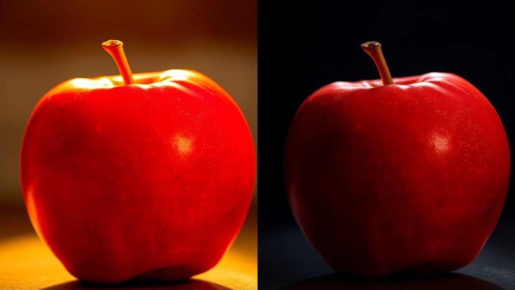

Lighting dramatically influences how you perceive colors in any environment. Warm light (2000K-3000K) enhances reds and browns, making them appear richer, while cool light (5000K-6500K) sharpens whites and blues. Ambient illumination provides overall color accuracy, but harsh or uneven lighting can distort hues and create shadows. Balancing ambient and task lighting, along with selecting the right color temperature, guarantees colors look their true self. Curious to learn how to optimize your space’s lighting effects?
Key Takeaways
- Color temperature influences whether lighting appears warm (yellowish) or cool (bluish), affecting how colors are perceived.
- Ambient lighting quality and intensity can enhance or distort true colors, with diffuse light providing more accurate perception.
- The balance between ambient and task lighting impacts color visibility, with harsh light potentially exaggerating or muting hues.
- Dim or uneven lighting can make colors seem dull, while bright, even illumination reveals their true shades.
- Adjusting lighting conditions helps create desired moods and ensures colors are perceived accurately and consistently.

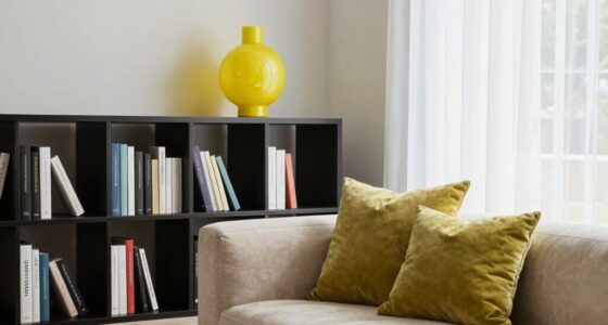
Lighting plays a vital role in how we perceive colors, shaping the way objects appear to us. When you step into a room, the type of lighting and its characteristics directly influence how vibrant, warm, or cool objects look. One of the key factors at play is color temperature, which refers to how warm or cool the light appears. Measured in Kelvin, lower color temperatures (around 2000K-3000K) emit warm, yellowish light, while higher temperatures (5000K-6500K) produce cool, bluish illumination. This variation can dramatically change the way colors are perceived. For instance, under warm lighting, reds and browns tend to appear richer and more inviting, while cooler light can make whites look crisper and blues more vibrant. Understanding color temperature helps you choose lighting that enhances the specific mood or aesthetic you desire in a space. Proper lighting setup can also help improve visual accuracy, ensuring that colors are seen as intended. Ambient illumination, which is the general, overall lighting present in an environment, also plays a fundamental role in color perception. When you’re in a room with abundant ambient light, it often helps colors appear more true to life because the light evenly illuminates objects from multiple directions. Conversely, if ambient illumination is poor or uneven, colors may look distorted or muted. For example, a dimly lit room can cause colors to seem dull or different from how they look in daylight. Bright, well-distributed ambient lighting ensures that your eyes can interpret colors more accurately, reducing shadows and glare that could skew perception. The balance between ambient illumination and task lighting is essential; too much harsh light can wash out colors, while too little can obscure details and color nuances. Moreover, the quality of ambient illumination—whether it’s soft and diffuse or harsh and direct—also influences how you perceive colors. Soft, diffuse light minimizes shadows and creates a more uniform appearance, making colors look more consistent. On the other hand, harsh, direct lighting can enhance contrast and shadows, sometimes causing colors to appear exaggerated or distorted. As a result, you can manipulate ambient illumination to achieve the desired color effects, whether you want a cozy, warm atmosphere or a bright, energetic space. Recognizing how both color temperature and ambient illumination interact allows you to optimize your environment for more accurate and appealing color perception, making your spaces feel more inviting and visually balanced.

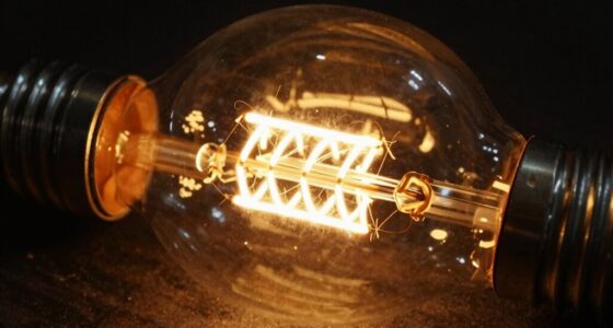
Feit Electric A19 LED Light Bulb, 60W Replacement, Dimmable, Selectable Color Temperatures (2700K-5000K), 800 Lumens, General Purpose Light Bulbs, 15,000-Hour Lifetime, OM60DM/5CCTCA/LED/ 10 Pack
CUSTOMIZABLE LIGHTING WITH ADJUSTABLE COLOR TEMPERATURE – Enjoy tailored lighting for every mood and setting with selectable color…
As an affiliate, we earn on qualifying purchases.
As an affiliate, we earn on qualifying purchases.
Frequently Asked Questions
How Does Natural Sunlight Compare to Artificial Lighting in Color Perception?
Natural sunlight offers a balanced color temperature and high light intensity, making colors appear more vibrant and true to life. In contrast, artificial lighting varies in color temperature, which can distort how you perceive colors, especially if it’s too warm or cool. You notice this most in settings with poor light intensity, where colors may seem dull or washed out. So, natural sunlight generally provides the most accurate and vivid color perception.
Can Lighting Conditions Change How We Perceive the Color of Clothing?
You might notice that lighting conditions subtly shift how you perceive clothing colors. When the color temperature varies, it can make your favorite outfit look brighter or duller, affecting your color matching decisions. Warm lighting enhances reds and yellows, while cool lighting emphasizes blues and greens. So, next time you’re choosing clothes, consider the lighting—your perception depends on it, and it could make all the difference in your style choices.
How Do Different Light Spectrums Influence Perceived Color Warmth or Coolness?
Different light spectrums, influenced by spectral composition and color temperature, directly impact how you perceive warmth or coolness in colors. Warm light with a lower color temperature (around 2700K) makes colors appear cozier and more inviting, while cool light with a higher color temperature (above 5000K) gives a crisp, bluish tone. By adjusting these factors, you can change the perceived mood and tone of colors in your environment.
What Role Does Eye Adaptation Play in Color Perception Under Various Lighting?
Your eye adaptation, including pupil dilation and retinal adaptation, plays a vital role in color perception under different lighting. When you enter a new lighting environment, your pupils dilate or constrict to control light intake, while retinal cells adjust to the brightness and color temperature. This process helps your brain interpret colors accurately, maintaining consistent perception despite changes in illumination. Your eyes continuously adapt to help you perceive colors reliably across various lighting conditions.
How Does Aging Affect the Sensitivity of Color Perception Under Different Lights?
As you age, your color sensitivity dims like a sunset fading, making vibrant hues less vivid. Age-related vision changes cause your eyes to become less responsive to different lights, dulling the brilliance of colors you once saw clearly. This natural decline means you might struggle to distinguish subtle shades under various lighting conditions, requiring brighter or more focused light to see colors as sharply as you did in your youth.

EOQIFJM Modern Industrial E26 Flush Mount Ceiling Light, Smoky Grey Amber Glass Globe Lamp, Decorative Ambient Lighting Fixture for Hallway, Entryway, Kitchen Island, Bedroom(Gold,A)
Chic Modern & Versatile Style: Elevate your home with this Modern Glass Flush Mount. Its elegant dome ceiling…
As an affiliate, we earn on qualifying purchases.
As an affiliate, we earn on qualifying purchases.
Conclusion
Understanding how lighting influences color perception helps you see the world more clearly. For example, under warm indoor lighting, a white shirt might look slightly beige, while in daylight, it appears pure white. By paying attention to lighting conditions, you can better interpret colors accurately, whether you’re choosing clothes, designing a space, or appreciating art. Remember, lighting isn’t just about visibility—it’s a powerful tool that shapes how you experience colors every day.
smart task lighting for home
As an affiliate, we earn on qualifying purchases.
As an affiliate, we earn on qualifying purchases.
warm and cool light LED bulbs
As an affiliate, we earn on qualifying purchases.
As an affiliate, we earn on qualifying purchases.