TL;DR
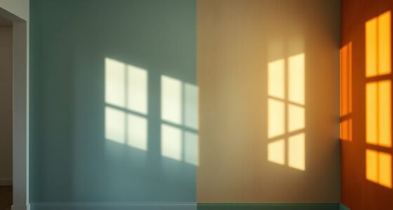
Paint brands and color specialists are publishing forecasts for 2027 that point to richer, more personal palettes, including wine reds, mossy greens, earthy pinks and browns, warm pastels and periwinkle. These are expert projections, not confirmed measures of what homeowners will choose or use.
Paint and color experts are forecasting 10 home color directions for 2027, ranging from wine reds and mossy greens to warm pastels and periwinkle. The projections from brands and color specialists suggest a move toward more saturated, nature-influenced shades and choices tied to personal memories, though they are forecasts rather than evidence of a settled consumer trend.

Get furniture and decor delivered free with Prime
- Fast, free delivery on millions of items
- Prime Video, Amazon Music and more included
- Member-only deals all year
The forecast describes a shift from some of the lighter, calming palettes prominent in recent years toward deeper, more complex hues. Experts connect the colors to natural pigments, plants and minerals, while also pointing to nostalgia: people may draw inspiration from a childhood home, a favorite trip or a vintage textile. The source material presents these as influences and expert interpretations, not measured findings about buyers.
Among the named examples, wine and berry shades include IKEA’s Wild Fig, a purple-burgundy tone; Townsend Harper Brown in Benjamin Moore’s Color Trends palette; and Sherwin-Williams forecast shades Cordovan and Stolen Kiss. For greens, Benjamin Moore selected Webster Green as its Color of the Year, while Behr named Grounded. Sherwin-Williams’s forecast also includes Secret Green and Roycroft Bronze Green.
Other sections of the forecast point to grounded rose tones, neutral browns, stone-based neutrals, complex blues, warm pastels, earthen oranges, mature yellows and periwinkle. The source material gives a fuller description of some categories than others, so the list should be read as a set of predicted directions, not a ranked survey or a claim that every shade is a new release.
From soft neutrals to bold hues
Paint brands and color specialists predict richer, more personal palettes for 2027. These are expert projections, not confirmed measures of homeowner choices.
The palette at a glance
The forecast spans deeper, nature-influenced shades and warmer, more complex colors.
Purple-tinged reds
Examples include Wild Fig, Cordovan and Stolen Kiss.
Moss to forest
Webster Green, Grounded, Secret Green and Roycroft Bronze Green are named.
A broad mix
The list also includes grounded roses, browns, stone neutrals, blues, warm pastels, earthen oranges, mature yellows and periwinkle.
Why colors may feel different
Experts connect the forecast to nature, nostalgia and personal expression.
- Lighter, calming palettes
- Pale neutrals and airy finishes
- Warmer, deeper, earthier shades
- Colors tied to memories and personal taste
Ways to explore the palette
Use the forecasts as inspiration while making choices for your own space.
Try paint samples against existing finishes and in your room’s lighting.
Consider a single wall or smaller room for a saturated color.
Choose colors that suit the home and the people who live there.
What the forecast can tell us
The supplied material names predicted directions and examples, but gives no consumer survey or sales evidence.
| Claim | What the material supports |
|---|---|
| Expert projections | Ten expected color directions are listed. |
| Consumer adoption | No survey or sales data is provided. |
| Popularity ranking | The directions are not ranked. |
Why Deeper Palettes Are Emerging
The forecast matters to homeowners and designers because paint color can influence the feel of a room and guide renovation or decorating decisions. Its central suggestion is that comfort is being interpreted in richer colors, rather than only through pale neutrals and airy finishes. That is an expert reading of the mood behind the palette, not a guarantee that deep shades will suit every space or become widely adopted.
For readers planning a refresh, the range also offers options beyond a single all-over color trend. A saturated shade might be used on one wall, in a smaller room, or alongside wood and neutral finishes. The experts’ emphasis on personal references supports choosing colors for their relationship to a home and its occupants, rather than treating a forecast as a prescription.
Products Worth Considering

Hisense E7 Cinema Series 55-Inch Hi-QLED Mini-LED 4K UHD Smart Fire TV

TCL 55-Inch R7D Series QLED 4K UHD HDR Roku Smart TV (55R7D, 2026)

Shark AI Ultra Robot Vacuum with Matrix Clean and Self-Empty Base
As an affiliate, we earn on qualifying purchases.
From Calm Neutrals to Personal Color
The forecast frames the 2027 palette as a continuation of earlier color cycles, but with more saturation and complexity. Red tones are described as moving from ruby and crimson toward purple-tinged wine shades; pinks shift from pale blush toward more earthy, layered roses. Greens remain a recurring feature, but the examples emphasize moss, olive and forest-like depth.
Emily Kantz, Sherwin-Williams color marketing manager, says some people are reconsidering the expectation that home interiors should always feel soothing. Andrea Magno of Benjamin Moore describes Webster Green as versatile and rooted in tradition, while Behr’s Kayla Kratz says the idea of comfort is moving toward warmer, earthier colors. Those statements explain the experts’ reasoning; they do not establish how widely homeowners share it.
“If you had to conjure in your mind the perfect mid-tone green, we really felt that this hits the mark.”
— Andrea Magno, Benjamin Moore vice president of brand, color, and integrated marketing
Forecasts, Not Consumer Results
The material does not provide survey data, sales figures or other measurements showing whether homeowners are already adopting these colors. It also does not specify how the 10 directions were selected or rank them by expected popularity. Forecasts reflect expert judgment, and individual paint brands’ Color of the Year selections are not proof of an industry-wide consensus.
Some trend categories receive little detail in the supplied material, including stone-based neutrals, complex blues, warm pastels, earthen oranges, mature yellows and periwinkle. Their inclusion is confirmed as part of the forecast list, but specific shades, expected use and brand selections are not fully established here.
How the Forecasts May Be Used
As 2027 approaches, homeowners can compare the forecasts with paint samples, room lighting, existing finishes and their own preferences. The cited brands have named several featured shades, but the source material does not give a schedule for further releases or explain whether additional forecast details are forthcoming. Actual uptake will become clearer only through later product, sales or consumer data.
Key Questions
What are the main home color trends forecast for 2027?
The forecast lists wine, mossy greens, grounded roses, neutral browns, stone-based neutrals, complex blues, warm pastels, earthen oranges, mature yellows and periwinkle.
Which paint colors are named as examples?
Examples include IKEA’s Wild Fig, Benjamin Moore’s Townsend Harper Brown and Webster Green, Behr’s Grounded, and Sherwin-Williams shades Cordovan, Stolen Kiss, Secret Green and Roycroft Bronze Green.
Do the forecasts prove these colors will be popular?
No. They are expert projections. The supplied material includes no consumer survey or sales data confirming how many people will use the colors.
Why do experts expect richer colors?
Experts cited nature, nostalgia and interest in personal expression. Some also described comfort as shifting toward warmer, deeper and earthier shades, rather than only pale, airy neutrals.
Source: veranda.com