
Using color psychology in boho spaces helps you create an environment that reflects your personality and boosts your mood. Earth tones like terracotta and sandy beiges ground the space and promote relaxation, while vibrant accents like jewel tones energize and inspire. Soft pastels add serenity and whimsy. By thoughtfully choosing colors, you can evoke calmness, excitement, or creativity, making your space truly personal. Explore more to discover how to perfectly tune your boho décor to your emotional needs.
Key Takeaways
- Use earthy tones like terracotta and sandy beiges to create a calming, stable foundation that fosters relaxation in boho spaces.
- Incorporate vibrant jewel tones and rich reds to energize the environment and reflect lively, dynamic personalities.
- Select cool hues like soft greens and muted blues to promote calmness, clarity, and a sense of tranquility.
- Mix unexpected colors intuitively to express individuality and evoke authentic emotional responses.
- Apply color psychology by choosing hues that align with desired moods, enhancing the space’s emotional and personal resonance.
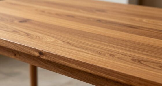
Color psychology plays an essential role in creating the relaxed, eclectic vibe that defines boho spaces. When you’re designing a boho environment, your color palette choices aren’t just about aesthetics—they deeply influence the mood and emotional impact of hues. You want your space to feel warm, inviting, and free-spirited, so selecting colors thoughtfully can help evoke the desired feelings. Earthy tones like terracotta, warm browns, and sandy beiges often serve as the foundation, grounding the space with a sense of stability and comfort. These hues foster a calming atmosphere that encourages relaxation, making your space feel like a cozy retreat.
Earthy tones like terracotta and sandy beiges create a warm, calming boho retreat.
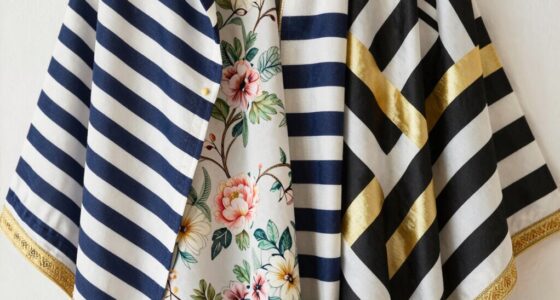
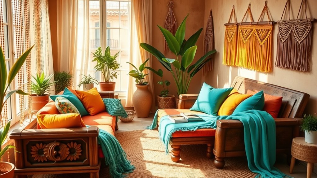
At the same time, vibrant accents such as jewel tones, deep oranges, or rich reds can inject energy and personality into your boho decor. The emotional impact of hues like these pulls you into a lively, passionate vibe that’s characteristic of boho style. Bright turquoise or emerald green can evoke feelings of freshness and vitality, while softer pastel shades like blush pink or lavender add a touch of serenity and whimsy. These choices allow you to create a layered color scheme that balances tranquility with lively expression.
Your color palette choices should also reflect your personal story and the ambiance you wish to cultivate. If you’re aiming for a more tranquil, meditative space, you might lean toward cool tones like muted blues and soft greens, which promote calmness and mental clarity. Conversely, if your goal is to energize and inspire, warmer shades like mustard yellow or burnt orange can spark motivation and joy. Remember, the emotional impact of hues isn’t just about their inherent color but also how they interact with each other and the lighting in your space. A well-balanced mix creates a harmonious environment that feels both dynamic and cohesive.
In boho spaces, you don’t have to stick to traditional color rules. The beauty lies in mixing and matching unexpected combinations, trusting your intuition to guide your choices. Use color to express your personality and evoke specific emotions, knowing that each hue contributes to the overall mood. Whether you want your space to feel relaxed, adventurous, or soulful, understanding the emotional impact of hues and choosing your color palette accordingly empowers you to craft a truly authentic boho sanctuary. Incorporating color psychology principles can help you select hues that resonate emotionally and enhance your space’s atmosphere. Your colors become more than just visual elements—they become a language that speaks to your spirit and creates an environment where you feel genuinely at home.

Barydat 6 Pieces Boho Plant Wall Art Decor Wooden Boho Farmhouse Rustic Bohemian Wall Hanging for Bedroom Living Room Office (Retro,8 Inch, 10 Inch)
Intricate Botanical Design in Neutral Tones: the neutral botanical design of our plant pictures wall art beautifully captures…
As an affiliate, we earn on qualifying purchases.
As an affiliate, we earn on qualifying purchases.
Frequently Asked Questions
How Do Color Choices Influence Mood in Boho Interiors?
Your color choices in boho interiors directly influence your mood through color symbolism and emotional impact. Warm hues like terracotta and ochre create cozy, inviting vibes, while cool shades like blues and greens promote calmness and relaxation. Bright colors energize your space, boosting happiness. By selecting colors thoughtfully, you shape the emotional atmosphere, making your boho space feel vibrant, soothing, or inspiring based on the mood you want to foster.
Which Colors Are Best for Creating a Relaxing Boho Atmosphere?
You should choose natural hues like soft beiges, warm browns, and muted greens to create a relaxing boho atmosphere. These colors foster a sense of calm and comfort through color harmony, making your space feel cozy and inviting. Incorporate subtle pops of calming blues or gentle terracottas for added warmth. Stick to these soothing shades, and your space will exude tranquility and relaxation effortlessly.
Can Color Psychology Help Balance Eclectic Boho Decor?
Color psychology acts like a balancing act in eclectic boho decor, helping you create harmony amidst diverse styles. You can harness paint psychology to choose colors that promote calm, joy, or energy, ensuring your space feels cohesive. By intentionally selecting hues that complement each other, you establish color harmony, making your vibrant, eclectic decor feel intentional and soothing rather than chaotic. This approach lets you enjoy a lively yet balanced boho haven.
How Do Lighting and Color Interact in Boho Spaces?
Lighting fixtures in boho spaces play a pivotal role in enhancing color contrast and creating ambiance. You can use warm, soft lighting to highlight earthy tones and vibrant accents, making the space feel cozy and inviting. Experiment with different lighting types, like string lights or lanterns, to emphasize the interplay between light and color. This interaction naturally enhances the eclectic vibe, making your boho space feel lively and balanced.
Are There Color Combinations That Enhance Creativity in Boho Rooms?
You’re really onto something when considering color pairing to boost creativity in boho rooms. Bright, energetic combinations like turquoise and coral or mustard and deep purple spark inspiration and keep things lively. Don’t be afraid to mix earthy tones with vibrant hues—these creative combinations can turn your space into a hub of innovation. Think outside the box, and your space will reflect your creative spirit effortlessly.

LANANAS Neutral Couch Throw Pillow Covers 18×18 Inch Set of 4 Decorative Farmhouse Boho Throw Pillows for Living Room, Couch, Bed, Sofa Soft Corduroy Accent Home Decor (Neutral Brown, 18×18 Inch)
COVERS ONLY.
As an affiliate, we earn on qualifying purchases.
As an affiliate, we earn on qualifying purchases.
Conclusion
Think of your boho space as a vibrant garden, where each color is a flower, and together they create a harmonious haven. By understanding the psychology behind these hues, you’re planting seeds of calm, creativity, and joy. As you nurture your space, it blossoms into a sanctuary that reflects your inner spirit. Remember, the colors you choose are like sunlight—guiding your mood and energy, transforming your home into a lush, soulful retreat.
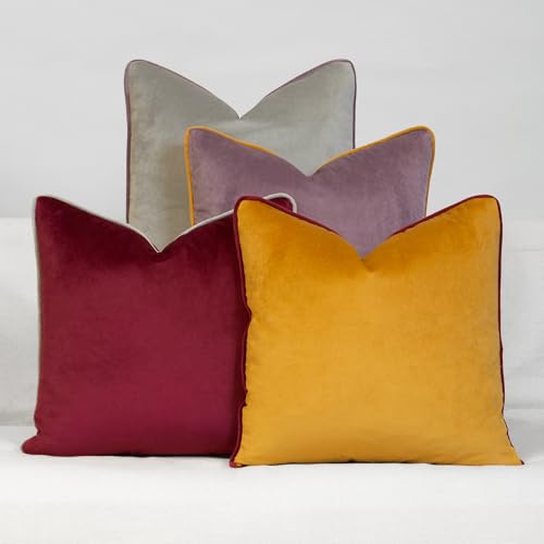
Daisy Linens Decorative Throw Pillow Set of 4, 18" x 18" Solid Colorful Velvet Accent Pillow Covers, Jewel Tones
100% polyester, set of 4 pillow covers, with hidden zipper closure. Imported.
As an affiliate, we earn on qualifying purchases.
As an affiliate, we earn on qualifying purchases.

12 Pcs Car Air Fresheners Hanging Car Interior Accessories, Boho Essential Oil Scented Diffusers, Kawaii Auto Mirror Decor, Vehicle Air Fresheners Gift for Women(Fresh)
What You Will Receive: the package contains 12 pieces of cute car freshener hanging in 6 cute designs,…
As an affiliate, we earn on qualifying purchases.
As an affiliate, we earn on qualifying purchases.