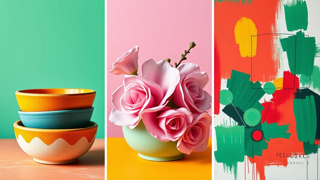

To master color pairing, understand that triadic schemes balance three evenly spaced colors for vibrant harmony, while analogous pairings use neighboring hues for seamless unity. Complementary contrasts sit opposite each other on the color wheel for striking visuals, especially when one color dominates. Knowing these rules helps you create dynamic, appealing designs. If you explore further, you’ll discover how to combine these schemes effectively for any project or mood.
Key Takeaways
- Triadic schemes use three evenly spaced colors on the wheel for vibrant, balanced contrast.
- Analogous pairings involve neighboring colors for harmonious, seamless transitions.
- Complementary combinations pair opposite colors for striking contrast and visual impact.
- Balancing saturation and brightness enhances harmony and prevents visual chaos.
- Understanding color relationships guides effective scheme selection for mood and message.

JimKing Creative Color Wheel, Paint Mixing Learning Guide, Art Class Teaching Tool for Makeup Painting Tattoo,Blending Board Chart Color Mixed Guide Hardboard(9.25inch)
Helps organise colours to make choices and combinations easier;Defines common terms and helps the artist to understand colour…
As an affiliate, we earn on qualifying purchases.
As an affiliate, we earn on qualifying purchases.
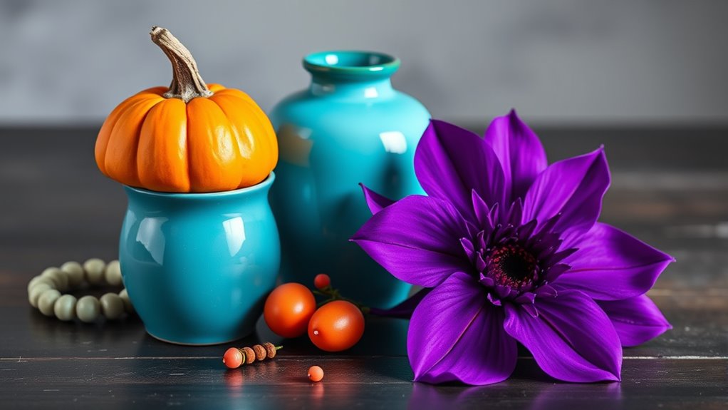
Understanding the Triadic Color Scheme
The triadic color scheme is a popular method for creating vibrant and balanced color combinations. It’s based on the principles of color harmony, which aim to make colors work well together. Understanding color theory basics helps you grasp how these schemes function. In a triadic palette, three colors are evenly spaced around the color wheel, forming a triangle. This arrangement ensures contrast while maintaining visual harmony. It’s ideal for adding energy to your design without overwhelming the viewer. When applying this scheme, focus on balancing the colors and varying their saturation or brightness to keep the composition interesting. Mastering the triadic approach allows you to produce dynamic, eye-catching visuals that feel cohesive and well-thought-out. Additionally, visual balance is essential to prevent the composition from becoming too chaotic or overly uniform.

Causeways Palette 50 Color Inspired Palettes with Color Names and Six Universal Color Codes: For Coloring Enthusiasts, Artists, Designers, Wedding Planners, Photographers, and Creatives Volume 1
As an affiliate, we earn on qualifying purchases.
As an affiliate, we earn on qualifying purchases.
Exploring Analogous Color Pairings
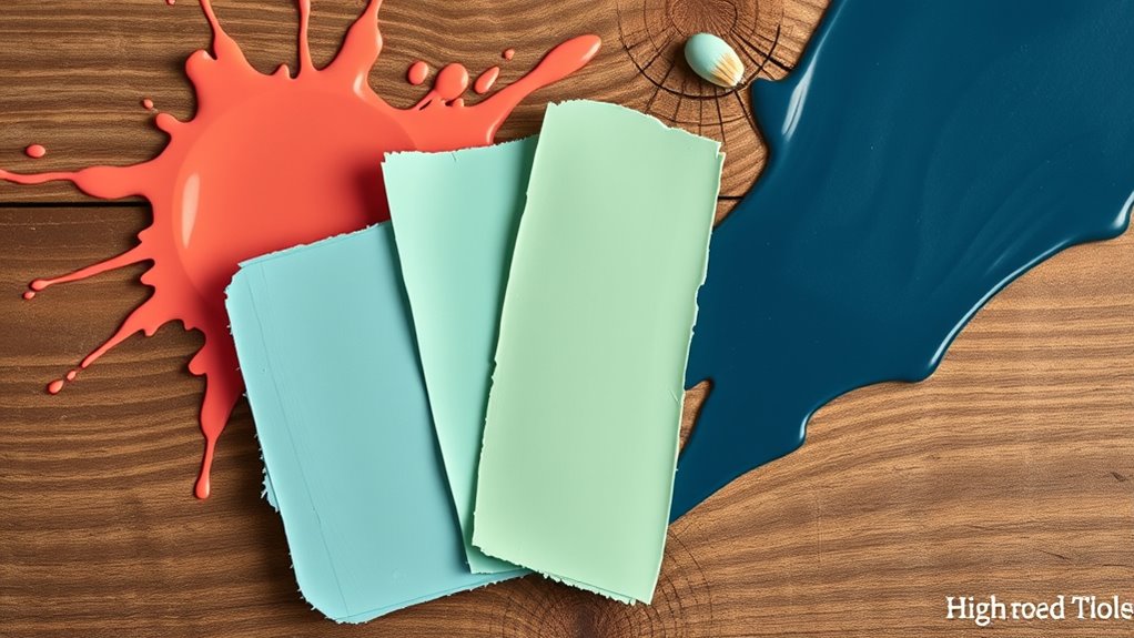
Building on your understanding of color harmony, exploring analogous color pairings offers a subtler way to create cohesive and harmonious designs. These pairings rely on color harmony principles, where colors next to each other on the color wheel work together naturally. When selecting an analogous color palette, you focus on shades that share common undertones, producing a seamless progression. This approach enhances visual unity without overwhelming the viewer. You can experiment with different shades and tints within the same color family to add depth and interest. By choosing colors that are closely related, you ensure your design remains balanced and pleasing to the eye. This strategy simplifies color palette selection and helps achieve a harmonious aesthetic effortlessly. Additionally, understanding color relationships can guide you in making more informed choices for visually appealing designs.

Color Theory Poster for Designers, 16"x24", Quick Reference, Colors Wheel Poster for Classroom, Color-Mixing, RGB, CMYK, Theory Knowledge
Premium Quality Paper: Crafted from durable 260 GSM paper, our poster offers a premium feel and lasting strength….
As an affiliate, we earn on qualifying purchases.
As an affiliate, we earn on qualifying purchases.
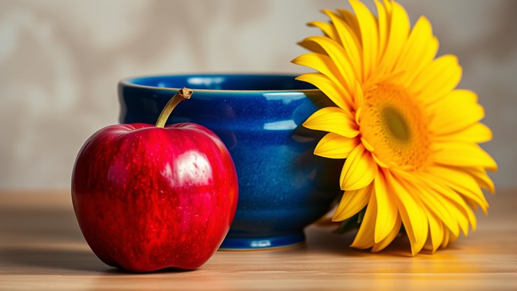
Mastering Complementary Color Combinations
Have you ever wondered how to create striking contrasts that still feel harmonious? Mastering complementary color combinations is key. These pairs sit opposite each other on the color wheel, offering strong visual contrast that catches the eye. When used thoughtfully, they enhance color harmony by balancing boldness with balance. To succeed, start with one dominant color and add its complement in smaller amounts to avoid overwhelming the eye. This technique creates vibrant, dynamic visuals perfect for accents, branding, or artwork. Pay attention to how these colors interact—sometimes a subtle touch is enough to achieve the desired impact. Understanding color relationships helps in designing with confidence, producing eye-catching compositions that feel both energetic and harmonious.

Mijello MWP-2050 50 Wells Water Color Color Wheel Palette
Mijello MWP-2050 Water Color Wheel Palette
As an affiliate, we earn on qualifying purchases.
As an affiliate, we earn on qualifying purchases.
Frequently Asked Questions
How Do I Choose Colors for Different Seasons?
To choose colors for different seasons, focus on seasonal color palettes inspired by nature. In spring, opt for soft pastels and fresh greens. Summer calls for bright, vibrant hues like turquoise and coral. Autumn features warm, earthy tones such as burnt orange and deep reds. Winter favors cool, rich shades like navy and emerald. Use nature-inspired schemes to reflect each season’s unique mood, creating harmony and visual interest in your wardrobe or decor.
Can I Mix More Than Three Colors in a Scheme?
Yes, you can mix more than three colors in a scheme. To guarantee color palette diversity and avoid clutter, use color contrast techniques like balancing bold hues with neutral shades. Incorporate varying tones and shades to create visual interest while maintaining harmony. Experiment with different combinations, but keep the overall balance in mind. This approach helps you craft vibrant, cohesive designs that stand out without overwhelming your space or project.
What Tools Help Visualize Color Harmony?
You can definitely visualize color harmony with helpful tools like a color wheel and digital palettes. The color wheel allows you to see relationships like complementary or triadic schemes, making it easier to select harmonious colors. Digital palettes offer customizable options, letting you experiment with different combinations instantly. Using these tools, you’ll develop a keen eye for color harmony and create balanced, visually appealing schemes effortlessly.
How Do Lighting Conditions Affect Color Pairing?
Lighting conditions greatly impact your color pairing choices by causing perception variation. Bright, natural light makes colors appear more vibrant and true to their hue, while dim or artificial lighting can dull or alter them. You should test your color combinations under different lighting to ensure they work well in all settings. Being aware of lighting impact helps you create harmonious color schemes that look great regardless of the environment.
Are There Cultural Differences in Color Preferences?
You’ll find that cultural differences markedly influence color preferences. For example, in Western cultures, white often symbolizes purity, while in some Asian cultures, it’s linked to mourning. These cultural symbols shape regional palettes, affecting color choices in design and fashion. By understanding these symbolism nuances, you can create more culturally aware and appealing color combinations, ensuring your work resonates well across diverse audiences.
Conclusion
By mastering triadic, analogous, and complementary color schemes, you can create stunning, balanced designs effortlessly. Did you know that color can increase brand recognition by up to 80%? So, when you apply these pairing rules, you’re not just making things look good—you’re also boosting your visual impact. Keep experimenting with these strategies, and watch your color palettes become more vibrant and eye-catching every time. Your creative potential is truly limitless!