Colors appear different under artificial light compared to daylight because of variations in spectral composition and color temperature. Natural daylight offers a broad, continuous spectrum that makes colors look vibrant and true to life. Artificial lights like LEDs, fluorescents, or incandescent bulbs often have uneven spectra, causing colors to seem dull, warmer, or distorted. Understanding these differences helps you choose lighting that maintains accurate colors. Keep exploring how lighting impacts color perception and how to optimize it.
Key Takeaways
- Daylight provides a broad, continuous spectrum that maintains accurate, vibrant colors, reducing color drift compared to artificial sources.
- Artificial lights often have limited, uneven spectral distributions, which can cause colors to appear dull, distorted, or shifted.
- Higher CRI artificial lighting minimizes color drift, but generally cannot fully replicate the natural spectrum of daylight.
- Spectral analysis reveals that differences in wavelength distribution under artificial versus natural light influence perceived color stability.
- Consistent use of full-spectrum, calibrated lighting reduces color drift and improves color fidelity across different lighting conditions.
Understanding Color Temperature and Its Impact
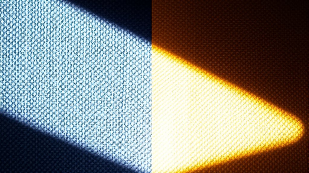
Understanding color temperature is essential because it influences how colors appear under different lighting conditions. When you grasp this concept, you can better predict how colors will look in various environments, ensuring color consistency across your projects. Spectral analysis helps you understand the distribution of light wavelengths emitted by different sources, which directly affects perceived color. For example, a light source with a higher color temperature, like daylight, tends to produce cooler, bluish tones, while lower temperatures emit warmer, yellowish hues. By analyzing spectral data, you can select lighting that maintains consistent color accuracy, preventing unwanted color drift. Additionally, spectral analysis techniques enable more precise adjustments to lighting setups, ensuring your work remains true to intended colors regardless of lighting conditions. This knowledge allows you to create visually coherent spaces and guarantees your work remains true to intended colors, regardless of the lighting conditions.
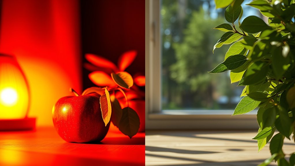
The Spectral Composition of Natural vs. Artificial Light
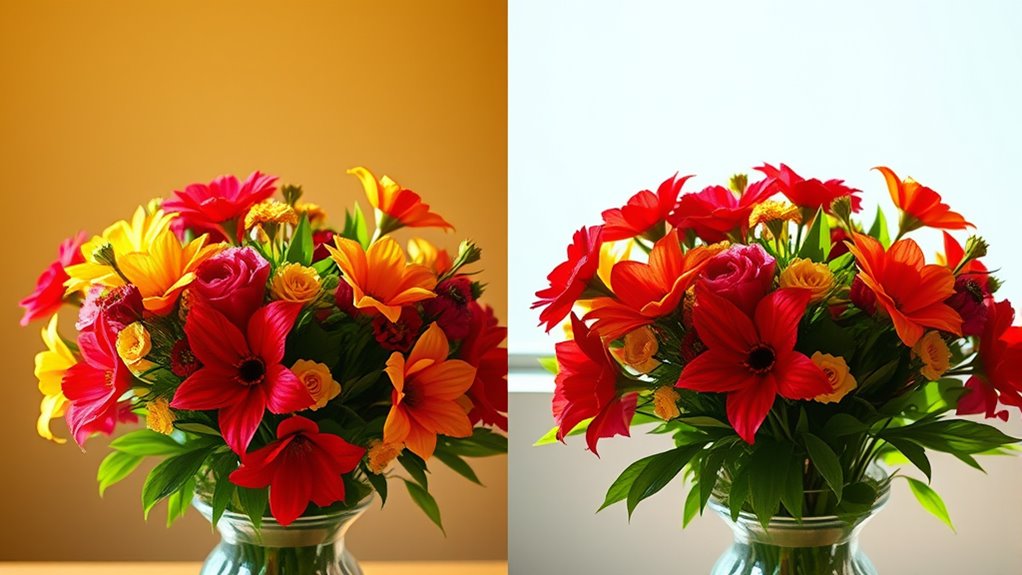
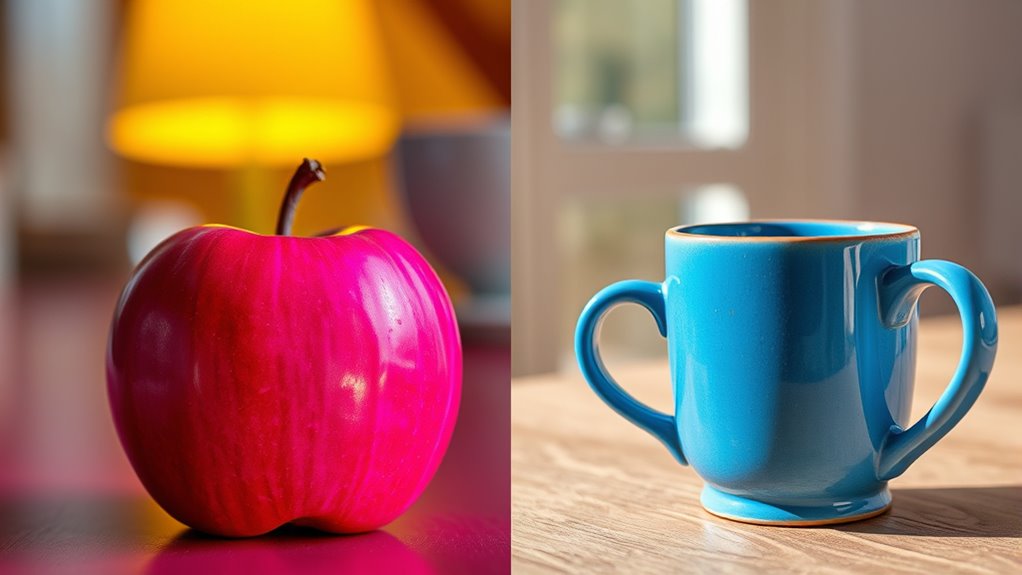
Natural light and artificial light differ markedly in their spectral composition, which directly impacts how colors are perceived. The spectral composition refers to how light’s energy is distributed across different wavelengths in the light spectrum. Sunlight provides a broad, continuous spectrum, covering nearly all visible wavelengths, resulting in vibrant, true-to-life colors. In contrast, artificial light sources like incandescent or LED bulbs have a more limited and uneven spectral composition. Incandescent bulbs emit a warm, yellowish light with a narrow spectrum, while LEDs can vary widely, often lacking certain wavelengths found in natural light. This difference in light spectrum influences how colors appear under each source, making some hues look dull or distorted under artificial lighting compared to natural daylight. Understanding spectral distribution helps explain why color perception varies so significantly between natural and artificial lighting conditions.
How Different Light Sources Affect Color Perception

The spectral differences between natural and artificial light sources directly influence how you perceive colors. These perception nuances can cause colors to appear slightly different depending on the light. Under daylight, colors tend to look more vibrant and true to their original hue, helping you distinguish subtle shades. Conversely, artificial lights, such as incandescent or fluorescent, can alter color perception due to their unique spectral emissions, sometimes making colors seem warmer, cooler, or duller. Ambient influences also play a role, as surrounding colors and lighting conditions can intensify or diminish these effects. Understanding how various light sources impact perception helps you anticipate color shifts and choose lighting that maintains color accuracy in your environment. Additionally, advancements in lighting technology are increasingly designed to minimize such color drifts, improving visual consistency across different settings.
Common Artificial Lighting Technologies and Their Color Traits

Different artificial lighting technologies produce distinct color characteristics that can profoundly influence how objects appear. For example, LED lights often emit a bright, cool light, but they can flicker subtly, affecting color stability. Incandescent bulbs produce a warm, pleasing glow with high color warmth, making colors look richer. Fluorescent lights tend to have a harsher, sometimes bluish tone, which can distort color perception. The key differences are summarized below:
| Technology | Color Trait |
|---|---|
| LED | Bright, energy-efficient, potential flicker |
| Incandescent | Warm, cozy, high color warmth |
| Fluorescent | Cool, sometimes harsh tone |
| Halogen | Slightly warmer than LED |
| CFL | Moderate warmth, flicker risk |
Understanding these traits helps you choose lighting that minimizes color drift. Additionally, lighting quality plays a crucial role in how accurately colors are rendered under different sources.
The Role of Color Rendering Index (CRI) in Color Accuracy
Color Rendering Index (CRI) plays a crucial role in how accurately artificial lighting displays colors. A higher CRI means better color matching, helping you see true shades and details. When CRI is low, colors can appear dull or off, making it harder to judge pigment stability or distinguish subtle hues. This is especially important in settings like art galleries or retail spaces, where accurate color perception matters.
Higher CRI lighting ensures true colors and better detail visibility in art and retail spaces.
To optimize color accuracy, consider these points:
- Choose lights with a CRI of 80 or above for better color fidelity.
- Understand that low CRI can distort color perception, affecting pigment stability.
- Match lighting conditions to daylight for consistent color rendering across environments.
Visual Examples of Color Drift in Various Environments
Lighting conditions dramatically influence how colors appear in various environments, often causing noticeable drift that can impact perception and decision-making. For example, in historical lighting, warm incandescent bulbs make whites appear yellowish, altering how artwork or textiles are viewed. Cultural perceptions also shift based on lighting; what looks vibrant under daylight may seem muted under artificial sources, affecting fashion choices or interior design. Visual examples highlight these differences:
| Environment | Color Appearance |
|---|---|
| Museum with incandescent | Colors seem warmer, less true to original |
| Office under fluorescent | Whites appear bluish, dull |
| Art gallery with daylight | Colors are vivid and accurate |
| Restaurant with warm light | Warm tones enhance cozy ambiance |
| Modern LED lighting | Color rendering can vary, influencing perception |
These examples reveal how context and lighting history shape our color perception daily.
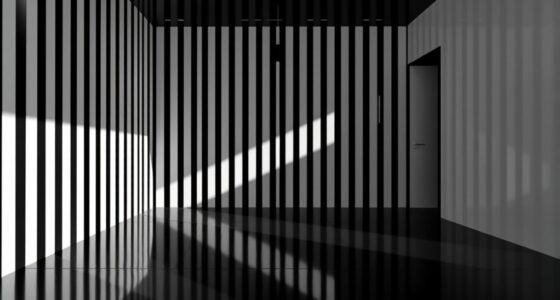
The Influence of Light Intensity and Angle on Color Appearance
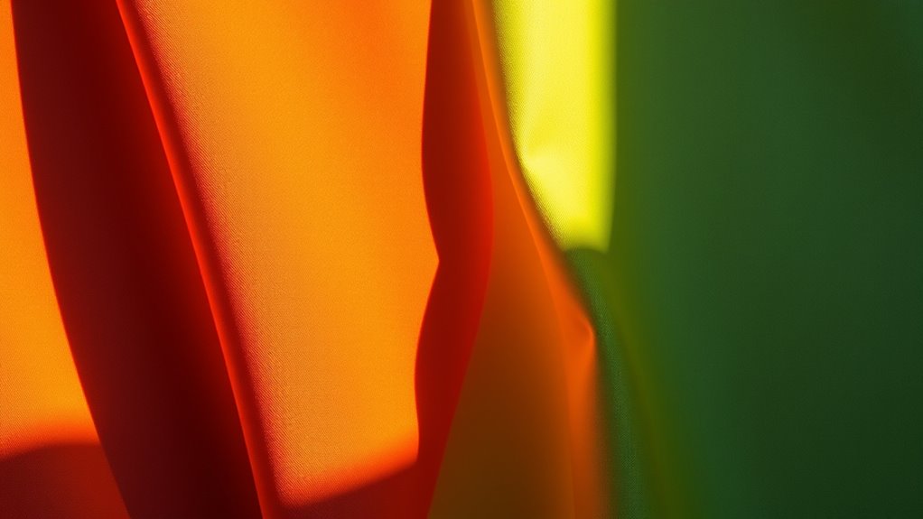
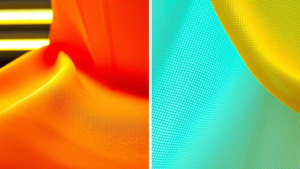
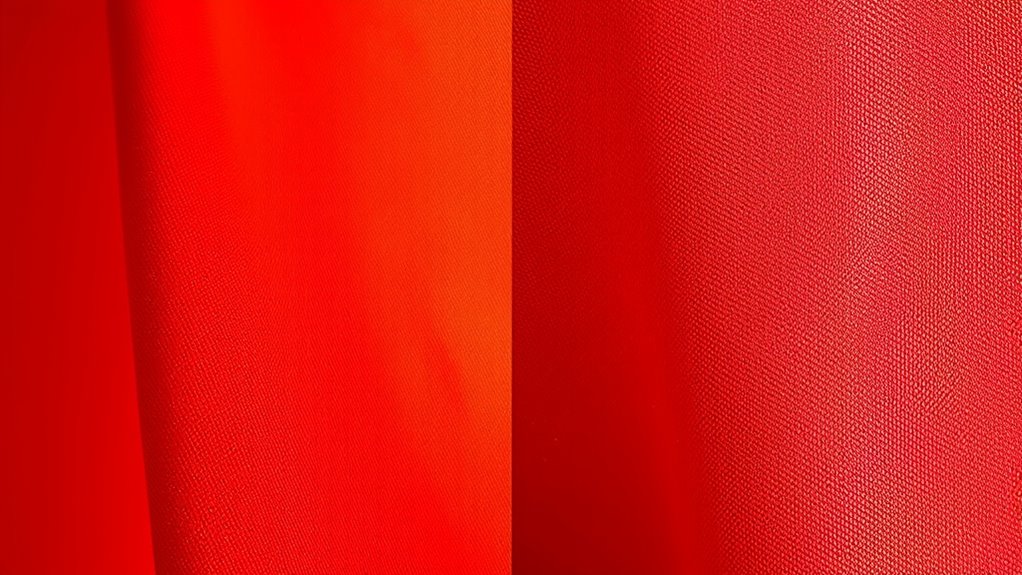
The way colors appear can change considerably based on the intensity and angle of the light hitting an object. When the light angle shifts, you might notice colors look different because the way light reflects onto surfaces varies. Light intensity also plays a vital role; brighter light can make colors seem more vivid, while dimmer light dulls them. Additionally, the comfort and support solutions available for different lighting conditions can influence how colors are perceived, especially in environments where specific lighting setups are used for tasks or display purposes.
Strategies for Minimizing Color Drift in Professional Settings
To reduce color drift in professional settings, you should start by standardizing your lighting conditions to make certain. Using consistent color metrics helps you accurately compare and monitor color accuracy over time. Additionally, scheduling regular calibration of your lights guarantees that colors stay true and minimizes shifts caused by equipment changes.
Standardize Lighting Conditions
Maintaining consistent lighting conditions is essential for minimizing color drift in professional settings. When you standardize your light spectrum, you help guarantee accurate color perception across tasks. Use controlled light sources that emit a stable spectrum, avoiding fluctuations that can alter colors. Consistency means aligning lighting conditions to reduce variability caused by different light sources or times of day. Consider these strategies:
- Use calibrated, high-quality light fixtures with a fixed spectrum
- Maintain uniform lighting intensity and angle
- Regularly check and adjust your lighting setup to prevent drift
- Incorporate consistent lighting conditions to ensure reliable color rendering and perception
Use Consistent Color Metrics
Using consistent color metrics is crucial for accurately monitoring and controlling color accuracy in professional environments. By establishing a standard measurement system, you ensure reliable comparisons over time, which helps maintain color consistency. Selecting appropriate color spaces and metrics—such as CIE Lab or Delta E—allows you to quantify color differences precisely. Consistent lighting calibration further supports this process by ensuring your light sources produce stable, predictable illumination. When you use uniform color metrics, you minimize discrepancies caused by varying measurement methods, making it easier to detect and correct color drift. This approach provides a clear benchmark for evaluating color accuracy, guaranteeing that your color management remains precise regardless of lighting conditions or material changes. Ultimately, dependable metrics are vital for high-quality, consistent visual outcomes. Additionally, understanding how lighting conditions influence perceived color can help refine your calibration process and improve overall accuracy.
Schedule Regular Calibration
Regular calibration is essential for keeping color accuracy consistent over time. By scheduling routine light calibration, you ensure your display maintains precise color matching, reducing drift caused by artificial or daylight changes. Consistent calibration helps catch subtle shifts before they impact your workflow. To streamline this process, consider:
- Performing calibration at regular intervals, such as weekly or monthly
- Using reliable calibration tools for accurate light calibration
- Documenting calibration results to track long-term color stability
- Understanding the impact of ambient lighting conditions on display color accuracy
These steps help you maintain reliable color matching, especially when working with critical visuals. Regular calibration minimizes the influence of ambient lighting variations, preventing color drift. This proactive approach ensures your workspace consistently produces accurate, professional results, no matter the lighting conditions.
Selecting Appropriate Lighting for Accurate Color Representation
Choosing the right lighting is essential for accurately perceiving colors, especially when color fidelity matters. To achieve precise color matching, select light sources with a high Color Rendering Index (CRI) of 90 or above. This ensures colors appear true to life under your lighting conditions. Consider lighting ergonomics by avoiding overly yellow or blue tints that can distort color perception. Opt for full-spectrum or daylight-balanced bulbs that closely mimic natural daylight, providing a neutral environment for accurate color evaluation. Adjust brightness levels to prevent glare or shadows, which can interfere with color judgment. Proper lighting setup minimizes color drift, helping you maintain consistency across projects. Additionally, understanding color calibration techniques can further enhance color accuracy in your environment. Prioritizing appropriate lighting choices ultimately improves your ability to judge colors accurately, making your work more reliable and professional.
Future Trends in Lighting Technologies and Color Fidelity

Advancements in lighting technology are poised to notably enhance color fidelity, addressing current limitations and opening new possibilities for accuracy. LED advancements are driving improvements in color rendering indices and spectral quality, making artificial lighting more consistent with natural daylight. Smart lighting systems will soon enable precise control over color temperature and brightness, adapting dynamically to your environment and needs. These innovations will reduce color drift and improve visual consistency across various settings. You’ll see brighter, more accurate colors in retail, art galleries, and hospitals. Additionally, integration with automation and AI will optimize lighting conditions in real-time, ensuring ideal color fidelity. As these technologies evolve, expect lighting to become smarter, more adaptable, and better at preserving true colors in any scenario. Incorporating dynamic calibration techniques will further minimize discrepancies over time, ensuring sustained color accuracy.
Frequently Asked Questions
How Does Ambient Temperature Affect Color Perception Under Different Lights?
Ambient temperature impacts your color perception through thermal effects that influence color stability. When it’s hot, colors may appear faded or washed out, while cold temperatures can make colors seem more vibrant or distorted. This happens because temperature affects how light interacts with surfaces and materials. You should be aware of these thermal effects, especially in environments with fluctuating temperatures, to accurately perceive true colors under different lighting conditions.
Can Paint or Fabric Colors Change Appearance Under Artificial Versus Natural Light?
Think of your paint or fabric like chameleons—its appearance shifts with the light it’s under. Under artificial light, colors often lose their true hue because of the limited light spectrum, causing a drift in color accuracy. Natural daylight, with its full spectrum, reveals true colors. You’ll notice your favorite fabric’s vibrant red looks dull indoors but pops under sunlight, highlighting how light spectrum impacts color perception.
What Is the Impact of Aging Light Bulbs on Color Fidelity?
As your light bulbs age, their degradation causes a noticeable color shift, impacting color fidelity. Over time, filament or LED components weaken, altering the light spectrum they emit. This change can make colors appear different from how they looked when the bulbs were new. To maintain true color accuracy, you should regularly replace aging bulbs and consider using bulbs with proven color stability ratings, especially in settings where color precision matters.
How Do Outdoor Weather Conditions Influence Daylight Color Accuracy?
Outdoor weather conditions considerably influence daylight color accuracy by causing spectral variability. Overcast skies diffuse sunlight, softening colors and reducing spectral precision, while clear sunny days provide more consistent, accurate daylight. Light pollution from nearby artificial lights can also distort natural color perception, especially during twilight or night. You’ll notice these effects more in fluctuating weather, where atmospheric conditions alter the spectral quality of sunlight, impacting your perception of true colors during outdoor activities.
Are There Standards for Consistent Color Measurement Across Various Lighting Environments?
Yes, there are standards for consistent color measurement across different lighting environments. You should follow standardization protocols like ISO and ASTM guidelines, which ensure uniformity. Calibration methods are essential; you need to regularly calibrate your instruments with lighting standards, such as standardized light sources or color targets, to maintain accuracy. By adhering to these protocols and calibration practices, you minimize color drift and attain reliable, consistent color measurements regardless of the lighting conditions.
Conclusion
To keep colors true, think of lighting like a lens that shapes your view. Whether under daylight or artificial light, understanding their differences helps you avoid unwanted color drift. By choosing the right light sources and paying attention to factors like CRI and intensity, you can guarantee your colors stay vibrant and accurate—like a clear, steady stream in a turbulent river. Mastering this keeps your work sharp and true to life.