
To use accent colors without overwhelm, focus on just one or two hues that complement your overall palette. Balance bright or bold shades with neutral tones like gray, beige, or white to create harmony. Place accents strategically in key areas such as focal walls or decor pieces, and keep proportions in check. Testing colors in your space under different lighting helps avoid surprises. If you want to master this balance, there’s more to discover below.
Key Takeaways
- Limit accent colors to one or two hues for a balanced and cohesive look.
- Use neutral tones on large surfaces to create a calm backdrop for vibrant accents.
- Apply accent colors sparingly in key areas like focal walls or decor pieces for maximum impact.
- Incorporate textures and patterns to add visual interest without overwhelming the space.
- Test colors in the actual environment to ensure harmony and prevent overstimulation.
Choosing the Right Accent Colors for Your Space
Selecting the right accent colors can transform your space from ordinary to striking. To do this effectively, consider color psychology—how different hues evoke emotions and influence mood. For example, blues promote calmness, while reds energize a room. Also, think about cultural associations, which can add meaning or significance to your choice; white might symbolize purity in some cultures but mourning in others. Your goal is to pick accent colors that align with your desired atmosphere and reflect personal or cultural significance. Remember, subtlety is key—choose hues that complement your primary palette without overwhelming it. Understanding color symbolism can help you select shades that resonate emotionally and culturally, enhancing your space’s ambiance and creating a cohesive, inviting environment.
Limiting the Number of Accent Hues
To create a balanced and harmonious space, it’s best to limit the number of accent hues you incorporate. Using too many accent colors can disrupt the harmony and make your room feel chaotic. Focus on one or two hues that complement your main palette, ensuring they work together through thoughtful color contrast. This restraint helps you maintain visual balance, preventing any one color from overpowering the others. By keeping the number of accent hues minimal, you create a cohesive look that feels intentional and well-curated. Remember, simplicity often brings sophistication. Limiting your accent hues allows each color to stand out without competing, fostering a sense of calm and order. Additionally, understanding self watering plant pots can help you maintain your plant’s health with minimal effort, enhancing your overall space. Ultimately, fewer hues lead to more impact and a more inviting, balanced space.
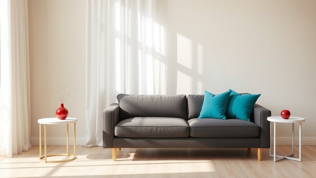
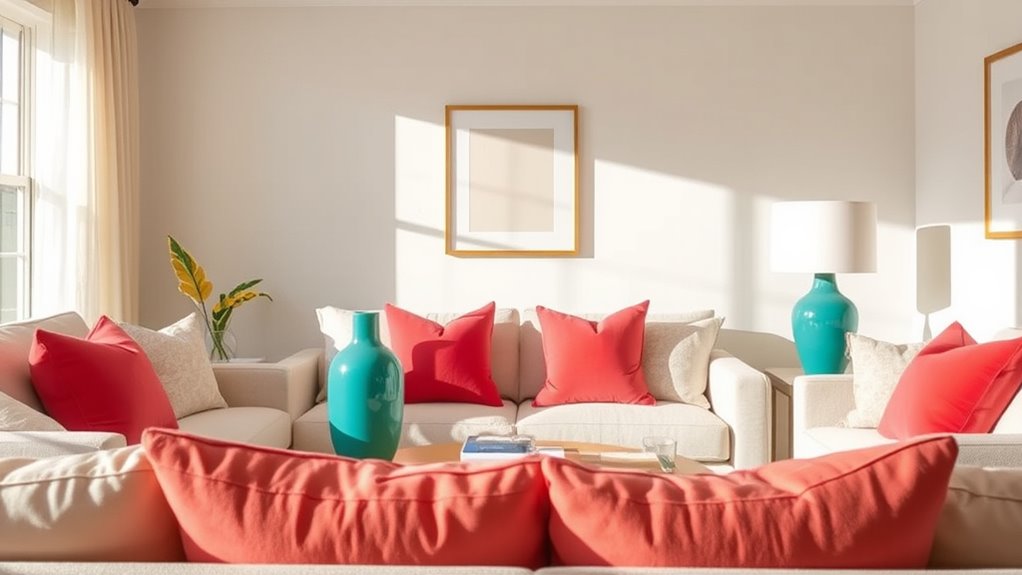
Using Neutral Tones to Balance Bright Colors
When you introduce bright colors into a space, balancing them with neutral tones prevents the room from feeling overwhelming. Neutral palettes, such as soft grays, beiges, or whites, create a calming backdrop that allows bold hues to stand out without dominating. This balance leverages color psychology, where neutral shades evoke feelings of stability and tranquility, helping to ground energetic accents. By incorporating neutral tones, you give your eyes a place to rest amid vibrant elements, making the space feel harmonious and inviting. Use neutrals on large surfaces like walls or furniture, then add pops of bright color through accessories or artwork. This approach guarantees your room feels lively yet balanced, avoiding visual clutter or sensory overload. Embracing minimalist principles ensures that each color choice contributes to a cohesive and peaceful environment.
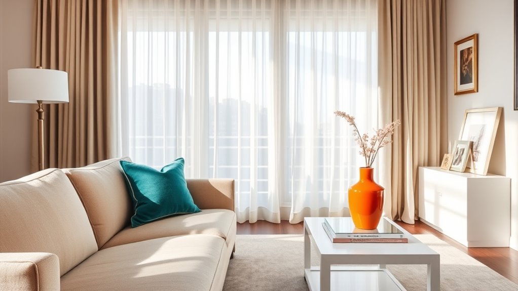
Applying Accent Colors Strategically in Key Areas
Once you’ve balanced bright colors with neutral tones, the next step is to apply those accents thoughtfully in key areas. Use color psychology to choose spots that naturally draw attention, like your entryway, focal wall, or around seating areas. Strategic accent placement helps reinforce the mood you want to create, whether calming or energizing. Keep in mind that small, deliberate pops of color can have a big impact without overwhelming the space. Consider highlighting architectural features or artwork with your accent colors to maximize visual interest. Incorporating visual indicators such as artwork or decorative elements can guide the eye and emphasize your chosen accents effectively. This approach ensures your color choices enhance the overall design, guiding the eye and creating balance. Thoughtful accent placement allows you to enjoy vibrant details without feeling cluttered or distracted.
Incorporating Accent Colors Through Accessories and Decor
You can add personality to your space by choosing bold accessories that stand out without overwhelming. Mixing different textures and patterns keeps the look interesting and dynamic. Incorporating colorful art pieces also helps introduce accent colors in a stylish, balanced way. Using layered textures and colors further enhances depth and visual interest in your decor.
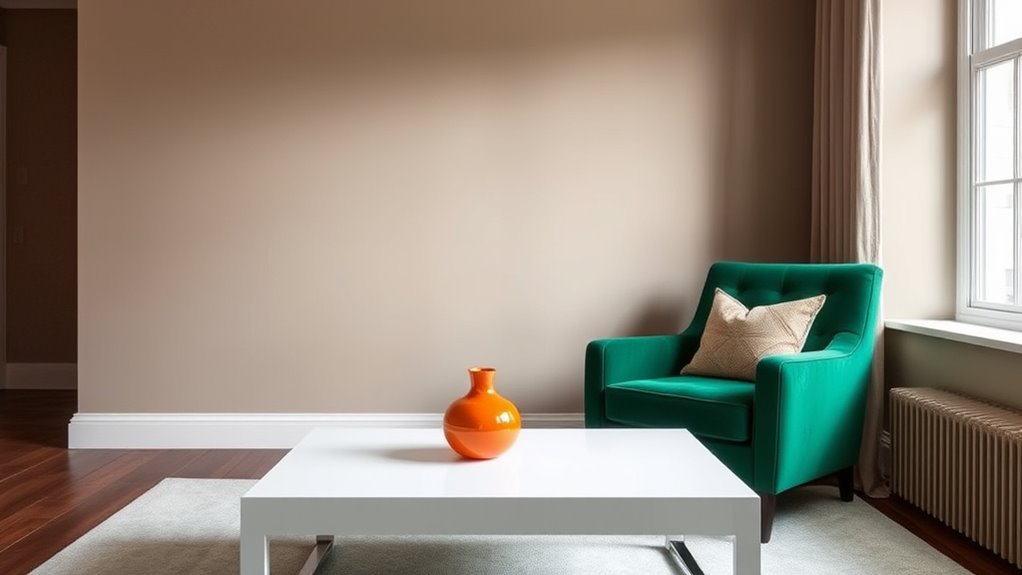
Select Bold Accessories
Choosing bold accessories is an effective way to incorporate accent colors into your space without overwhelming it. A bold statement can be made with eye-catching accessories like vibrant vases, colorful artwork, or striking statement jewelry. These pieces draw attention and add personality without dominating the room. When selecting accessories, focus on items that reflect your style and include the accent color in a vivid way. Statement jewelry, for example, can inspire your decor choices, inspiring you to add similarly bold touches elsewhere. Keep the rest of your decor simple and neutral to let these accessories shine. This approach ensures your space feels lively and cohesive, with just enough pop of color to energize the room without feeling chaotic. Additionally, understanding how resources and tools can help you select the right accent pieces can ensure your decor remains balanced and stylish.
Mix Textures and Patterns
Mixing textures and patterns is a dynamic way to incorporate accent colors into your decor, creating visual interest and depth. By skillfully blending different textures, like smooth ceramics with rough textiles, you enhance the impact of your chosen accent colors. Pattern pairing involves combining complementary or contrasting patterns—such as stripes with florals—to keep the look lively yet cohesive. To master this, consider these tips:
- Use a unifying color palette to tie different textures and patterns together.
- Balance bold patterns with subtle textures to prevent overwhelm.
- Mix large-scale patterns with smaller ones for visual rhythm.
- Layer accent colors through diverse textures and patterns for richness without clutter.
This approach makes your decor engaging, lively, and perfectly balanced.
Use Colorful Art Pieces
Incorporating colorful art pieces into your decor instantly introduces accent colors that breathe life into any space. An art collection can serve as a focal point, adding visual interest without overwhelming the room. Choose pieces that reflect your personality and complement your existing color palette. To achieve color harmony, select artwork with hues that subtly echo your overall scheme, creating a cohesive look. Displaying vibrant paintings, prints, or sculptures strategically can highlight your accent colors while maintaining balance. Keep the surrounding decor simple to let the art stand out. colorful art pieces can also serve as a reflection of your personal style, making your space feel more authentic and inviting. By thoughtfully curating your art collection, you add personality and vibrancy without cluttering your space. This approach ensures your accent colors enhance your environment naturally and attractively.
Experimenting With Shades and Tones for Depth
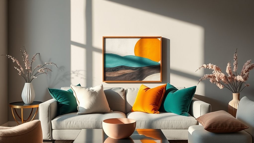
By experimenting with different shades and tones of your accent color, you can create a sense of depth in your space. Incorporating lighter and darker variations adds visual interest and prevents the color from feeling flat. This layering technique guides the eye and makes your design feel more dynamic and inviting. Additionally, understanding color contrast can help you choose the right shades to enhance visual hierarchy without overwhelming the senses.
Layering Light and Dark
Layering light and dark shades creates visual interest and adds depth to your color palette. By using color contrast and light layering, you can make accent colors stand out without overwhelming the space. Here are some tips:
- Start with a neutral base and add darker shades to create depth and focus.
- Use lighter tones to highlight areas and create a sense of openness.
- Mix shades within the same hue for subtle variation and visual richness.
- Balance dark and light shades evenly to maintain harmony and prevent overpowering the palette.
- Remember to consider Halloween decoration ideas when choosing your color palette to ensure a festive yet balanced look.
Experiment with different shades to find the perfect balance, ensuring your accent colors enhance rather than compete. Light layering helps guide the eye and creates a sophisticated, layered look that feels inviting yet controlled.
Creating Visual Interest
Experimenting with different shades and tones adds depth and dimension to your color scheme. By subtly adjusting hues, you create visual interest that guides the eye naturally. Lighter shades can highlight key areas, reinforcing your visual hierarchy, while darker tones add contrast and weight. This interplay influences color psychology, evoking emotions and setting the tone of your space. Using variations of your accent color prevents the look from feeling flat or overwhelming, allowing you to emphasize certain elements without overpowering the overall design. When you incorporate shades and tones thoughtfully, you craft a layered, engaging environment that captures attention and communicates your intended mood. Incorporating visual hierarchy principles ensures your accent color enhances your space rather than dominating it.
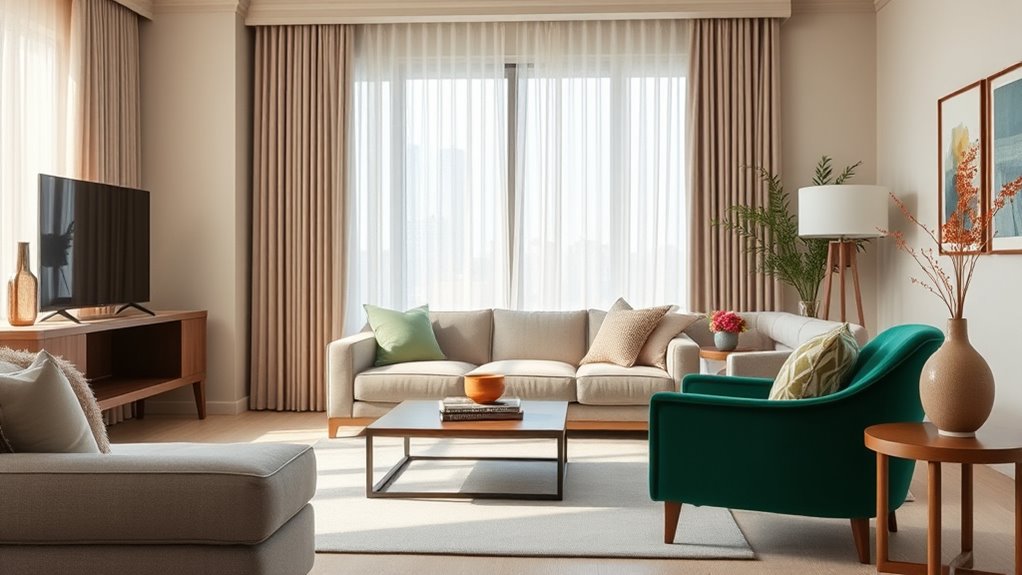
Paying Attention to Proportions and Scale
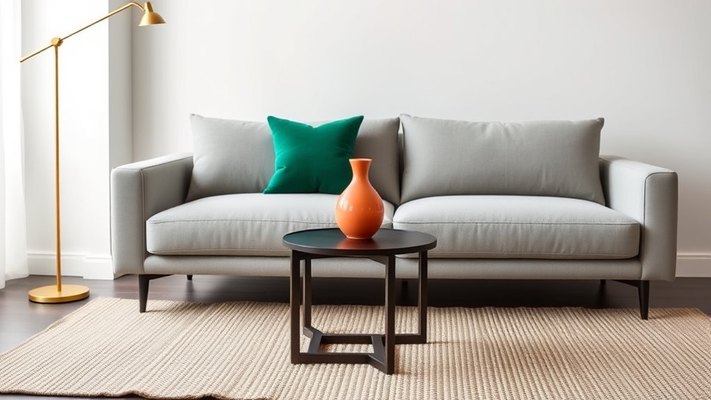
When incorporating accent colors into your design, paying close attention to proportions and scale guarantees they enhance rather than overpower the space. Achieving scale balance helps your accents feel intentional, not overwhelming. Focus on proportion harmony by distributing color accents thoughtfully throughout the room. Here are four tips to master this:
Balance accent colors with proportion and scale for a harmonious, intentional space.
- Use larger accents sparingly to maintain balance.
- Keep smaller accents in proportion to surrounding elements.
- Vary the size of accents to create visual interest without clutter.
- Ensure the color’s intensity aligns with the space’s overall scale.
- Incorporate furniture proportions that complement the accents, ensuring a cohesive and well-balanced look.
Testing and Adjusting Before Finalizing Your Design

Before finalizing your design, it’s important to test your accent color choices in the actual space. This allows you to observe how color psychology influences the environment and guarantees the accent colors work harmoniously. Pay attention to lighting effects, as natural and artificial light can alter how colors appear throughout the day. Test your chosen shades under different lighting conditions to see if they remain subtle or become overwhelming. Adjust the hue, saturation, or placement as needed, making sure the accents complement rather than clash with your overall palette. Taking these steps helps prevent surprises once the design is complete, assuring your accent colors enhance your space without overpowering it. Remember, a little testing goes a long way in creating a balanced, inviting environment. Additionally, asset division considerations in design can inform how different elements are balanced for visual harmony.
Frequently Asked Questions
How Can I Incorporate Accent Colors in Small Spaces Effectively?
You can incorporate accent colors in small spaces by using color blocking techniques to create visual interest without overwhelming the room. Focus on one wall or piece of furniture as a focal point, choosing a bold accent hue that complements your overall palette. Keep other elements neutral to balance the look, allowing your accent color to stand out and add vibrancy without cluttering the space.
What Are Common Mistakes to Avoid When Using Accent Colors?
Avoid overloading your space with highly saturated colors, which can feel overwhelming. Instead, balance accent colors with neutral tones and guarantee good color contrast where needed to create visual interest without chaos. Don’t forget to test your chosen shades in different lighting conditions, and steer clear of too many competing accent hues—simplicity and thoughtful contrast keep your space harmonious and stylish.
How Do Lighting Conditions Affect the Appearance of Accent Colors?
Lighting conditions greatly impact how your accent colors look. Natural light can make colors appear brighter and more vibrant, while artificial lighting might cast warm or cool tones that alter their appearance. You should test your accents under different lighting scenarios to guarantee they maintain their intended effect. Adjusting your lighting or choosing colors suited for specific conditions helps you avoid surprises and keeps your accents looking balanced and intentional.
Can Accent Colors Be Changed Easily Over Time?
Did you know that 60% of homeowners change their accent colors within five years? You can definitely update your accent colors easily over time. This is thanks to your color palette flexibility and paint refresh options, which make switching shades simple without a full overhaul. Whether you want a bold new look or subtle change, these options allow you to keep your space fresh and stylish with minimal effort.
How Do I Choose Accent Colors That Match My Personal Style?
To choose accent colors that match your personal style, start by identifying colors you naturally gravitate toward and that reflect your personality. Focus on color harmony by selecting shades that complement your main palette, creating a balanced look. Trust your instincts, and don’t be afraid to experiment with different hues until you find combinations that feel authentic and visually appealing, making your space uniquely yours.
Conclusion
By thoughtfully choosing and balancing your accent colors, you can transform your space without feeling overwhelmed. Remember, studies show that a well-balanced color scheme increases mood and comfort by up to 70%. So, take your time experimenting with shades, proportions, and accessories. When you strike the right balance, your room becomes a vibrant, inviting haven that reflects your personality—without overpowering your senses. Trust your instincts and enjoy creating a space you’ll love.