
To mix warm and cool woods without clashing, focus on balancing undertones and textures. Choose a dominant tone to set the mood, then add contrasting woods in smaller amounts for interest. Use neutral accessories or finishes to unify the space, and consider lighting, grain patterns, and finishes like matte or glossy. Keep contrast subtle for harmony, and pay attention to overall color harmony. Exploring these tips will help you create a cohesive, stylish environment.
Key Takeaways
- Identify undertones: warm woods have yellow, orange, or red hues; cool woods lean toward blue, gray, or silvery tones.
- Balance tones by mixing textures and finishes, such as matte with glossy, to create visual interest without clash.
- Use a dominant wood tone to set the overall mood and incorporate complementary or transitional woods for harmony.
- Consider lighting and wall colors to see true wood undertones and prevent color misjudgment.
- Limit contrasting wood tones and distribute light and dark finishes evenly for cohesive and balanced spaces.

HROOME Cool Tall Wood Floor Lamp for Living Rooms Bedrooms – Office Corner Decorative Reading Standing Arc Light Creative Swing Arm Gift Ideas for Kids Boys Girls Bedside – LED Bulb Included (Ash)
♠Cool Farmhouse Corner Floor Lamp Appropriates to/for Living Room Kids Bedroom Decoration: a unique design (Person Lamp), this…
As an affiliate, we earn on qualifying purchases.
As an affiliate, we earn on qualifying purchases.
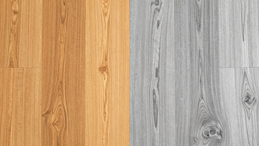
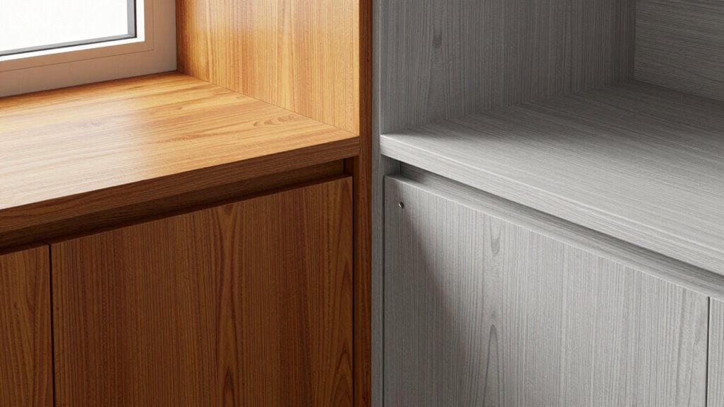
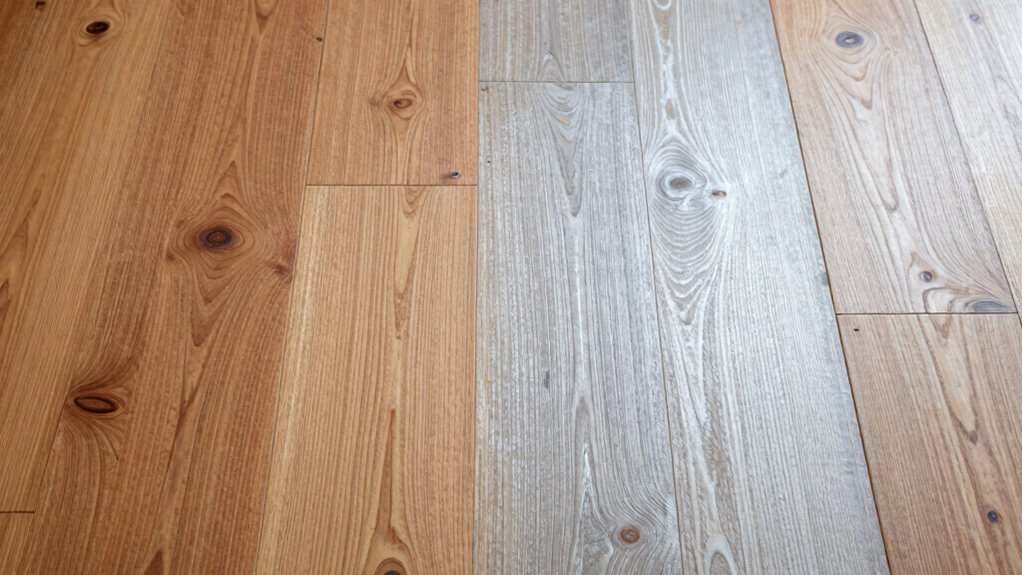
What’s the Difference Between Warm and Cool Woods?
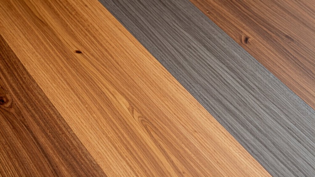
Have you ever wondered how to tell warm woods from cool woods? Many wood tone myths suggest that warm woods are always reddish or golden, while cool woods are blue-gray or ash-toned. But that’s not entirely accurate. A true color temperature comparison reveals that warm woods have undertones of yellow, orange, or red, giving them a cozy feel. Cool woods, on the other hand, lean toward bluish, grayish, or silvery hues, creating a calm vibe. The key is to look beyond surface colors and focus on the underlying undertones. This understanding of color temperature can help you accurately identify whether a wood is warm or cool, avoiding common misconceptions and making better choices for your space. Recognizing undertone differences allows for more harmonious mixing of different wood tones in a design. Additionally, paying attention to the lighting conditions can significantly influence how the wood tones appear in your environment. Understanding how natural light interacts with wood tones can further enhance your interior design choices.

YCNNU Wood Furniture Repair Kit- 12 Colors Wood Fillers and 8 Colors Furniture Touch Up Markers-Set of 28-Repair Hardwood/Laminate Scratches, Cracks, Holes for Door, Floor, Table, Cabinet
Universal Wood Repair Kit for Furniture: This repair kit includes 12 wood fillers, 8 furniture touch up pens,…
As an affiliate, we earn on qualifying purchases.
As an affiliate, we earn on qualifying purchases.
How Do You Decide Which Wood Tones Fit Your Space?
Choosing the right wood tones for your space starts with considering the overall mood and existing elements. Think about how wood tone psychology influences the atmosphere—warm woods evoke coziness, while cool woods create calm. To decide which tones fit best, evaluate these factors:
- Furniture Style Compatibility: Match wood tones with your furniture’s design—sleek modern pieces often suit cool woods, while rustic styles pair well with warm tones.
- Room Lighting: Natural light emphasizes warm hues, while cooler lighting enhances cooler woods. Incorporating lighting conditions can help you determine which tones will look best throughout the day. Additionally, understanding wood tone psychology can guide your choices to influence the space’s ambiance effectively.
- Color Palette: Coordinate with wall colors and accessories to create harmony or intentional contrast. Incorporating visual balance can help achieve a cohesive look.
- Contrast and Harmony: Understanding contrast ratios can help in selecting wood tones that either blend seamlessly or stand out effectively within your space. Additionally, considering precious metals in accents can add a touch of elegance and complement the wood tones beautifully.

DEAYOU 6 PCS Wood Grain Tool Set, 7" Fake Wood Graining Roller, Soft Rubber Wood Textured Pattern Paint Tool with Handle for Wall Floor Furniture Art Painting DIY Room Decoration
Great Value Package: Coming with 6 packs of wood grain tool set. 1 x 7" Wood Pattern Paint…
As an affiliate, we earn on qualifying purchases.
As an affiliate, we earn on qualifying purchases.
What Are the Best Tips for Pairing Warm and Cool Woods?
To create a harmonious look, you should balance warm and cool tones carefully. Incorporate neutral colors to complement both wood types and prevent clashes. Keep these tips in mind to achieve a cohesive and inviting space. Additionally, understanding color coordination can help you select the right shades and finishes to enhance your design.
Balance Warm and Cool Tones
Balancing warm and cool wood tones can transform a space by creating visual harmony and depth. To achieve this, focus on three key tips:
- Mix wood grain textures—combine smooth, sleek finishes with more textured grains to add tactile interest and soften the contrast.
- Use wood finish options strategically—pair matte finishes with glossy ones for subtle variation that balances warmth and coolness.
- Limit the number of tones—stick to two or three wood colors to prevent clashing and make sure your space feels cohesive.
- Incorporate wood color harmony principles to ensure the tones complement each other naturally and enhance the overall aesthetic.
Use Neutral Complementary Colors
When pairing warm and cool woods, neutral complementary colors can create a seamless shift that enhances the overall harmony of your space. A neutral palette acts as a bridge, balancing contrasting tones and making the progression between warm and cool woods feel intentional. Incorporate complementary hues like soft beiges, gentle grays, or warm taupes to unify the look. Use this table for guidance:
| Warm Woods | Neutral Palette | Cool Woods |
|---|---|---|
| Cherry | Beige | Light Gray |
| Walnut | Taupe | Slate Gray |
| Oak | Cream | Pale Blue |
Choosing these neutral shades helps to anchor your design, ensuring both warm and cool woods coexist beautifully without clashing. The key is to select versatile hues that emphasize color harmony and enhance your overall aesthetic. Additionally, understanding color balance principles can help you create a cohesive and visually pleasing space.
PEAKOLY Wood Knot Decor Natural – Coffee Table Sculpture, Wood Chain Link Decor, Decorative Chain, Wooden Knot, Console Table Decoration Items, Shelf Decorations, Bookshelf Decorative Objects, Beige
💡 Need to style your COFFEE TABLE? Looking to accent your SHELVES? Trying to elevate your favorite space?…
As an affiliate, we earn on qualifying purchases.
As an affiliate, we earn on qualifying purchases.
Common Mistakes to Avoid When Mixing Wood Tones
Mixing different wood tones can instantly add warmth and character to a space, but it’s easy to make mistakes that disrupt the overall harmony. One common error is ignoring how clashing patterns can make the room feel chaotic instead of cohesive. Another mistake is mismatched textures, which can create visual confusion rather than balance. Additionally, sticking to too many contrasting wood tones without a unifying element can overwhelm the space. To avoid these pitfalls, stick to a consistent color palette and consider how different textures work together. Keep an eye out for clashing patterns, and choose complementary wood tones that blend seamlessly. Recognizing the importance of harmony in wood tones can also help create a visually appealing environment, ensuring your design feels cohesive and inviting. Remember, harmony in wood tones comes from thoughtful pairing, not random mixing.
How Can You Balance Warm and Cool Woods in Different Rooms?
To balance warm and cool woods in different rooms, consider using transitional design techniques that link spaces smoothly. A consistent color palette across rooms helps create harmony and prevents clashing tones. By thoughtfully connecting these elements, your home will feel cohesive and well-balanced. Additionally, understanding the benefits of curiosity can encourage you to explore various design ideas and unlock creative solutions for your space.
Transitional Design Techniques
Balancing warm and cool woods in different rooms requires a thoughtful approach to passage design techniques. To create harmony, consider these strategies:
- Use contrasting wood grain patterns to highlight differences while maintaining cohesion.
- Apply similar wood finishing techniques, such as matte or satin, across rooms for visual consistency.
- Introduce transitional pieces that combine both warm and cool tones, bridging the gap between spaces.
- Incorporate paint and wall finishes to unify the overall aesthetic and emphasize the balance between different wood tones.
Consistent Color Palette
Achieving harmony between warm and cool woods across different rooms starts with establishing a consistent color palette. To do this, focus on matching wood grain textures and stain finishes that complement each other. For example, if you choose a warm, honey-toned wood with prominent grain textures in one space, carry similar tones or finishes into other rooms to create visual flow. Using stain finishes that share undertones helps unify the look, even if the wood types vary. Stick to a core color theme, like neutral browns or soft greys, and incorporate accents that echo these shades. This approach ensures that your spaces feel connected, making the mix of warm and cool woods appear intentional rather than disjointed. Regular appliance maintenance plans can also help keep your home’s aesthetic consistent by preventing issues that might disrupt the visual flow. Consistency is key to a cohesive, balanced design.
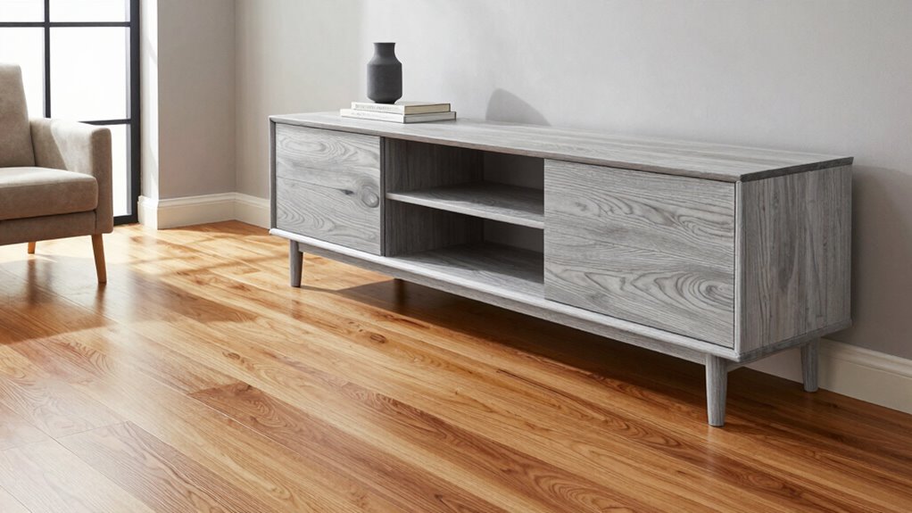
Real-Life Examples of Successful Wood Tone Combinations
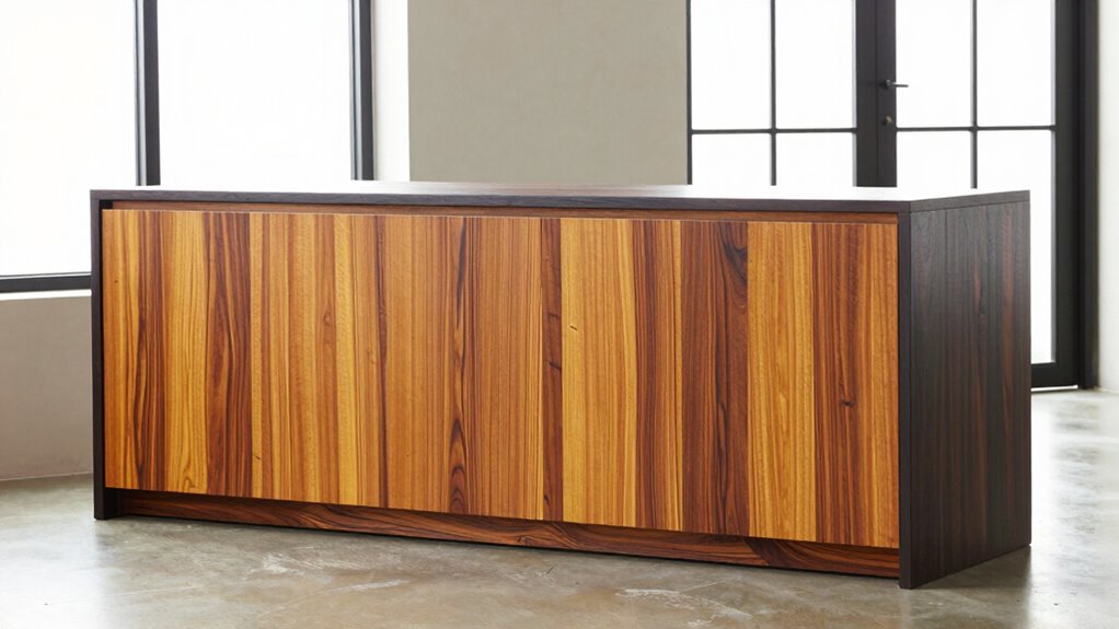
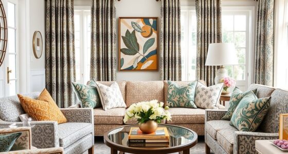
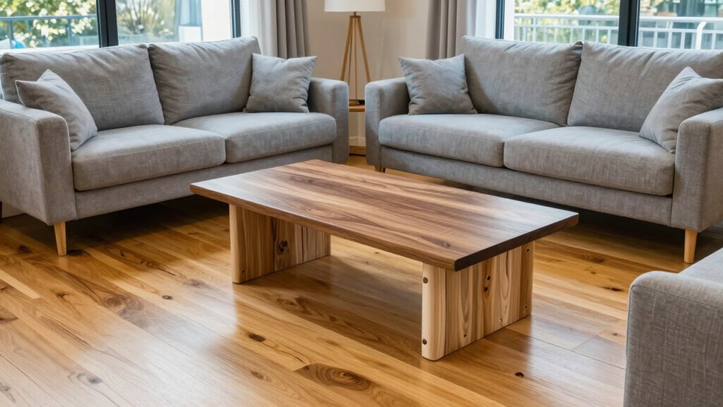
Many interior designers successfully mix warm and cool woods to create visually striking spaces. For example, they might combine a rich walnut dining table with sleek, cool-toned maple chairs, balancing warmth and chill. Here are some inspiring examples:
- Decorating with accents like brass fixtures against a cool ash wood wall for contrast.
- Furniture pairing that mixes a warm cherry sofa with cool-toned oak coffee tables for harmony.
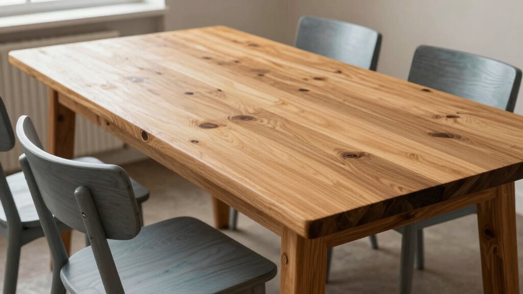
- Combining warm pine shelves with cool gray-toned cabinetry in a kitchen to add depth.
- Paying attention to support networks for new fathers can inspire you to incorporate personal touches that foster warmth and connection in your space. Additionally, understanding how color temperature affects wood pairing can help you choose tones that naturally complement each other. Recognizing how wood grain patterns influence visual cohesion can further enhance your design choices. Considering visual weight helps in balancing different wood tones effectively within a space. Being mindful of metabolic health can also inspire you to create environments that promote overall well-being through thoughtful design choices. These successful combinations show how mixing tones without clashing can elevate your space. Focus on balancing warm and cool woods through accents and furniture pairing to achieve a cohesive, eye-catching look.
Final Tips for Achieving a Cohesive Wood Tones Look
To create a cohesive wood tone look, start by choosing a dominant wood finish that sets the overall mood of your space. This helps establish a foundation for natural textures and guarantees color harmony throughout. When selecting additional woods, stick to tones that complement your main finish, whether warm or cool, to prevent clashing. Incorporate varied textures—like matte, glossy, or distressed surfaces—to add depth without overwhelming the eye. Balance lighter and darker woods thoughtfully, distributing them evenly around the room for visual flow. Remember, subtle contrasts often work better than stark differences. Trust your eye, and don’t be afraid to mix tones, as long as they relate harmoniously. Exploring environmental impact of different woods can also guide more sustainable choices. With intentional choices, you’ll achieve a polished, inviting look that feels cohesive and well-designed.
Frequently Asked Questions
Can Lighting Affect How Warm or Cool Wood Tones Appear?
Lighting effects and color temperature can definitely influence how warm or cool wood tones appear. When you use warm lighting, it enhances the golden or reddish hues, making woods look warmer. Conversely, cool lighting with higher color temperature emphasizes the blues and grays, giving woods a cooler appearance. So, if you want to highlight or downplay certain wood tones, adjusting the lighting effects is a quick and effective way to do it.
Are There Specific Finishes That Enhance Warm or Cool Wood Tones?
You can enhance warm or cool wood tones with specific finishes. For warm woods, choose wood stain options like honey or amber and apply a varnish or finish that adds richness and depth. Cool woods benefit from stain options like gray or ash, paired with matte or satin finishes that highlight their subtle tones. Always test finishes first to see how they interact with your wood’s natural color before committing to the entire piece.
How Do I Incorporate Wood Tones in a Small or Open-Concept Space?
Think of your space as a canvas where wood tones symbolize harmony. In small or open-concept areas, use space planning to balance warm and cool woods, creating visual flow. Focus on strategic furniture placement—place lighter, cool-toned woods near windows for openness, and warm tones in cozy corners. This approach enhances depth and cohesion, making your space feel inviting yet expansive. Keep it simple to avoid clutter and maximize the effect.
What Accessories Work Best With Mixed Warm and Cool Wood Tones?
You should choose accessories with complementary color schemes to harmonize warm and cool wood tones. Incorporate contrasting textures, like smooth ceramics with rough woven fabrics, to add visual interest. Metal accents in brushed gold or silver can bridge the gap between tones. Keep accessories balanced, avoiding overwhelming either warmth or coolness, so your space feels cohesive and inviting while showcasing the beautiful interplay of mixed wood tones.
How Do I Maintain Color Consistency When Sourcing Different Wood Pieces?
Think of color consistency as a dance—you want every step to match perfectly. To keep your wood pieces harmonized, use wood staining techniques like sample testing and layering. Rely on color matching tips by comparing stain swatches in natural light, and don’t forget to document your exact stain formulas. This way, you guarantee your warm and cool woods blend smoothly, creating a cohesive look that feels intentional and polished.
Conclusion
Remember, blending warm and cool woods is an art that requires patience and an eye for harmony. By understanding the differences and following expert tips, you can create a space that feels balanced and inviting. Don’t forget, Rome wasn’t built in a day—so take your time experimenting with tones. With a thoughtful approach, you’ll find that “the whole is greater than the sum of its parts,” resulting in a beautifully cohesive environment.