
Color drenching in monochromatic interiors involves immersing your space in varying shades of a single hue, creating a bold, cohesive look that transforms how the room feels. You can use the full spectrum—from light tints to deep shades—to evoke specific emotions and create visual harmony. It’s about balancing surfaces, textiles, and accents for a layered, textured effect. Keep exploring, and you’ll discover how this technique can turn your interior into a striking, emotionally resonant space.
Key Takeaways
- Color drenching immerses a space in a single hue, creating bold, cohesive visual impact.
- It uses a spectrum from light tints to deep shades for layered, textured interiors.
- Psychology guides color choices to evoke calmness, energy, or specific moods within monochromatic schemes.
- Maintaining visual balance ensures harmony among surfaces, furnishings, and accents.
- Proper execution enhances emotional resonance, transforming spaces into immersive, stylish environments.
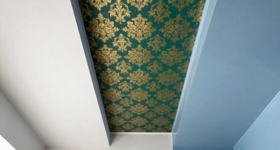
Have you ever wondered how farmers achieve vibrant, eye-catching crops? Well, in interior design, there’s a similar magic called color drenching, especially when it comes to monochromatic interiors. This technique involves immersing a space in varying shades of a single color, creating a bold, cohesive look that can evoke specific emotions and transform how you experience a room. When you choose to implement a monochromatic palette, you’re not just picking one hue; you’re playing with its entire spectrum, from light tints to deep shades, to craft a seamless and harmonious environment. This approach relies heavily on understanding color psychology—how different colors influence mood and perception—and maintaining design consistency to guarantee the space feels balanced and intentional.
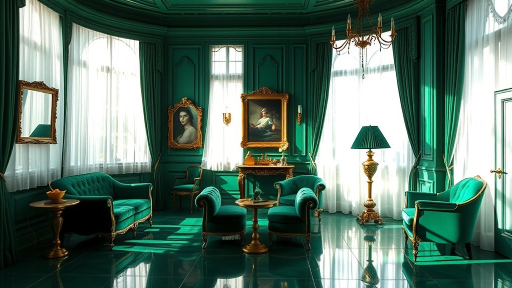
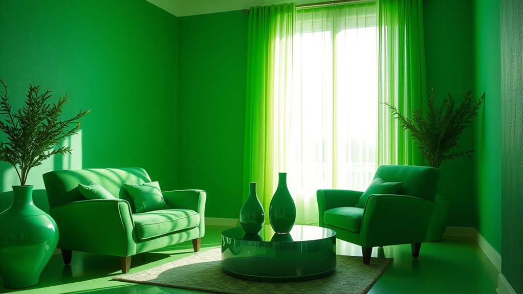
Color psychology acts as your guiding compass in monochromatic design. For instance, if you opt for blue, you might aim to foster calmness and serenity, ideal for bedrooms or relaxing lounges. On the other hand, a bold red can energize a space, making it perfect for social areas like dining rooms or kitchens. By immersing yourself in a single color family, you can subtly evoke specific feelings without overwhelming the senses. This emotional resonance is what makes monochromatic interiors so compelling—they communicate a mood through careful color choices that resonate deeply with inhabitants and visitors alike.
Design consistency is vital when executing a monochromatic scheme. It’s about maintaining a balanced visual weight across the room, ensuring that no single element feels out of place or overly dominant. When you drench a space in different shades of one color, you create a layered, textured look that’s both dynamic and cohesive. To achieve this, pay attention to how surfaces, furnishings, and accents complement each other within the palette. For example, if your main color is green, you might incorporate darker forest hues for walls, lighter mint shades for textiles, and subtle olive accents for decor pieces. This consistency helps your eye flow naturally across the space, making it feel unified rather than chaotic. Additionally, understanding interior design principles can help you refine your monochromatic scheme for maximum impact.
The beauty of color drenching in monochromatic interiors lies in its simplicity and power. It demands a keen eye for detail and a thoughtful approach to color selection, which guarantees the room doesn’t feel monotonous but instead feels intentionally curated. When you master the balance between color psychology and design consistency, you can craft interiors that are striking, harmonious, and emotionally resonant—all within a single hue’s full spectrum. In this way, color drenching becomes more than just a decorating technique; it transforms your space into an immersive experience that reflects your style and mood with clarity and confidence.

White Paint for Wall, 17.6 Floz Wall Touch Up Paint With Roller
- All-in-One Wall Touch-Up Kit: Includes paint, roller, brush, gloves
- Non-Toxic, Family-Safe Formula: Odorless, washable, safe for kids and pets
- Effective Wall Damage Repair: Covers stains, scratches, scuffs, and marks
As an affiliate, we earn on qualifying purchases.
As an affiliate, we earn on qualifying purchases.
Frequently Asked Questions
How Can I Balance Color Drenching Without Overwhelming a Space?
To balance color drenching without overwhelming your space, focus on controlling color saturation. Use bold, saturated shades on large surfaces but keep accents like pillows or artwork in softer tones. Incorporate neutral elements to break up intense colors and create visual relief. Adding accent accessories in contrasting or muted hues helps prevent the room from feeling too overwhelming, ensuring your monochromatic interior remains harmonious and inviting.
What Are the Best Color Schemes for Monochromatic Interiors?
You might find that subtle variations in shade selection create a harmonious monochromatic interior, avoiding visual fatigue. Soft, muted tones with just a touch of contrast foster color harmony, making your space feel cohesive yet dynamic. Opt for a palette that includes lighter and darker versions of your chosen hue, ensuring the overall look remains sophisticated. This approach allows you to enjoy a beautifully balanced, monochromatic environment without overwhelming your senses.
How Does Lighting Affect Monochromatic Color Drenching?
Lighting dynamics play a crucial role in monochromatic color drenching by influencing how color intensity appears in your space. Bright, natural light enhances the vibrancy, making subtle shades pop, while softer, dimmer lighting creates a more muted and cozy atmosphere. You can manipulate these effects to highlight different aspects of your monochromatic scheme, ensuring your interior remains visually engaging and balanced regardless of the lighting conditions.
Can Color Drenching Work in Small Rooms Effectively?
Yes, color drenching can work in small rooms effectively. You should choose a monochromatic palette that reflects your desired mood, leveraging color psychology to create a sense of space and calm. To avoid overwhelming the room, add subtle color contrast with textures or accessories, which enhances depth without losing the cohesive vibe. Proper lighting also amplifies the color’s impact, making your small space feel larger and more inviting.
What Materials Complement Monochromatic Color Schemes?
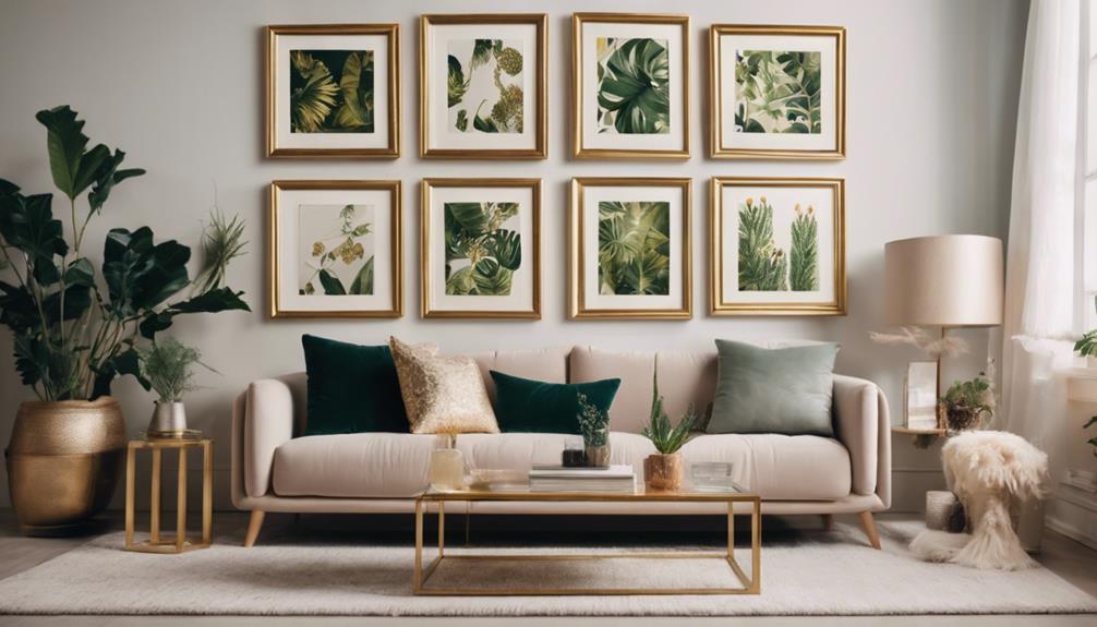
Think of your space as a canvas where textures tell stories. You’ll want to choose natural materials like wood, stone, or woven textiles to add depth and warmth to monochromatic schemes. Textile textures, such as plush rugs or linen cushions, create tactile contrast, making your room inviting. These materials complement the unified color palette, enhancing visual interest and comfort while emphasizing the harmony and subtle complexity of your monochromatic interior.
Conclusion
Imagine stepping into a room where every wall, furniture, and accent bursts with bold, monochromatic hues. Take Sarah’s living room, painted in vibrant cobalt blue; it feels like stepping into a serene ocean. Color drenching transforms your space into a powerful statement, enveloping you in mood and personality. So, don’t hold back—embrace a monochromatic palette and turn your home into a mesmerizing, immersive experience that truly reflects your style.