You can make chartreuse work as a neutral by pairing it with more subdued tones like charcoal, taupe, or cream. This helps balance its boldness and creates a sophisticated, lively look. Combining it with softer shades such as blush or pale gray adds calmness, while darker colors like navy or purple give depth. With strategic pairing, chartreuse can elevate your space or outfit without overwhelming. Keep exploring how to master this vibrant, versatile color—there’s more to discover!
Key Takeaways
- Pair chartreuse with subdued neutrals like gray, beige, or white to create balance and prevent overwhelming the space or outfit.
- Use darker shades such as navy, charcoal, or deep purple to anchor chartreuse’s vibrancy and add sophistication.
- Incorporate soft hues like blush or pale gray to evoke calmness alongside chartreuse’s energetic tone.
- Balance boldness by limiting chartreuse to accent pieces or small areas rather than large surfaces.
- Experiment with contrasting colors and patterns to achieve a harmonious, balanced look that highlights chartreuse’s lively nature.
Is chartreuse truly a neutral color? That’s a question many people ask when exploring its role in design and fashion. Traditionally, neutrals like beige, gray, or white are seen as calming and versatile, but chartreuse challenges that idea with its vibrant mix of green and yellow. Its boldness can be both a strength and a challenge, depending on how you approach pairing strategies. If you want to incorporate chartreuse into your wardrobe or space without overwhelming, understanding how to balance its intensity is key. One effective way is to pair it with other neutrals. Think of it as a splash of vibrancy against subdued tones like charcoal, taupe, or cream. These combinations allow chartreuse to stand out without feeling chaotic, creating a sophisticated contrast that highlights its lively nature.
Color psychology plays a significant role here. Chartreuse evokes energy, freshness, and vitality, which can invigorate a room or an outfit. When used thoughtfully, it becomes a statement piece that captures attention but doesn’t dominate the entire visual landscape. It’s important to contemplate the mood you want to create. If you want a calming effect, pair chartreuse with softer hues like blush or pale gray. For a more dynamic look, combine it with navy or deep purple, which can anchor its brightness while emphasizing its lively undertones. The key is to experiment with different combinations and see how they make you feel, whether you’re aiming for a tranquil or energetic vibe. Additionally, understanding the concept of visual impact helps in applying this color effectively.
In terms of styling, don’t shy away from using chartreuse as a neutral itself—especially when you balance it with other bold accents or patterns. For example, in fashion, pairing a chartreuse blouse with dark skinny jeans and minimal jewelry can bring a modern, fresh look. In interior design, a chartreuse accent wall paired with white or black furniture creates a striking yet balanced aesthetic. The idea is to let chartreuse act as a foundational color that energizes the space or outfit, rather than competing with other elements. When you understand its pairing strategies and harness the insights from color psychology, you’ll see how versatile and powerful this color can be. It’s not just a bright, eye-catching hue; it’s a strategic tool that, when used correctly, can elevate your style and environment with its bold but balanced presence.
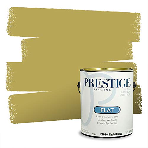
PRESTIGE Paints Interior Paint and Primer In One, 1-Gallon, Flat, Comparable Match of Valspar* City Chartreuse*
Prestige Paints has created a comparable Color based on Color specifications of the original Color using industry leading…
As an affiliate, we earn on qualifying purchases.
As an affiliate, we earn on qualifying purchases.
Frequently Asked Questions
How Does Chartreuse Compare to Other Neutral Colors in Design?
You’ll find chartreuse stands out among neutrals thanks to its unique color versatility, blending boldness with subtlety. Unlike traditional neutrals like beige or gray, it adds a lively, energetic vibe to your space or outfit. Its bright hue enhances mood, making environments feel more vibrant and uplifting. While other neutrals tend to be calming, chartreuse offers a dynamic balance, giving your design a fresh, modern twist that energizes without overwhelming.
Can Chartreuse Be Used Effectively in Minimalist Decor?
Think of chartreuse as a lively brushstroke in your minimalist masterpiece. Yes, it can be used effectively in minimalist decor, adding a pop of energy without overwhelming. Its nature-inspired palette and bold yet versatile tone create a fresh backdrop for artistic expressions. Use it sparingly on accent pieces or walls to keep your space balanced, letting its vibrant personality shine while maintaining that clean, streamlined aesthetic you love.
What Are the Best Color Combinations With Chartreuse?
You should try pairing chartreuse with complementary hues like deep purple or rich blues to create striking contrasts. For a more harmonious look, explore analogous schemes with shades of green or yellow-green. These combinations highlight chartreuse’s boldness while balancing it with complementary or similar tones. Incorporate these pairings into your decor for a lively, cohesive space that energizes without overwhelming.
Is Chartreuse Suitable for Professional or Corporate Settings?
Yes, chartreuse can be suitable for professional or corporate settings if used thoughtfully. In office attire, pairing it with neutral colors creates a fresh, modern look, while in branding strategies, it conveys innovation and creativity. Just guarantee you balance its boldness with subtle accents to maintain professionalism. When incorporated properly, chartreuse adds a vibrant touch that can make your style or brand stand out confidently.
How Does Lighting Affect the Appearance of Chartreuse in a Space?
Lighting effects considerably influence how chartreuse appears in a space. Bright, natural light enhances its vibrancy, making it pop, while softer or dimmer lighting can dull its boldness. Surface reflections also play a role, adding a subtle shimmer or muting the color. You should consider the lighting setup carefully to achieve the desired mood, ensuring that chartreuse complements the overall design and creates the right visual impact.

MIULEE Pack of 2 Corduroy Decorative Throw Pillow Covers 18×18 Inch Soft Boho Striped Pillow Covers Modern Farmhouse Home Decor for Sofa Living Room Couch Bed Cream White
QUALITY MATERIAL: The pillow cover is composed of a soft and comfy corduroy which is a kind of…
As an affiliate, we earn on qualifying purchases.
As an affiliate, we earn on qualifying purchases.
Conclusion
You see chartreuse as a neutral, a balance between boldness and subtlety. You embrace its ability to energize a space, to calm a room, to challenge conventions. You recognize its versatility as a neutral, as a statement, as a foundation. You appreciate its role in creating harmony, sparking innovation, and inspiring confidence. You understand that chartreuse isn’t just a color—it’s a choice, a balance, a boldness that transforms your environment and your perspective.

Blouses for Women Satin Shirts Long Sleeve Silk Blouse Womens Dressy Casual Button Down Shirt Up Dress Tops Women's Button-Down Silky Business Clothing Washable Clothes Holiday Golden Chartreuse S
Luxurious Satin Fabric: This long-sleeve striped shirt is expertly crafted from a premium blend of 80% polyester and…
As an affiliate, we earn on qualifying purchases.
As an affiliate, we earn on qualifying purchases.

Roundhill Furniture Capa Print Fabric Armless Contemporary Accent Chair, Purple Floral
[BOXED EDGE CUSHION DESIGN]: This fashionable armless chair brings a cool vibe to your home with patterned fabric…
As an affiliate, we earn on qualifying purchases.
As an affiliate, we earn on qualifying purchases.