
You might notice browns and muddy tones making a comeback because artists are intentionally using subdued colors to create depth, warmth, and realism. This trend recognizes that not all vibrant hues are ideal everywhere, and controlled dullness can add richness to your work. By understanding how muddy colors form and how to manage them, you can harness their expressive potential. Keep exploring these principles, and you’ll discover how muddy tones can become a powerful tool in your art.
Key Takeaways
- Muddy colors often result from mixing complementary hues, creating dull, brownish tones.
- Artists intentionally use browns and muted colors to add depth and realism to their work.
- Proper pigment selection and layering techniques prevent unintentional muddiness and maintain vibrancy.
- Understanding color interactions helps artists control when muddy hues like brown are desirable.
- Brown’s resurgence in art reflects its versatility in conveying natural textures and subdued atmospheres.
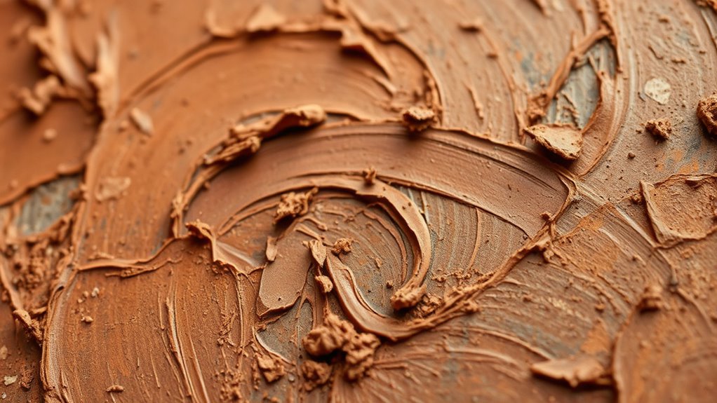
Muddy colors often appear when mixing paints, but understanding why they happen can help you create more vibrant artwork. One key to avoiding muddiness is mastering the art of color mixing, which involves understanding how different colors interact and how pigment selection plays a fundamental role. When you choose the right pigments, you’re more likely to produce clean, lively hues instead of dull, brownish tones.
The core issue with muddy colors often stems from mixing complementary colors or using pigments that don’t blend well. Complementary colors—those opposite each other on the color wheel, like red and green or blue and orange—tend to neutralize each other when mixed, resulting in a muddy, brownish hue. To keep your colors vibrant, it’s best to either use colors that are adjacent on the wheel or to carefully manage how you blend complementary shades, perhaps by layering instead of mixing directly.
Mixing complementary colors often creates muddy, dull hues; opt for adjacent shades or layering to maintain vibrancy.
Pigment selection is equally important. Not all paints are created equal, and some pigments are more prone to muddying than others. For instance, certain earth tones or muted pigments might inherently lean toward dullness if overmixed. Bright, transparent pigments like cadmium red or ultramarine blue tend to retain clarity when mixed correctly. When you select pigments with high tinting strength and transparency, you’ll find it easier to create vibrant mixtures without unintentionally dulling your colors.
Practicing controlled color mixing can also help you avoid muddying. Start with small amounts and test how different pigments combine before applying them to your main work. This way, you learn firsthand which combinations produce the desired hues and which lead to mud. Keep in mind that adding a touch of a pure, unblended color can revive a dull mixture, helping you maintain vibrancy in your artwork.
Understanding the properties of your pigments can guide your choices and mixing techniques. For example, some pigments are more opaque, which can make your mixes look muddy if not handled carefully. Conversely, using transparent colors allows you to build up layers gradually, preserving brightness. Additionally, understanding the fundamentals of color theory can help you make more informed decisions when blending paints, ensuring more vibrant and clean results.
In the end, the secret to avoiding muddy colors lies in thoughtful pigment selection and deliberate color mixing. When you pay attention to these details, you’ll find your palettes staying cleaner and your paintings bursting with life. Brown, once seen as a mistake, can become a deliberate and powerful part of your color vocabulary, adding depth and richness to your work instead of muddiness. With patience and practice, you’ll learn to control your colors more effectively, transforming potential muddiness into intentional, beautiful tones.
Frequently Asked Questions
How Can I Prevent My Colors From Becoming Muddy While Painting?
To prevent your colors from becoming muddy, always check the color wheel and keep complementary colors apart. Use warm and cool color temperatures deliberately, avoiding mixing too many in one stroke. Clean your brushes frequently and limit your palette to a few harmonious hues. By managing color temperature and understanding color relationships, you’ll maintain vibrant, clean colors and avoid muddiness in your artwork.
What Are the Best Color Palettes to Avoid Muddy Hues?
Think of your palette like a well-tuned orchestra, where every instrument plays in harmony. To avoid muddy hues, choose a color harmony that emphasizes complementary or analogous colors. Opt for a palette with balanced warm and cool tones, avoiding too many muted or triadic combinations. Good palette selection keeps your colors vibrant and clean, making your artwork lively rather than muddled. Always test mixes before applying them to your piece.
How Does Lighting Affect the Appearance of Muddy Colors?
Lighting substantially impacts how muddy colors appear by affecting color temperature and shadow influence. When you use warm light, muddy hues can seem richer and more vibrant, while cool lighting may make them look dull or muted. Shadows deepen the muddy effect, emphasizing the color’s natural earthiness. To manage this, adjust your lighting setup to balance color temperature and minimize harsh shadows, ensuring your muddy colors add depth without dulling your artwork.
Can Muddy Colors Be Intentionally Used for Specific Artistic Effects?
Absolutely, you can intentionally use muddy colors for striking artistic effects. Think of muddy hues as the secret sauce that adds depth and emotion to your work. By understanding color theory, you harness these complex tones for mood, atmosphere, or realism. Use muddy colors intentionally to evoke nostalgia, tension, or harmony, making your artistic expression richer and more compelling—like painting with the subtle whispers of a story only your brush can tell.
What Mixing Techniques Help Maintain Vibrant Colors Over Muddy Ones?
To keep your colors vibrant and avoid muddy mixes, focus on color harmony by choosing complementary and analogous colors. Use transparent pigments to layer and blend without dulling the hues. When mixing, add small amounts gradually and keep track of color relationships, ensuring your mixes stay bright. This approach helps you maintain clarity and vibrancy, preventing muddy effects while creating harmonious, lively artwork.
Conclusion
So, next time you see a vibrant landscape painting featuring rich browns, remember how muddy colors add depth and warmth. Think of a hypothetical artist, Sarah, who struggled with dullness in her work until she embraced earthy tones. Once she did, her landscapes felt more grounded and inviting. Don’t shy away from muddy colors—they’re your secret weapon to creating richness and realism in your art. Embrace brown; it’s making a comeback for a reason.